The Bar of Ireland: News & Events Hub

The Bar of Ireland is the professional association and regulatory body for barristers practicing in Ireland. Established under the Barristers Act 1867, it ensures the integrity, competence, and ethical conduct of its members while providing support and resources for their professional development.
Project details
Designing a news and event section is essential for fostering communication and engagement within the legal community. Barristers and solicitors rely on timely and accurate information to stay informed , legislative changes, professional development opportunities, and networking events. A well-crafted news and event page serves as a central hub where legal professionals can easily access relevant information, supporting their continuous learning and career advancement. Furthermore, it promotes a sense of community and connection among members, encouraging collaboration, knowledge sharing, and active participation in relevant activities.
Project took place from November 2018 to 2019.
Website went live in July 2019.
Maintained until October 2019.
My process

Discovery and Research: Lead and conduct UX research to develop a deep understanding of The Bar of Ireland, its user’s goals & needs and what the organisation’s needs are to achieve these goals.
Methodologies used:
Stakeholder Interviews
Customer surveys
User personas
User Flows
Wireframing
Iterative Prototyping
Stakeholder interviews
Some noteworthy user quotes from my stakeholder interviews:
“We receive frequent calls and emails from barristers seeking confirmation on legal updates. Although we publish these updates on our website, they often struggle to locate them. Having a centralised repository webpage would be immensely beneficial for us to reference and direct them too.”
“I would like the CPD events to be front and center, as each barrister needs to obtain 12 CPD points per year to stay in practice. Additionally, having links to past events so they can watch events they couldn’t attend would be very helpful.”
Quantitative research

I delved into our database and analytics to better understand our users. Here are two key insights that guided my design decisions:
Our data indicates that the average age of barristers entering the Bar of Ireland is 45. This demographic insight is crucial as it informs various design elements such as font size, content presentation, and overall user experience.
Analytics reveal that 76% of our users access the site from desktops. This significant percentage impacts our design choices, particularly in terms of responsiveness and layout.
User centered research

Focus Groups: As we had the client base, we were designing for at our fingertips we really took advantage of the situation. We sent out a request for barristers to join a focus group to voice what they would like to see on their personalize news and events page and the pain points they have with the current set up.
Site Visits: We selected 2 very different barristers, who agreed to let us observe them in their own habitat, we did this over a course of 3 days. We noted how they interacted with the current website and other in-house services.
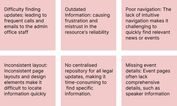
Findings:
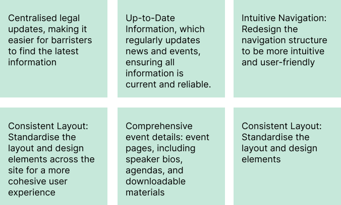
A dedicated news and events page on The Bar of Ireland website would be extremely valuable to its members.
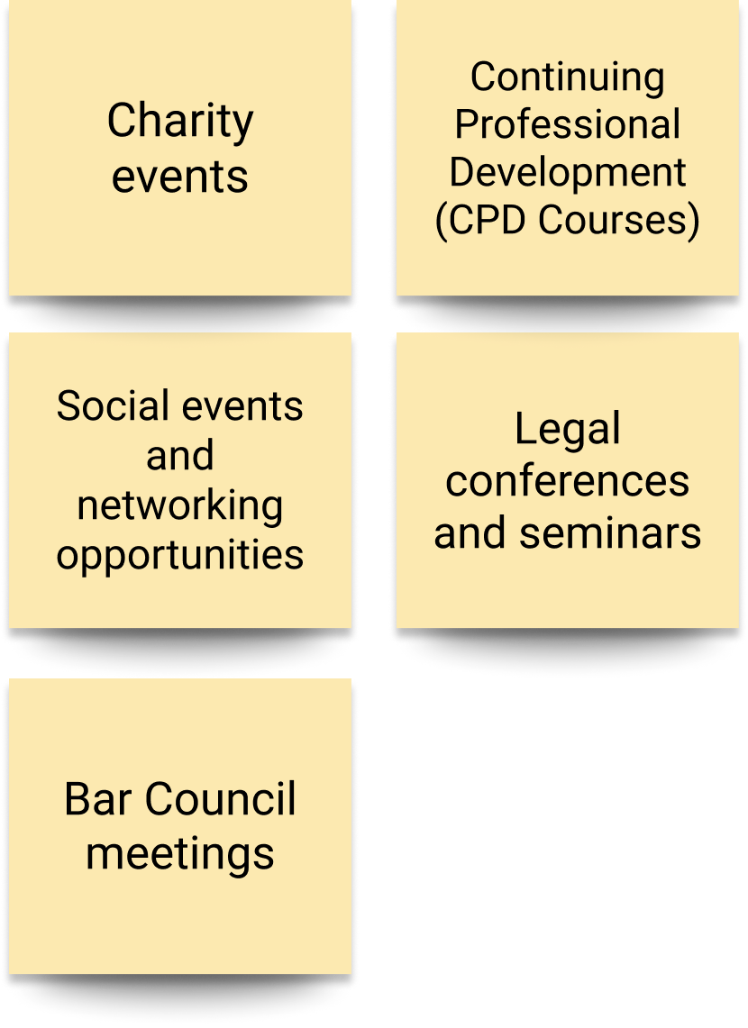
Type of events:
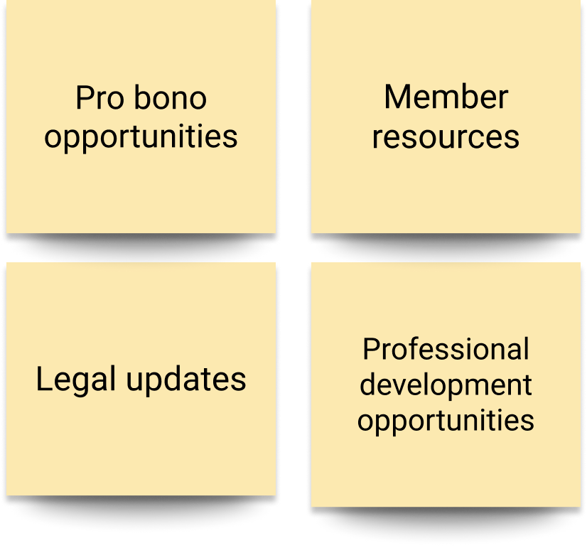
Type of information:
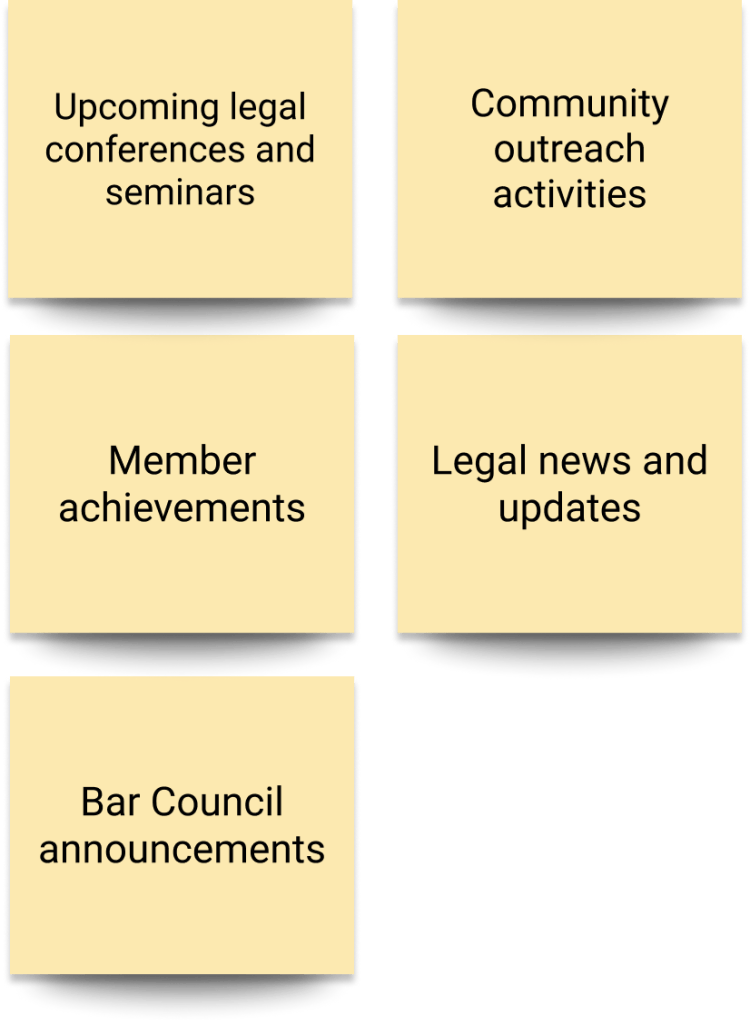
Type of news:
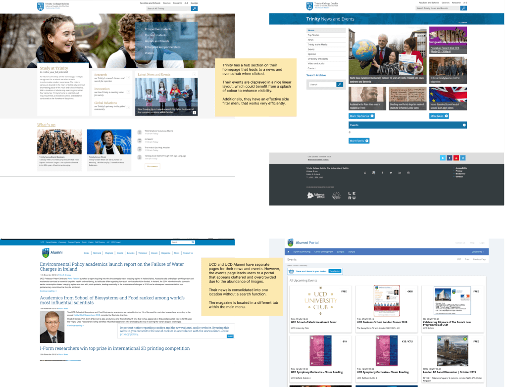
Market research
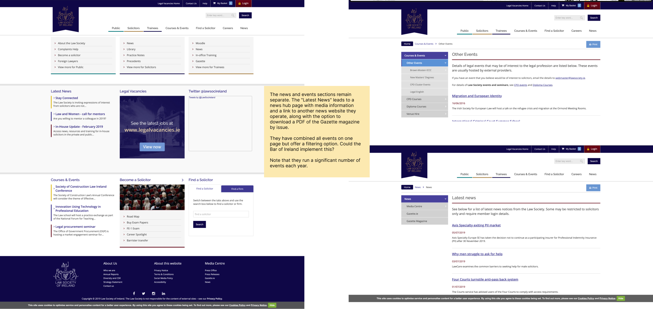
To gain valuable insights and benchmark best practices, I chose to examine UCD, Trinity College, and the Law Society. These institutions were selected because they represent leading academic and professional bodies within the legal field, and their websites are known for effectively communicating news and events to a similar audience. By analysing their layout, design elements, and user engagement strategies, I aimed to identify key features and innovative approaches.
User Persona’s
Using personas to develop a news and events page for the Bar of Ireland ensures the design meets the specific needs of the users. This approach allows for tailored content that resonates with the audience segments. Furthermore, they help align stakeholders by providing a clear understanding of the end users.
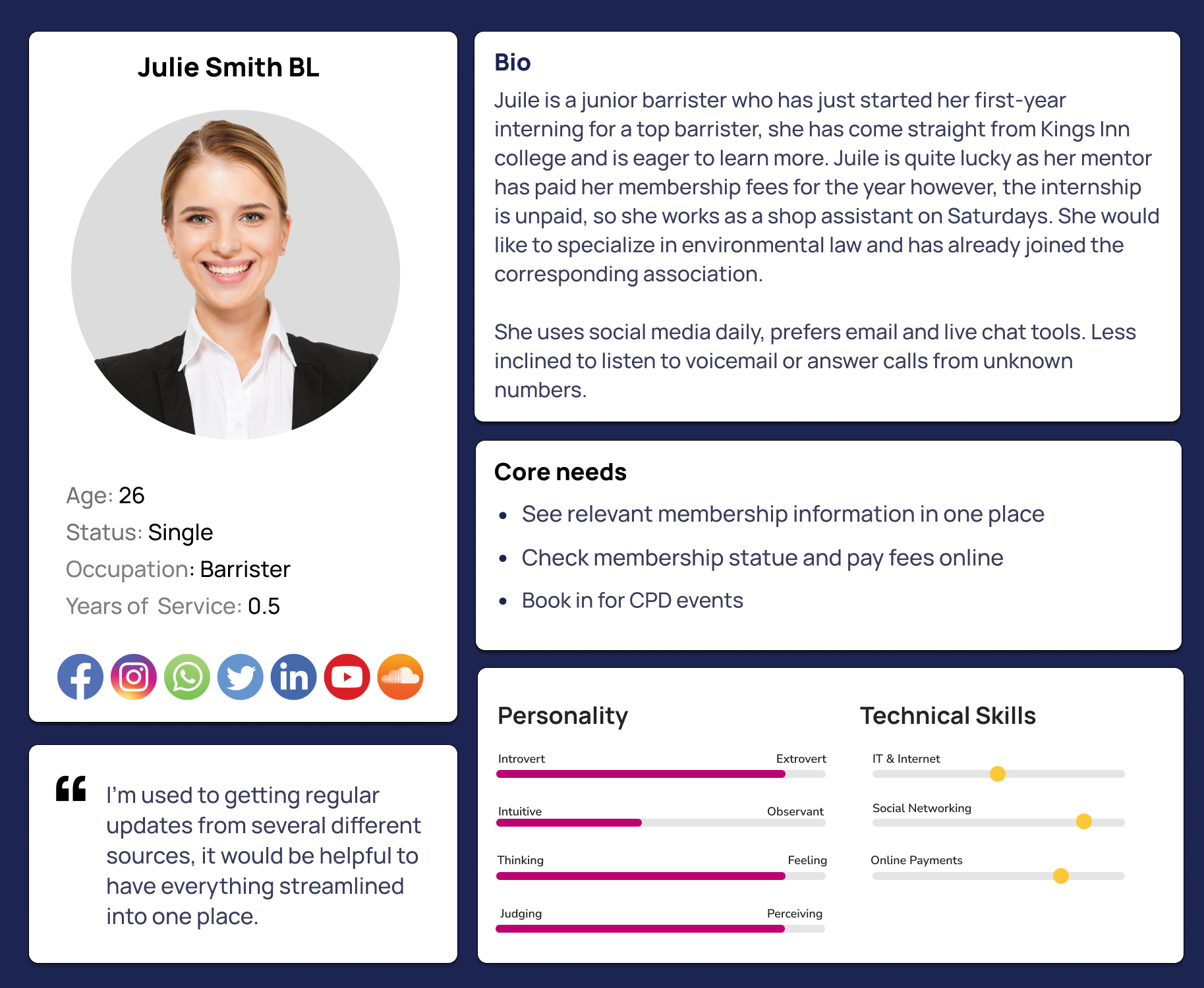
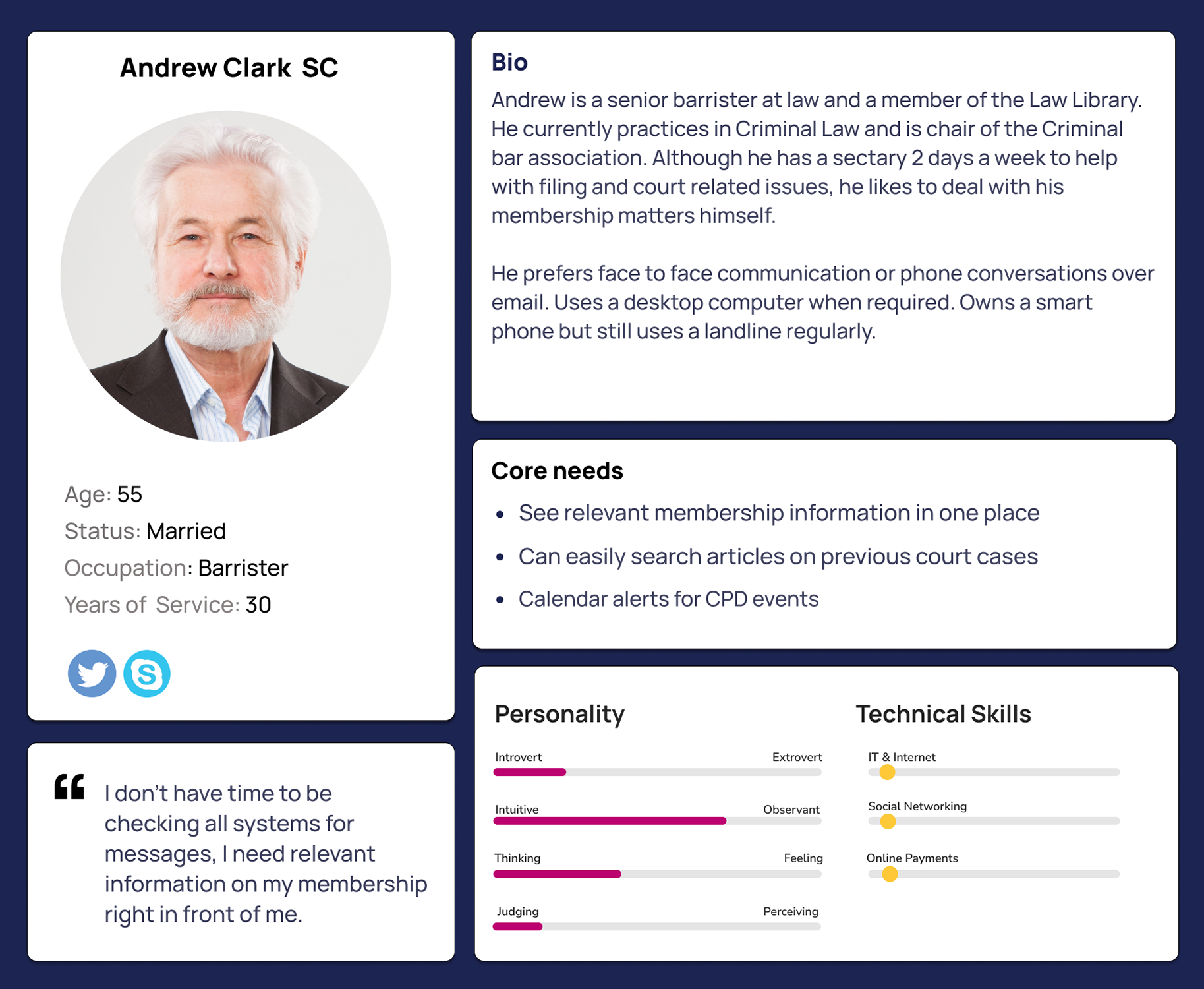
Knowing the primary pain points and goals helps prioritise the most impactful features and improvements, ensuring that development efforts are focused where they matter most.
Pain points
Goals
Sketching and paper prototyping
Our research indicates the need to tailor the News and Events page for a slightly older audience, ensuring the information is accessible and engaging for our primary users. Since most users prefer desktops, we prioritised a desktop-first design approach to optimise the experience on larger screens while maintaining mobile usability.
We began brainstorming on paper, developing two concepts and creating paper prototypes. Our focus was particularly on the page content and its hierarchy.

Testing
We conducted user testing on paper prototypes to understand user expectations for the News and Events page. This stage was crucial for establishing the navigational structure and category hierarchy.
Box cutouts of various categories, important to stakeholders and barristers, were created in different sizes. To create a hassle-free, one-stop shop for all membership news.
Barristers were given three scenarios and asked to arrange the boxes in order of importance from top to bottom, place them in the sidebar, or exclude them altogether.
Concept development
From our sketches and paper prototype testing, we developed the idea of replacing a traditional menu page for news and events with a more interactive page. This approach aims to build trust and confidence among barristers, showing that this is a truly reliable resource for their membership. The concept includes a scroll with snippets of information for each category, allowing users to quickly scan all the info to see what is most important to them.

Testing
At this stage, we learned a lot through stakeholder check-ins, system checks, and barrister testing, prompting us to refine our concept before moving to high-fidelity design. We discovered that barristers want all news archived and appreciated the idea of snippets but also want easy access to the full catalog. Although we have a CPD recording feature in the sign-in functions, it cannot be integrated into the news and events page at this time. We can implement all news and announcements into the “Latest News” section and consolidate all events as well. Additionally, we plan to add podcasts and viewpoints next year, and don’t want the page to become overcrowded.
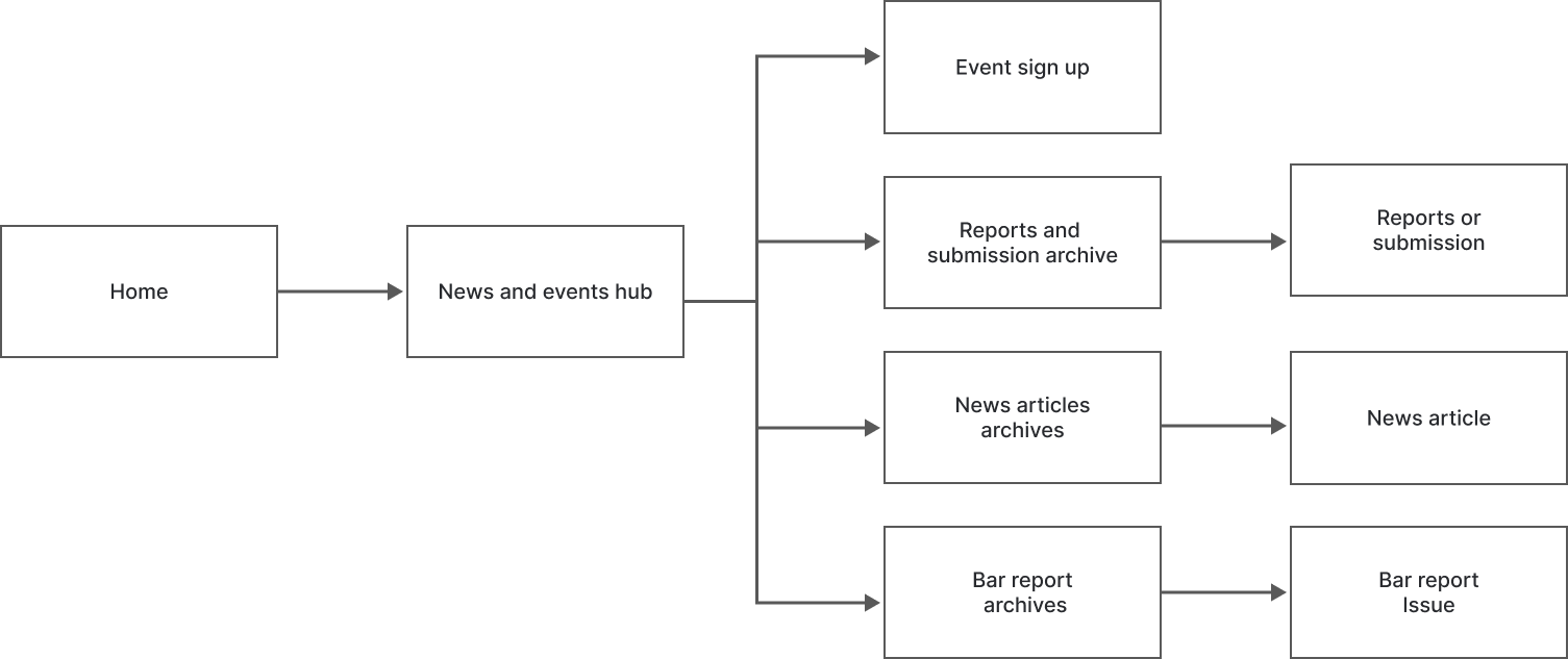
User flow
After we did a round of testing on the concept development we created a newuser flow diagram for the news and events page to ensure a seamless and intuitive navigation experience for users. This helps in identifying the most efficient pathways for accessing relevant information, enhancing user satisfaction.
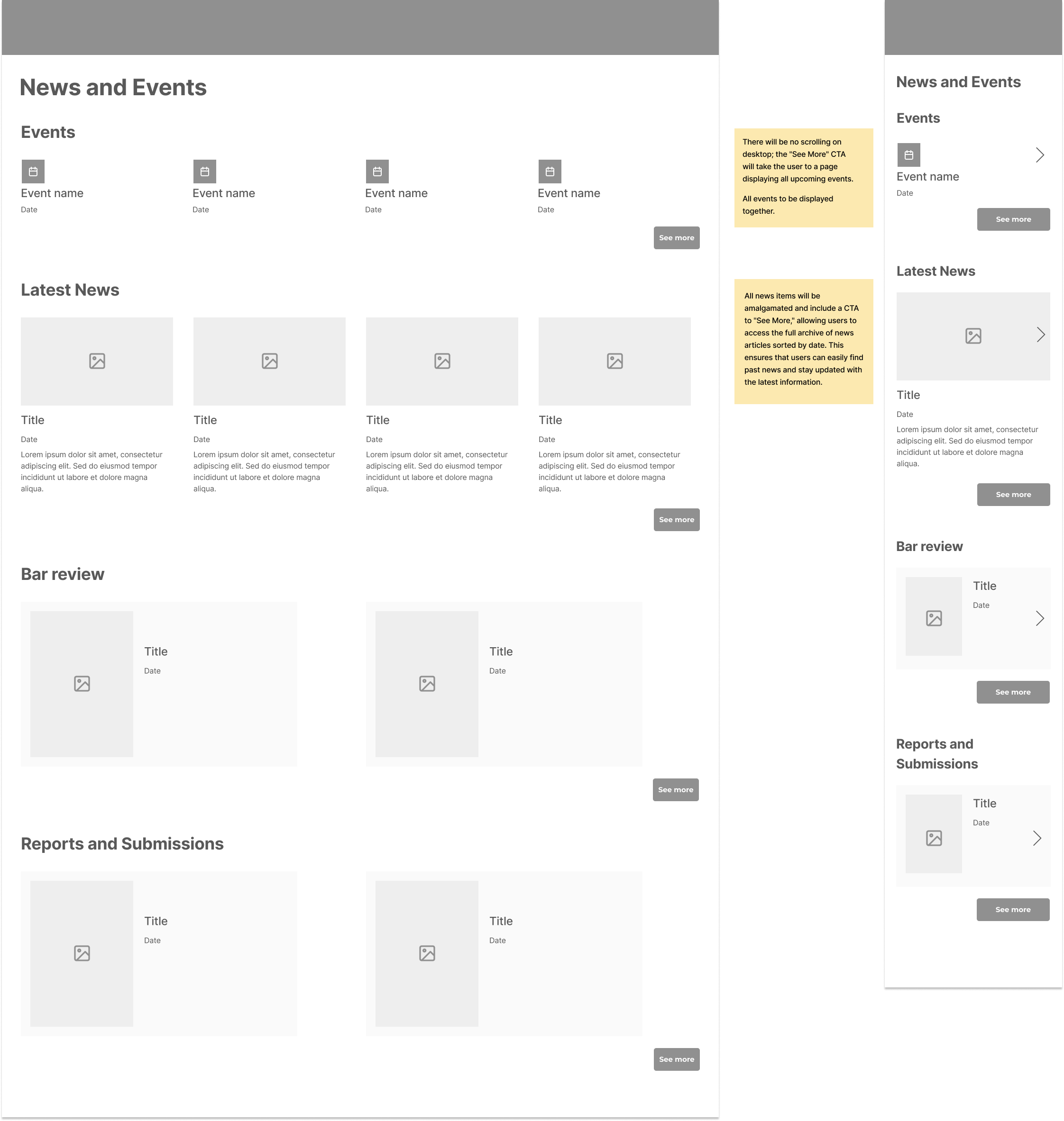
Wireframing with system testing
The objective of the wireframe and system testing was to evaluate the effectiveness of restructuring the news and events page. This included consolidating news updates into a single “Latest News” section, unifying events for a cleaner appearance, and integrating key sections such as “The Bar Review Magazine” and “Reports and Submissions.” The goal was to ensure users could easily navigate to detailed content, including news articles, events, magazines, and reports, and to validate that the new layout provided a streamlined and user-friendly experience.
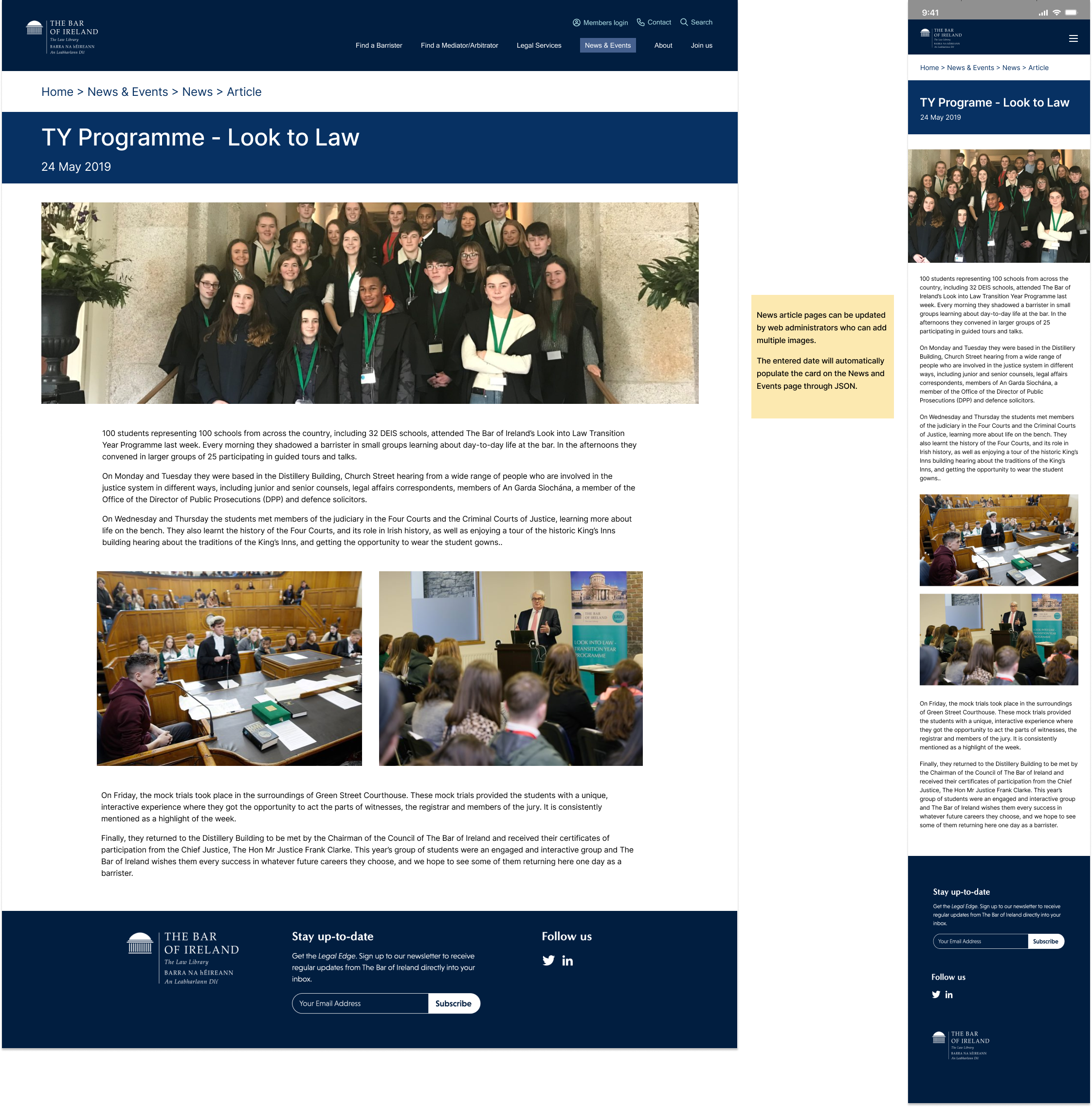
News and event hub page
News article page
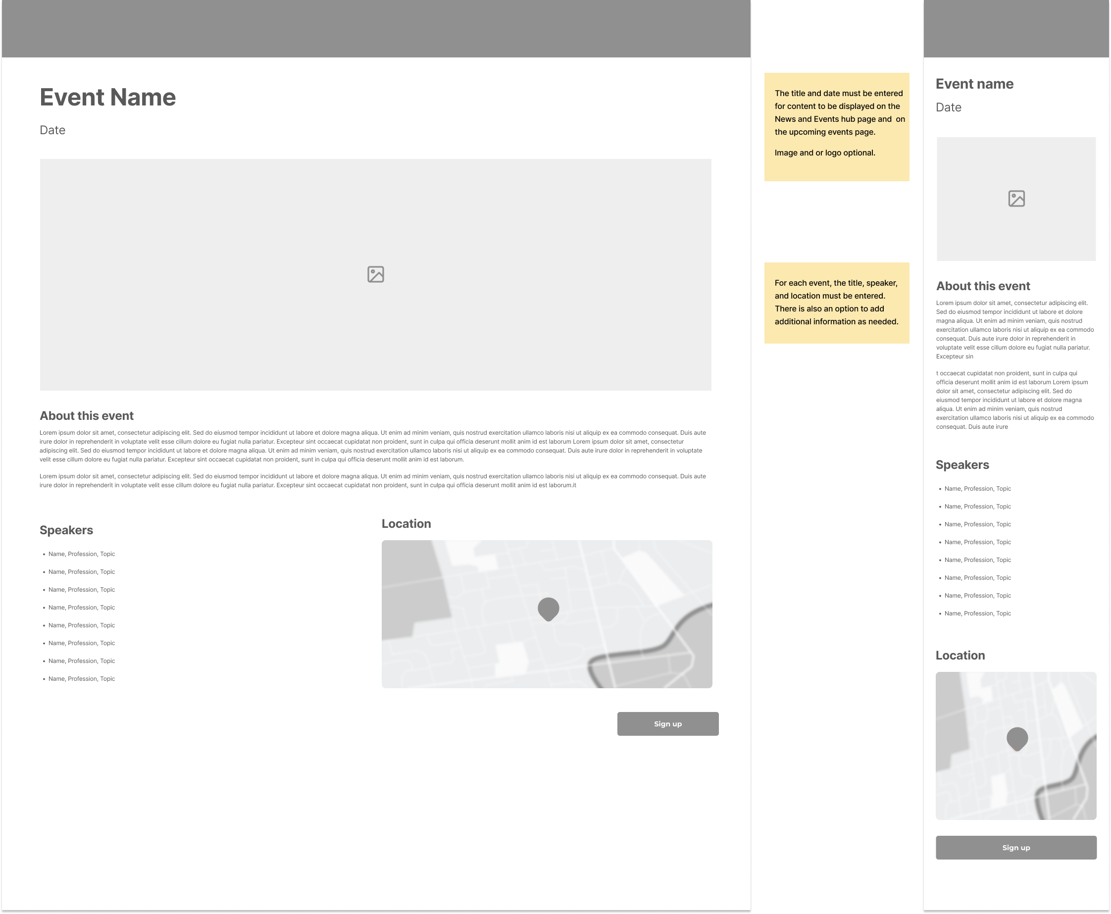
Event page
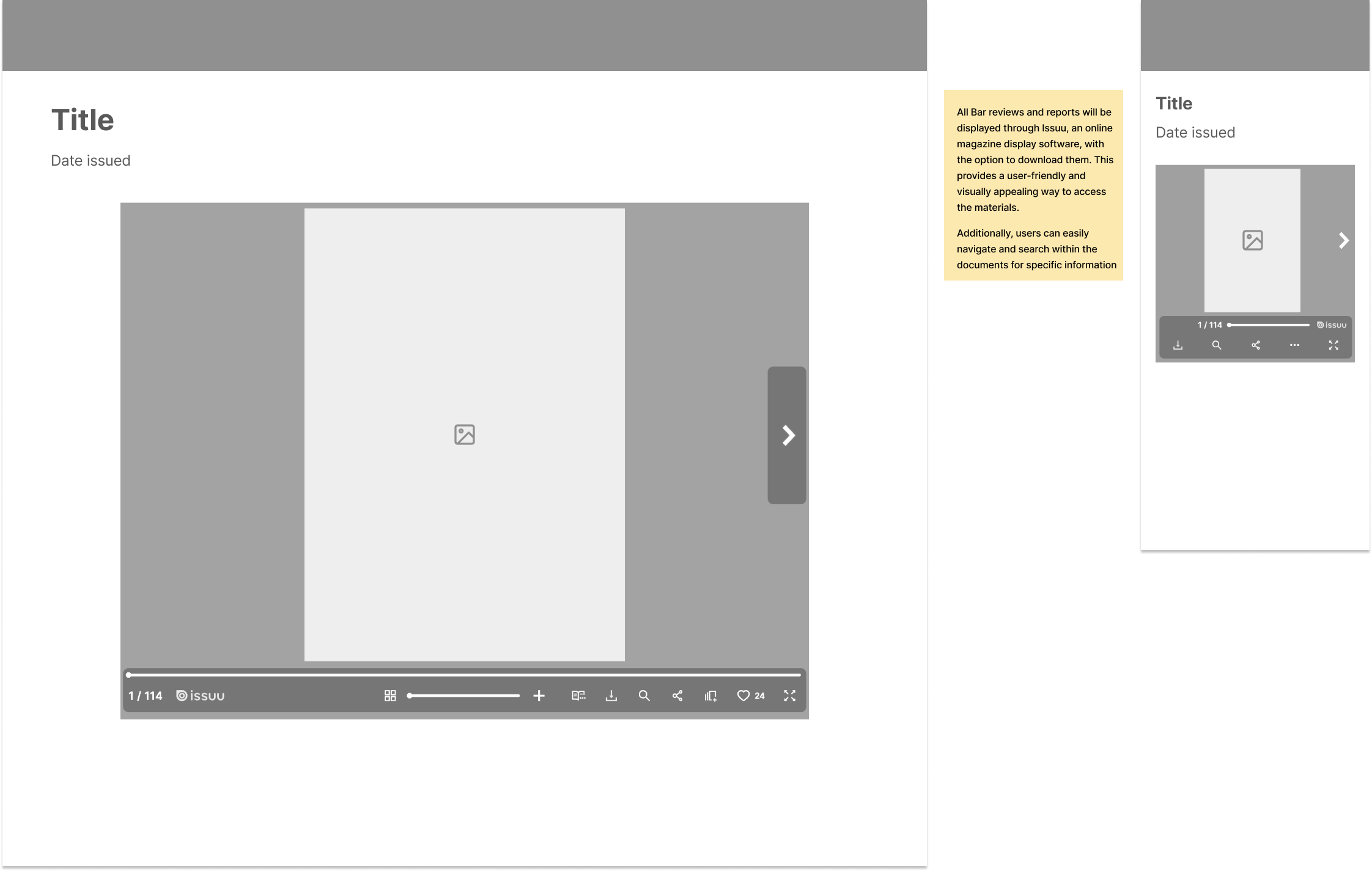
Magazine and report page
Outcome:
Testing revealed that the swipe interaction feature on mobile was not well-received by barristers. This feedback suggested the need to consider alternative interaction designs for high-fidelity testing.
We successfully consolidated all news and announcements into the “Latest News” section and unified events to enhance the page’s clarity and organization. Additionally, we planned to incorporate podcasts and viewpoints into the site to expand content offerings and further engage users.
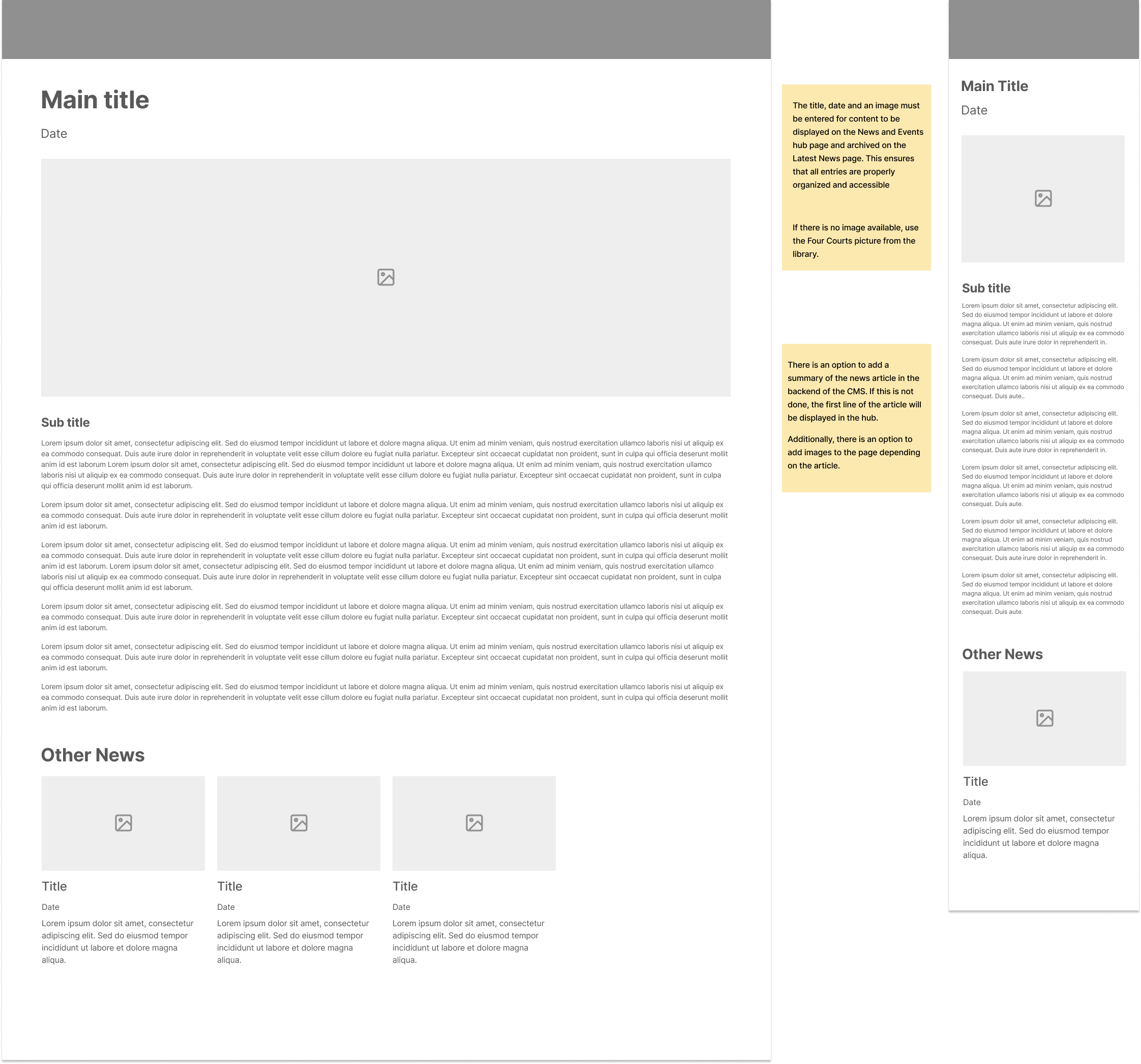
High-fidelity wireframe testing
Objective:
The objective of the high-fidelity wireframe testing was to refine the design of the News and Events hub page based on insights from low-fidelity testing. This involved finalizing the prototype, integrating Tito for efficient ticket management, and ensuring that the layout met user expectations. The goal was to optimize navigation, enhance user experience, and ensure the page structure effectively supported content discovery and engagement.
News and events hub page

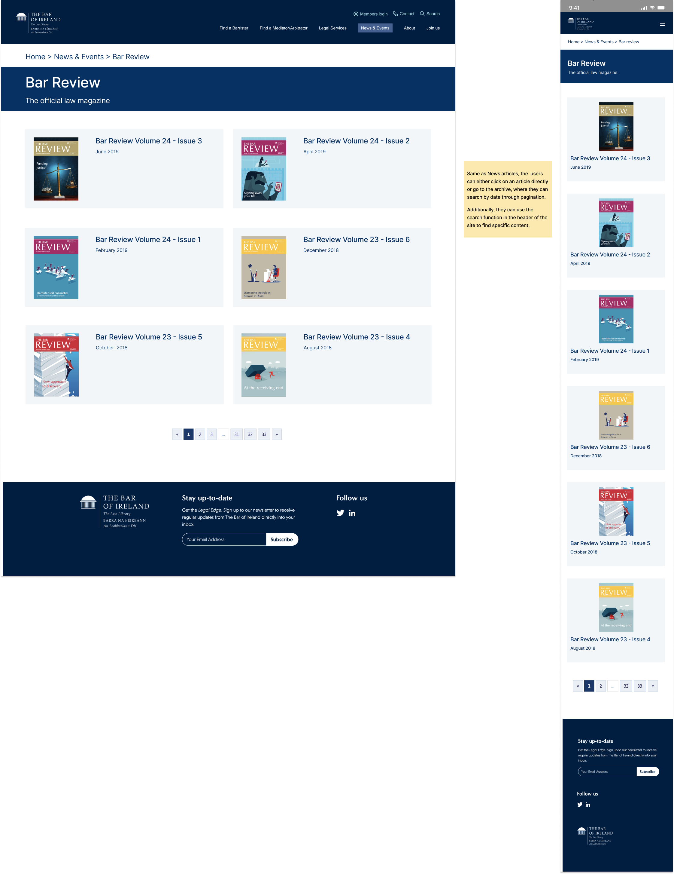
Bar review magazine archive page
News archive page
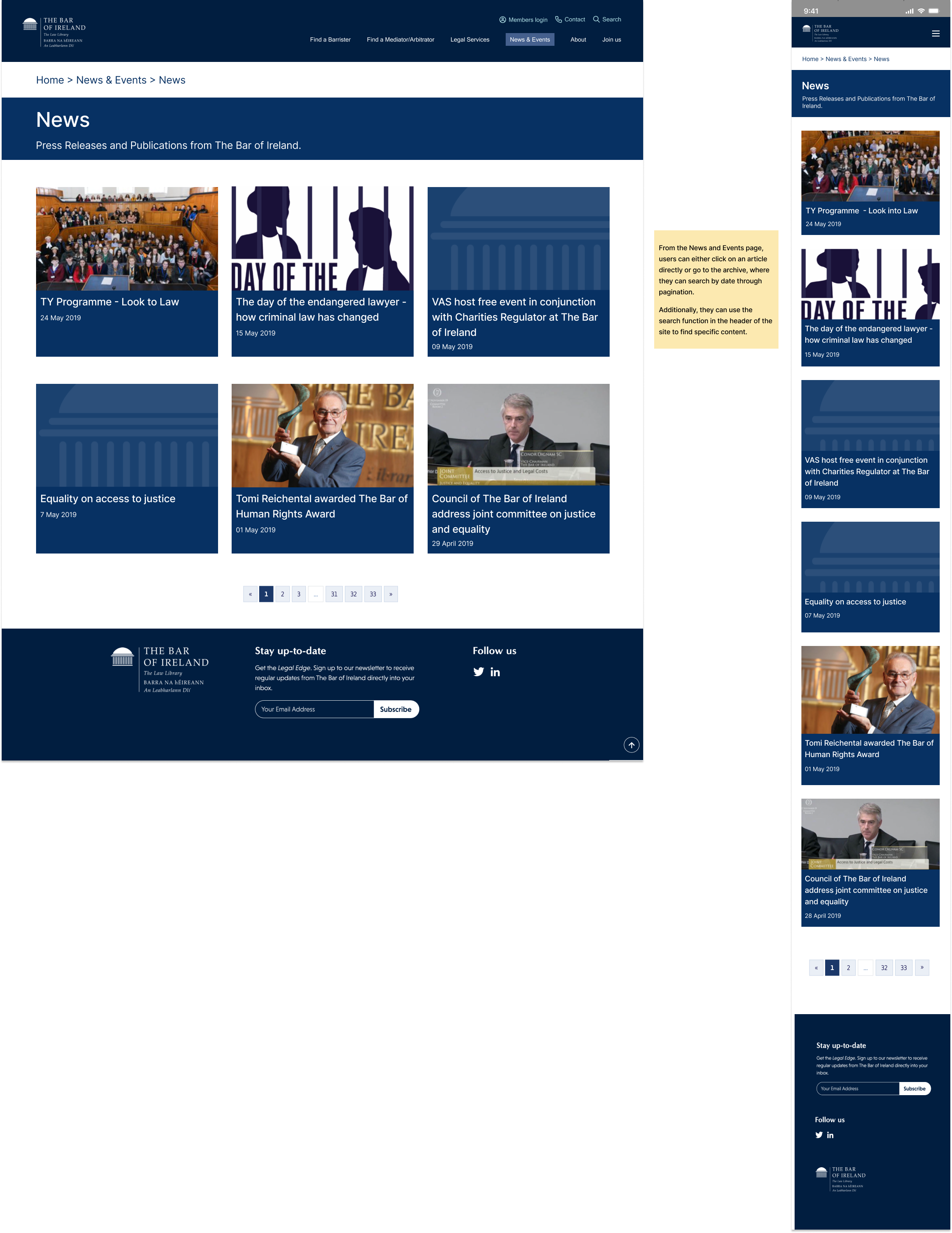
News article page
Outcome:
Testing revealed that the “See More” call-to-action (CTA) should be renamed to “See All,” as users expected to access an archive of the category in chronological order. Additionally, users preferred having the “Latest News” section moved to the top of the page to better align with their expectations for discovering upcoming events.
To address user navigation challenges, breadcrumb navigation was introduced, which provided clear paths and improved orientation within the hub. This change helped users maintain context and easily understand their current location on the website.
The Solution
The News and Events hub features four main sections, each displaying the latest snippets. In the Latest News section, users can click on a card to go directly to the article or click “See All” to access the archive page.
The Events section lists the latest events, and users can click on an event to be taken directly to the sign-up page through the integration of Tito. If users click “See All,” they are brought to the Bar of Ireland’s Tito page with all upcoming events.
The Bar Review and the Reports and Submissions sections work similarly: users can either click on an individual card or the “See All” CTA. The integration of ISSUU is used for both, creating a realistic flip-through interaction and providing a downloadable PDF version.
Additionally, breadcrumb navigation was added to improve overall site usability, making it simpler for users to explore related content without getting lost.
