New Life Centre Resign
Project Details
The New Life Centre is a vibrant community hub dedicated to supporting local residents through a range of services, classes, and social events. The Centre plays a vital role as the heart of the community, offering a welcoming space where people can learn, connect, and grow together.
The goal of this project is to create a user-friendly, accessible website that clearly communicates everything the Centre offers while making it easy for staff to manage updates.
Additional recommendations include a brand refresh with updated colours and high-resolution logo files to future-proof the Centre’s visual identity, a centralised digital calendar to replace the paper-based system, and a Google My Business setup to enhance online visibility.
The final design will strengthen the Centre’s online presence, making it easier for residents to access services, stay informed, and engage with their community — helping solidify the New Life Centre’s position as a cornerstone of local life.
My Process
Discovery and Research:
Led UX research to uncover insights about the New Life Centre’s users their goals, needs, and behaviours and aligned these findings with the organisation’s objectives to create a user-centred design direction.
Methodologies
Stakeholder Interviews
Heuristic Evaluation
Market Research
Customer Survey
Wire-framing
Discovery Findings
Through meetings with the New Life Centre staff, I identified key needs and priorities for the website. These findings helped define the project goals and design direction. In addition to improving usability and content structure, there’s also a strong interest in updating the Centre’s branding, including refreshed colours and high-resolution logo files to help future-proof the organisation as it grows and evolves.
Core Website Requirements
1. User Experience & Accessibility
– User-Friendly Design: An intuitive, easy-to-use interface for visitors, with a simple backend for staff to manage content.
– Improved Navigation: Clear, accessible menus to help users quickly find information.
2. Community Engagement
– Highlight Classes: Showcase popular activities such as flower arranging.
– Feature Events: Promote community assemblies and local gatherings.
– Drop-In Chat & Café: Emphasize the Centre as a welcoming social space.
– News Feed: Keep residents informed about updates, cancellations, and weekly newsletters.
3. Services & Communication
– Showcase Services: Clearly list offerings including, room hire, catering, and minibus rental.
– Dedicated Forms: Create individual contact forms for each service with custom subject lines to streamline communication
4. Additional Enhancements
– Google Maps Integration & Opening Hours: Ensure visitors can easily locate the Centre.
– One-Time Donations: Enable quick community support through a simple donation feature.
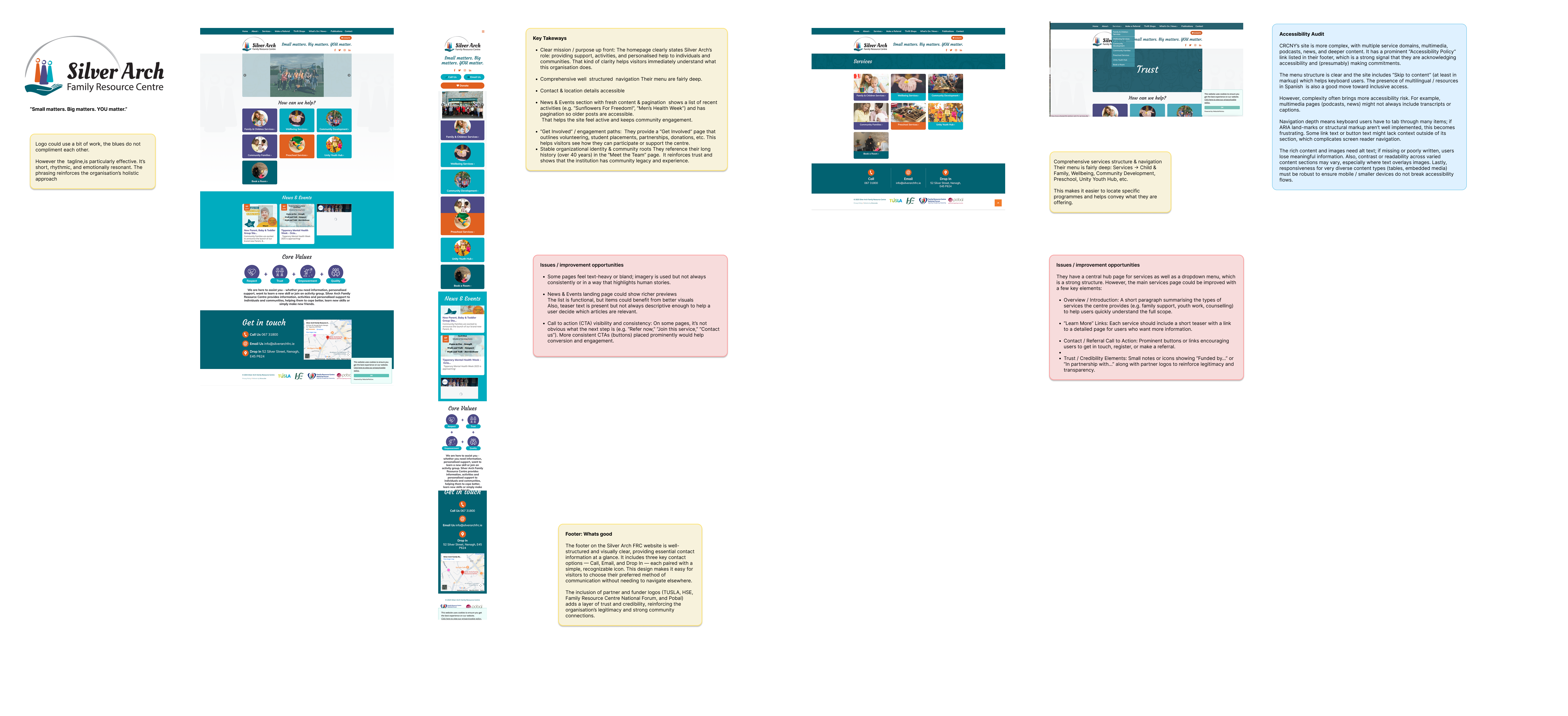
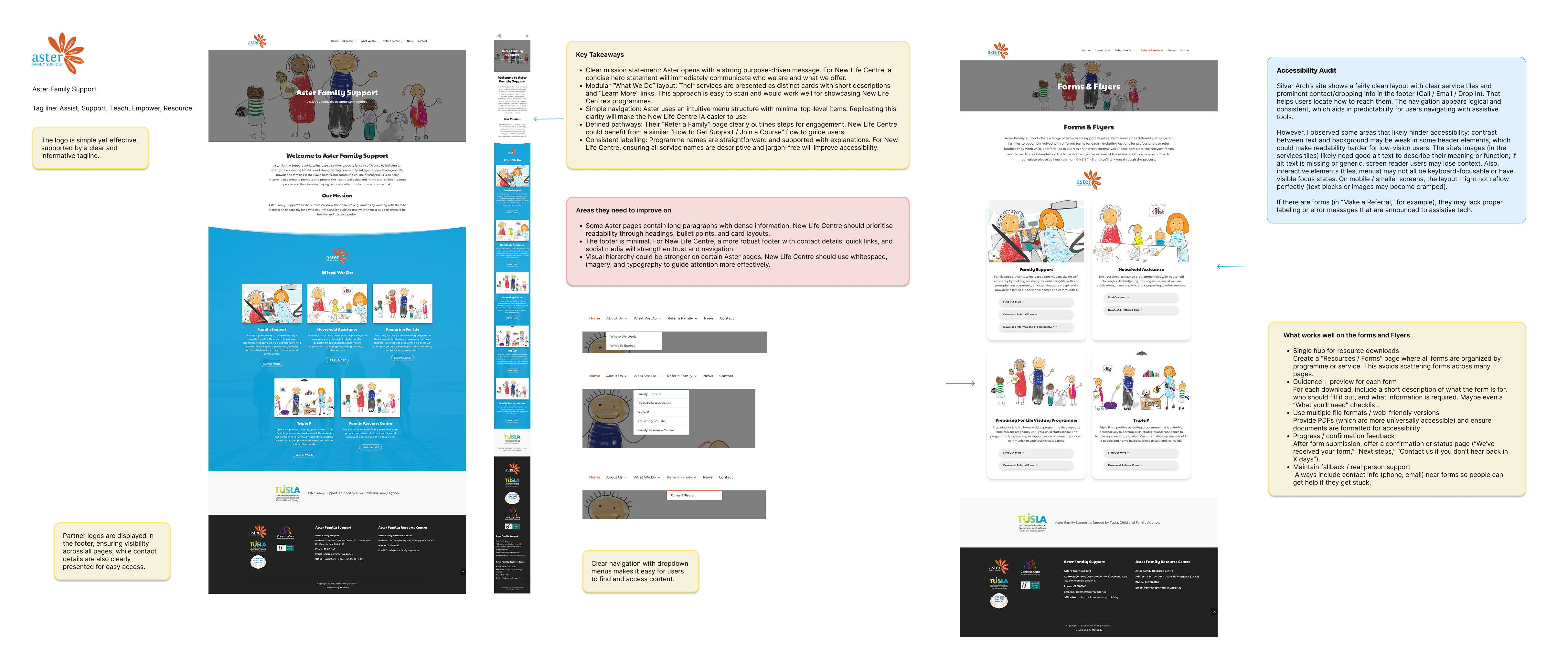
Market Research
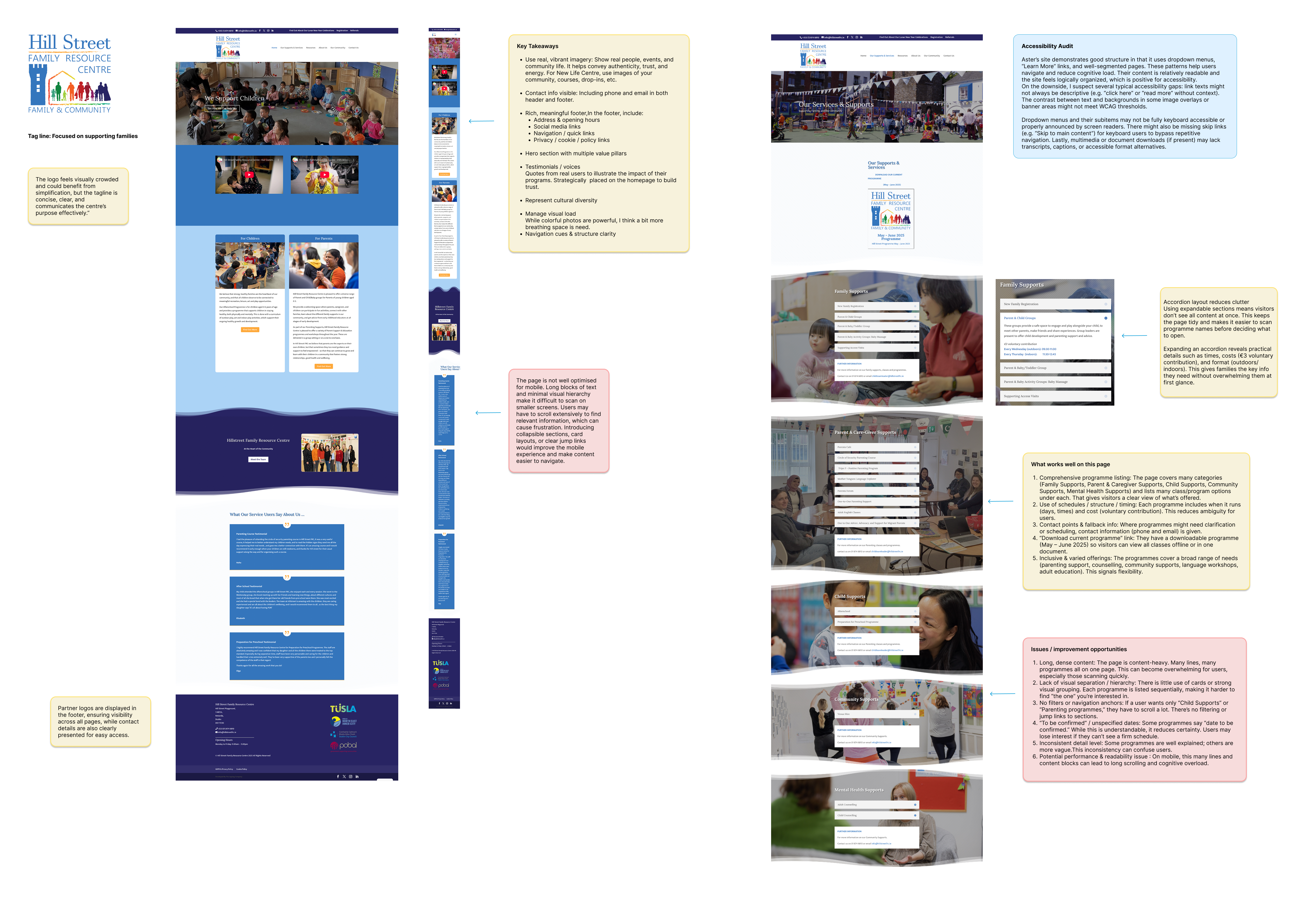
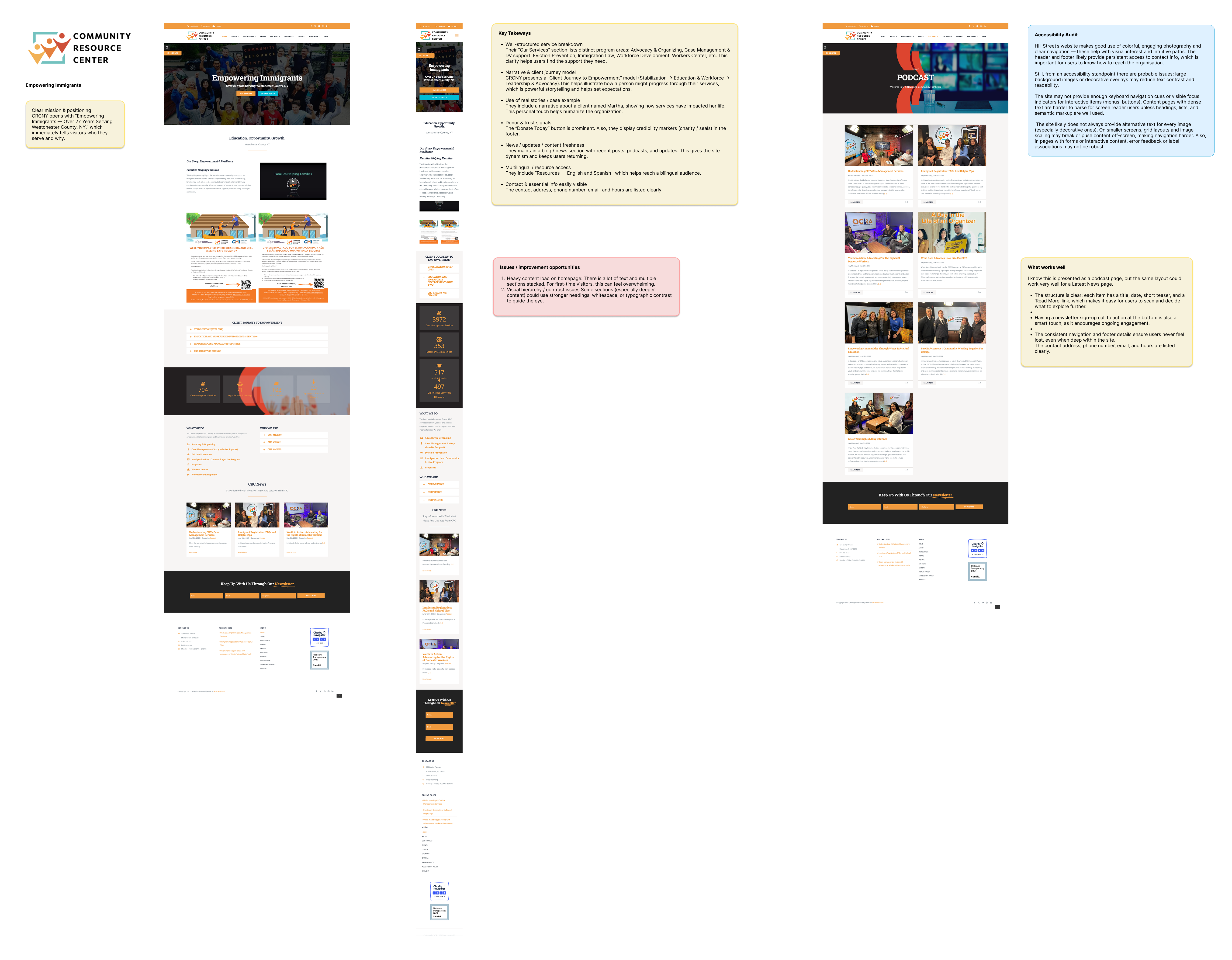
Market research was conducted to evaluate the design, structure, and accessibility of existing community centre websites in Ireland, the UK, and the US. The goal was to identify best practices and common pain points that could inform the redevelopment of the New Life Centre website. Four organisations were selected for detailed analysis, Aster Family Support, Hill Street Family Resource Centre, Silver Arch Family Resource Centre, and the Community Resource Center (New York). Each site was reviewed for layout clarity, navigation flow, accessibility, and content presentation. The findings helped highlight what works well in community-focused design such as clear pathways, inclusive visuals, and strong calls to action — while also uncovering common issues like text-heavy layouts, limited mobile optimisation, and inconsistent accessibility features. These insights directly shaped the new design direction for the New Life Centre, ensuring it meets both community needs and modern usability standards
Heuristic Evaluation
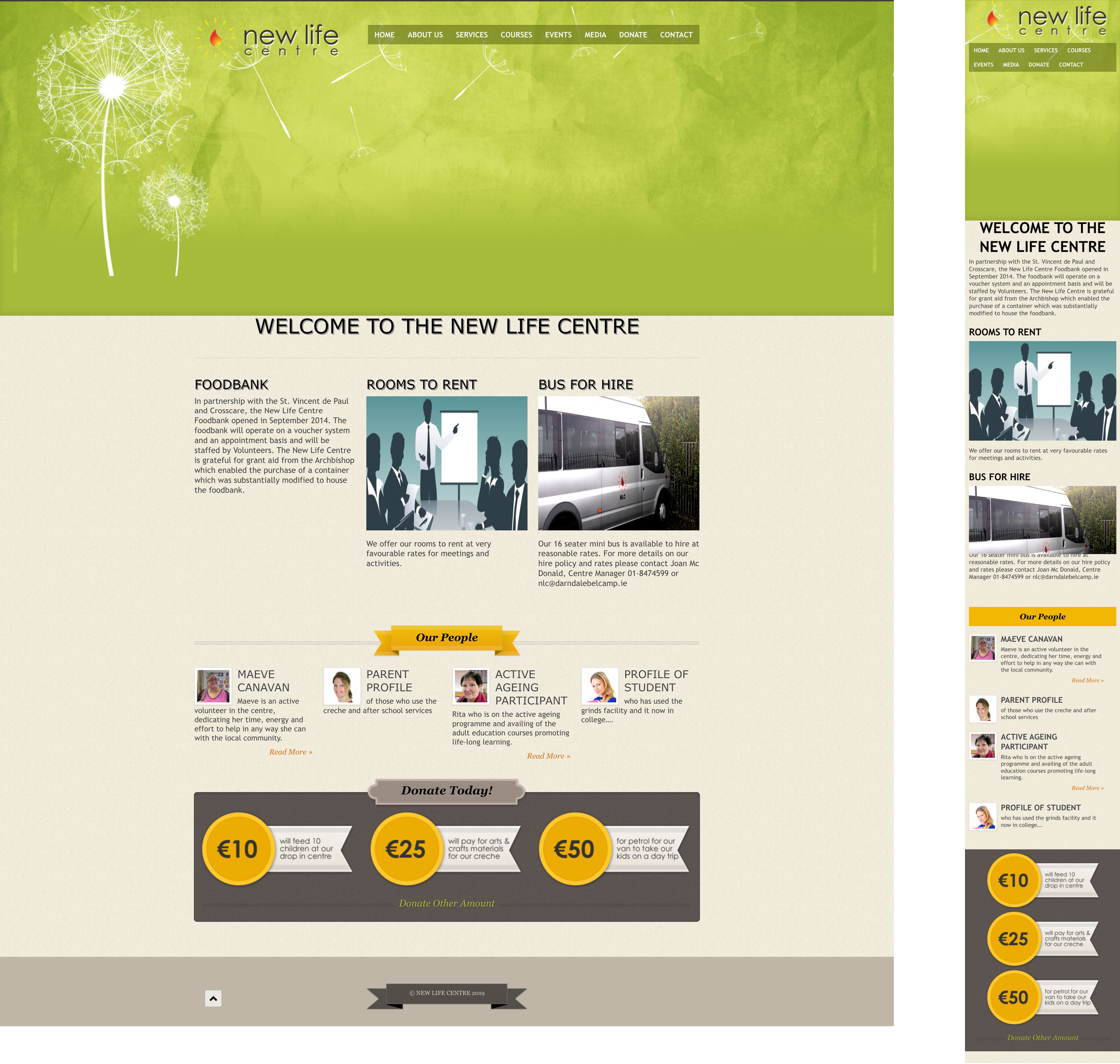
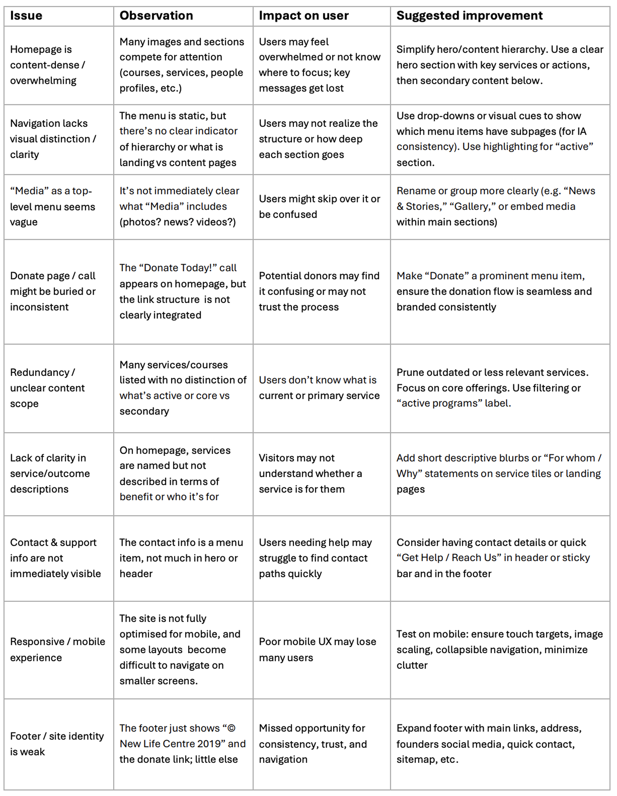
The Home Page Audit was carried out to assess the current usability, accessibility, and content structure of the New Life Centre website. The goal was to identify areas where the homepage could better support users in quickly finding information, understanding available services, and feeling welcomed by the centre’s mission. By reviewing layout, navigation, visual hierarchy, and consistency, this audit highlights key barriers that may impact user engagement and trust. The findings provide a clear foundation for redesign decisions ensuring the new homepage will be more intuitive, inclusive, and aligned with the community-focused values of the New Life Centre
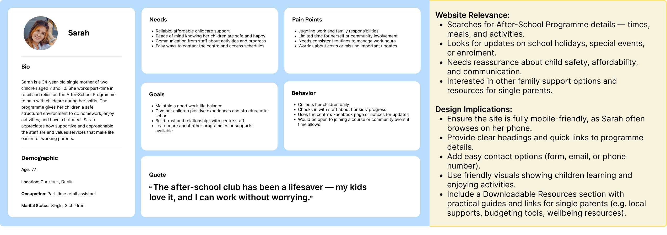
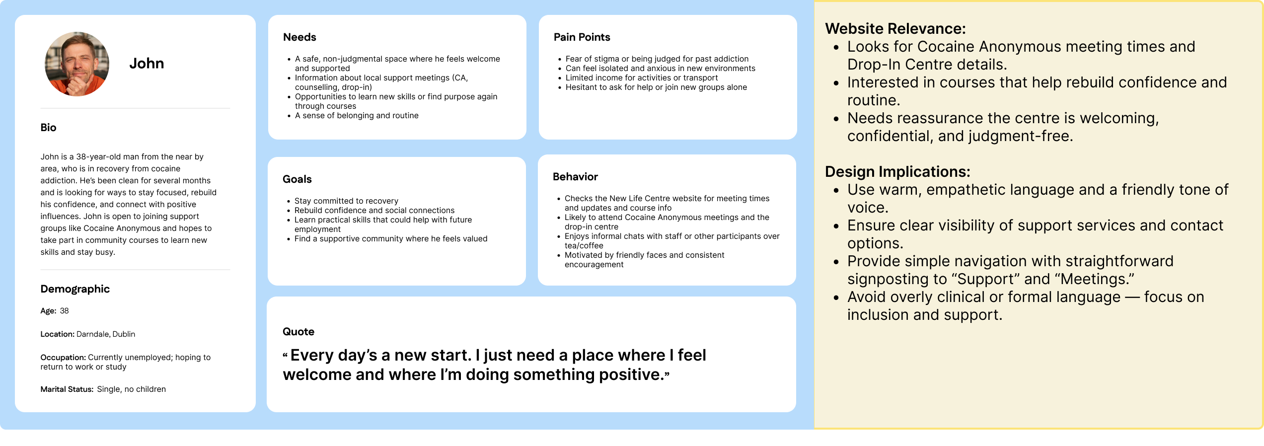
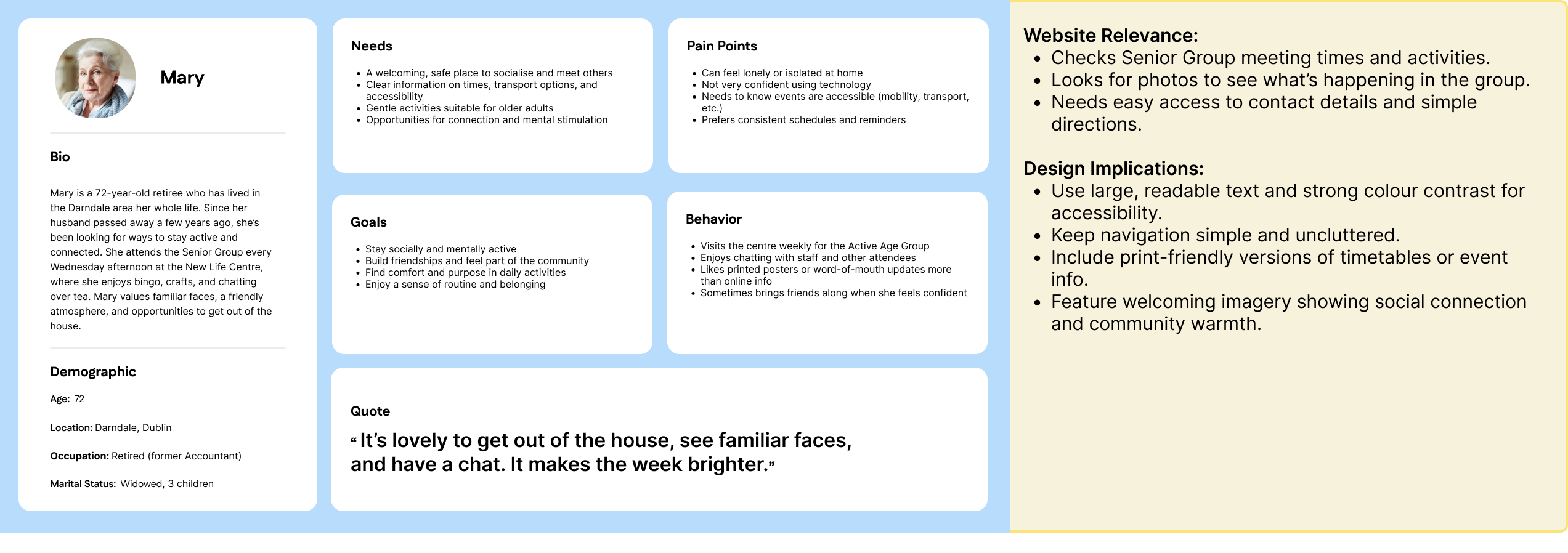
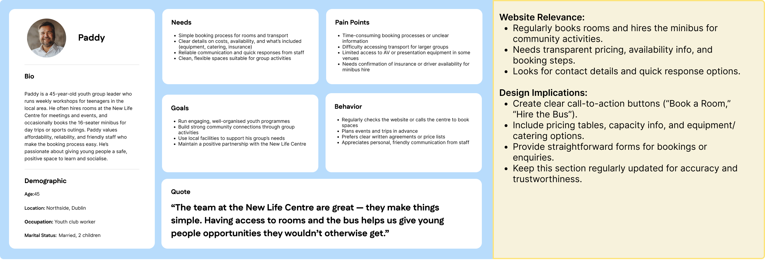
User Personas
The following personas represent the diverse users of the New Life Centre website. Each persona captures a key audience group from within the Darndale community, reflecting different needs, goals, and challenges. Together, they guide the website’s tone, structure, and functionality ensuring that the new design supports people of all ages and circumstances. These insights help the design stay empathetic, inclusive, and community-driven.
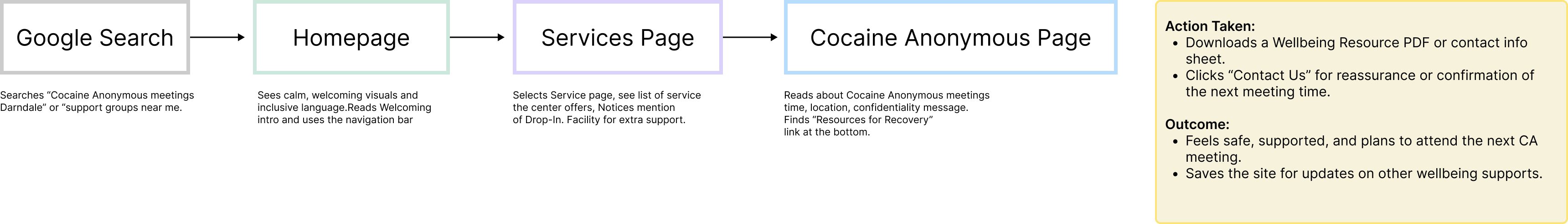
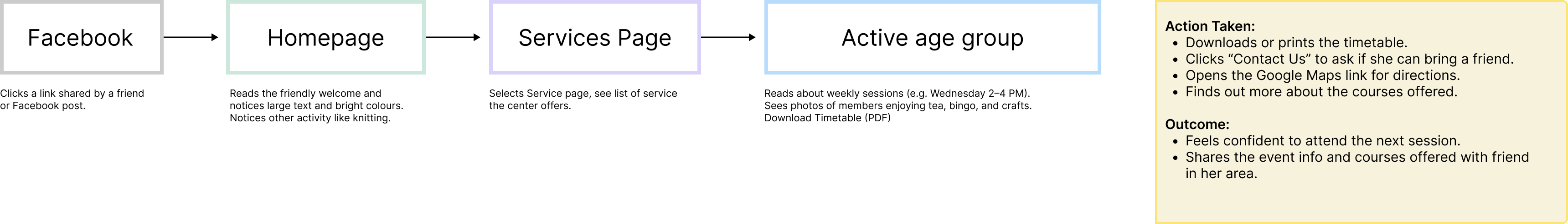
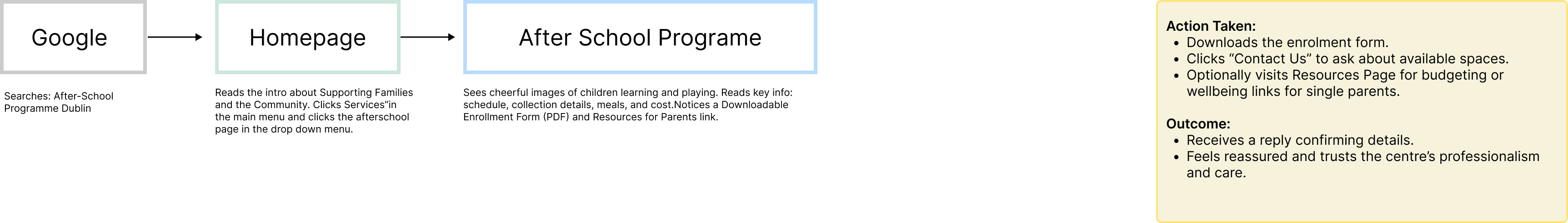
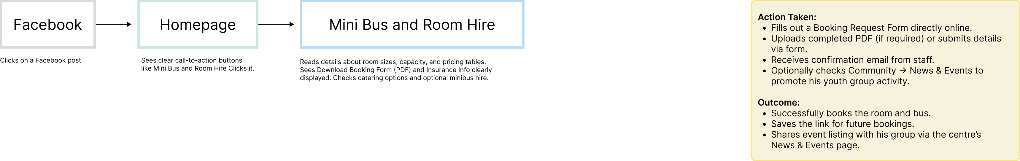
User Flows
The following user flows were developed to represent the diverse ways members of the community engage with the New Life Centre’s online presence. Each flow reflects a real user persona, outlining their motivations, key steps, and desired outcomes. Together, these journeys ensure that the website structure supports easy access to information, reassurance, and engagement opportunities for all users.
John’s goal: Find support and attend a Cocaine Anonymous meeting.
Mary’s goal: Find details about the Senior Group meetings, print the schedule, and get directions to the centre.
Sarah’s goal: Find details about the After-School Programme, including times, meals, and enrolment options and easily contact staff.
Paddy’s goal: Book a room for his youth workshops and outings.
Information architecture
The new Information Architecture was designed to balance clarity, inclusivity, and community engagement. Each top-level menu item reflects a key area of the centre’s work from support services to education and social activities ensuring users can quickly locate what’s most relevant to them. Grouping related subpages under intuitive categories (e.g., Services, Courses, About Us) reduces cognitive load and supports easier wayfinding for users of all ages and digital literacy levels. The addition of a dedicated Resources section improves accessibility by providing downloadable materials and practical information, while a visible Contact and Donate menu helps drive engagement and community support. Overall, this structure promotes a more welcoming, user-centred experience that aligns with the New Life Centre’s mission of inclusion and empowerment.
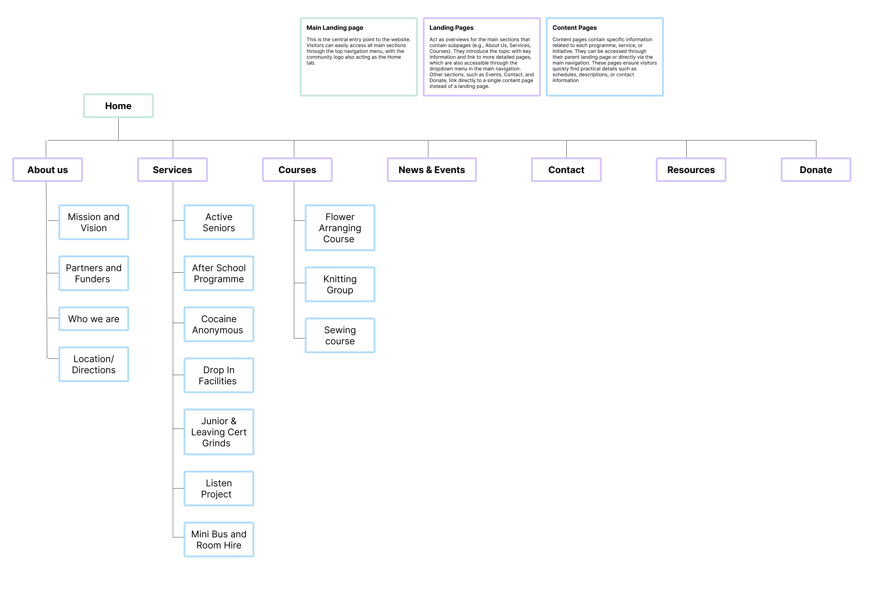
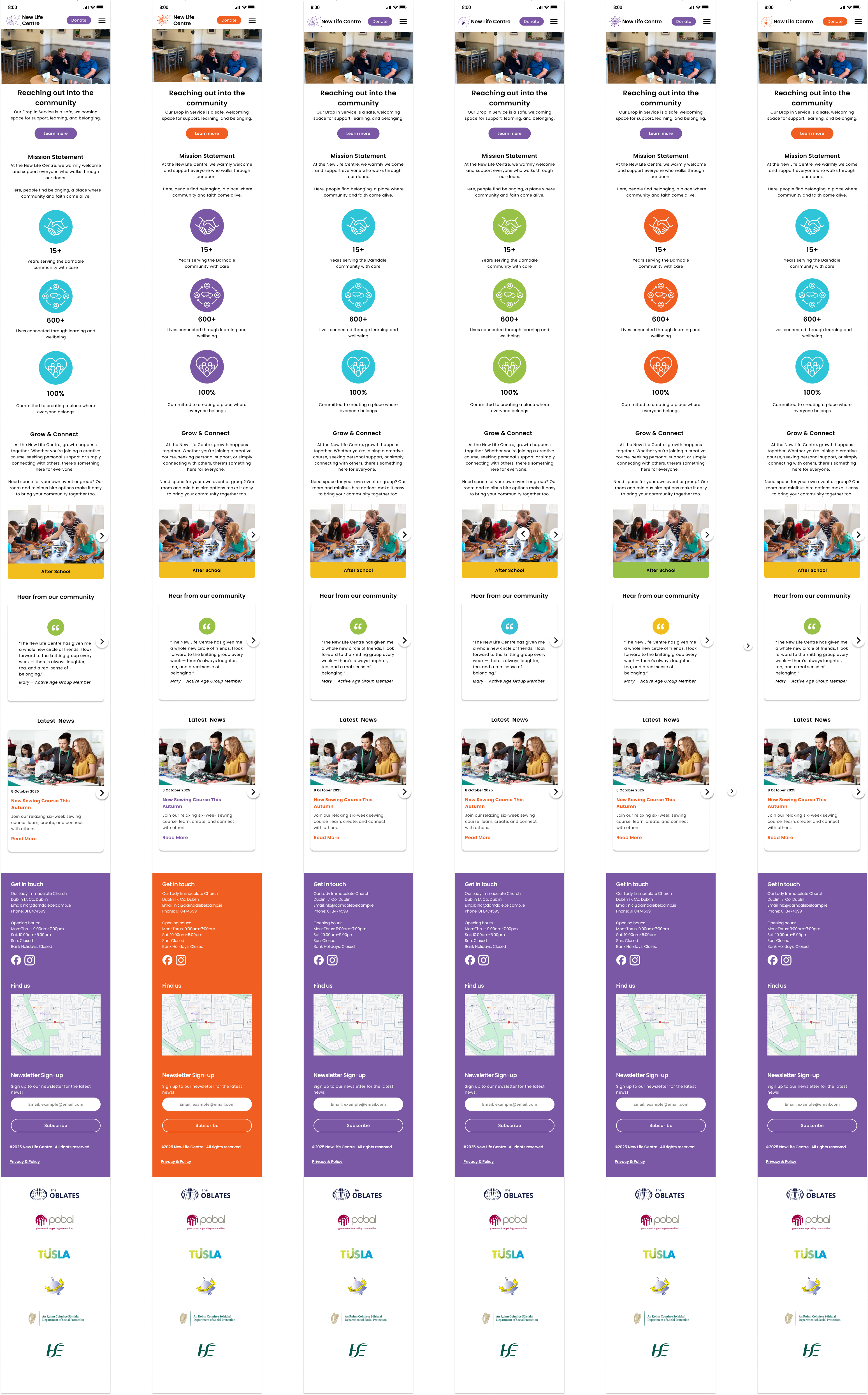
Wire-frames
As part of the design phase, I created low-fidelity wireframes for the Hero, Footer, and Home pages in both desktop and mobile formats. These wireframes serve as the foundation for the New Life Centre’s new website structure, ensuring that every design decision supports usability, accessibility, and the Centre’s community-driven goals.
The wireframes are a critical step in translating requirements into tangible layouts. They establish a clear content hierarchy and navigation flow before moving into high-fidelity design, helping confirm that all essential features are represented from promoting classes and events to showcasing key services and contact forms.
Developing both desktop and mobile versions at this stage ensures a responsive, user-first experience, reflecting how visitors are most likely to engage with the site across devices.
These wireframes provide a visual blueprint for the website’s structure, aligning user needs with the organisation’s communication goals.
*The icon and facts section need to be done with the community center staff

Homepage: UX Considerations: Social Media Integration
After reviewing the purpose and structure of the New Life Centre website, I decided not to include a full social media feed on the homepage. While social feeds can showcase community engagement and help the site feel active, they can also negatively impact performance and visual clarity. Embedded feeds from platforms like Facebook or Instagram often slow down page loading times and can clutter the layout, distracting users from key calls to action such as “Join a Class” or “Donate.” Additionally, if social channels are not updated frequently, an outdated feed could give a poor impression. Instead, the homepage design focuses on clearly communicating the Centre’s mission, services, and community impact. To maintain a connection with social media, I’ve included easily accessible social icons in the footer. This approach keeps the homepage streamlined and focused while still highlighting community activity in a dedicated, relevant space.
Branding and Tone for the New Life Centre
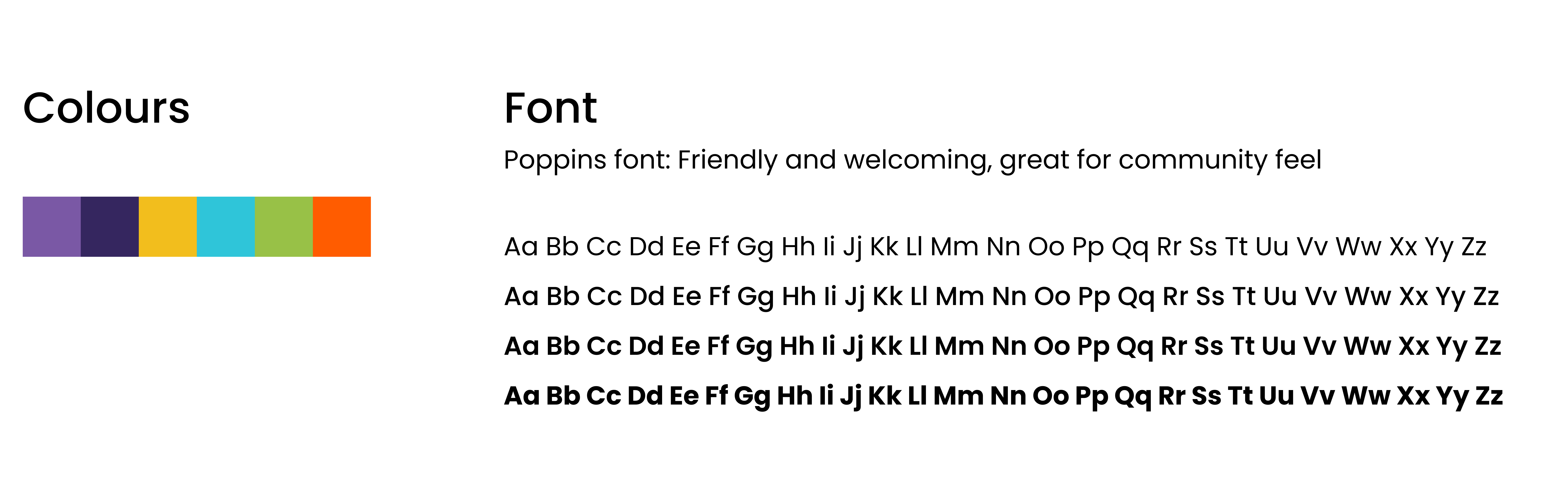
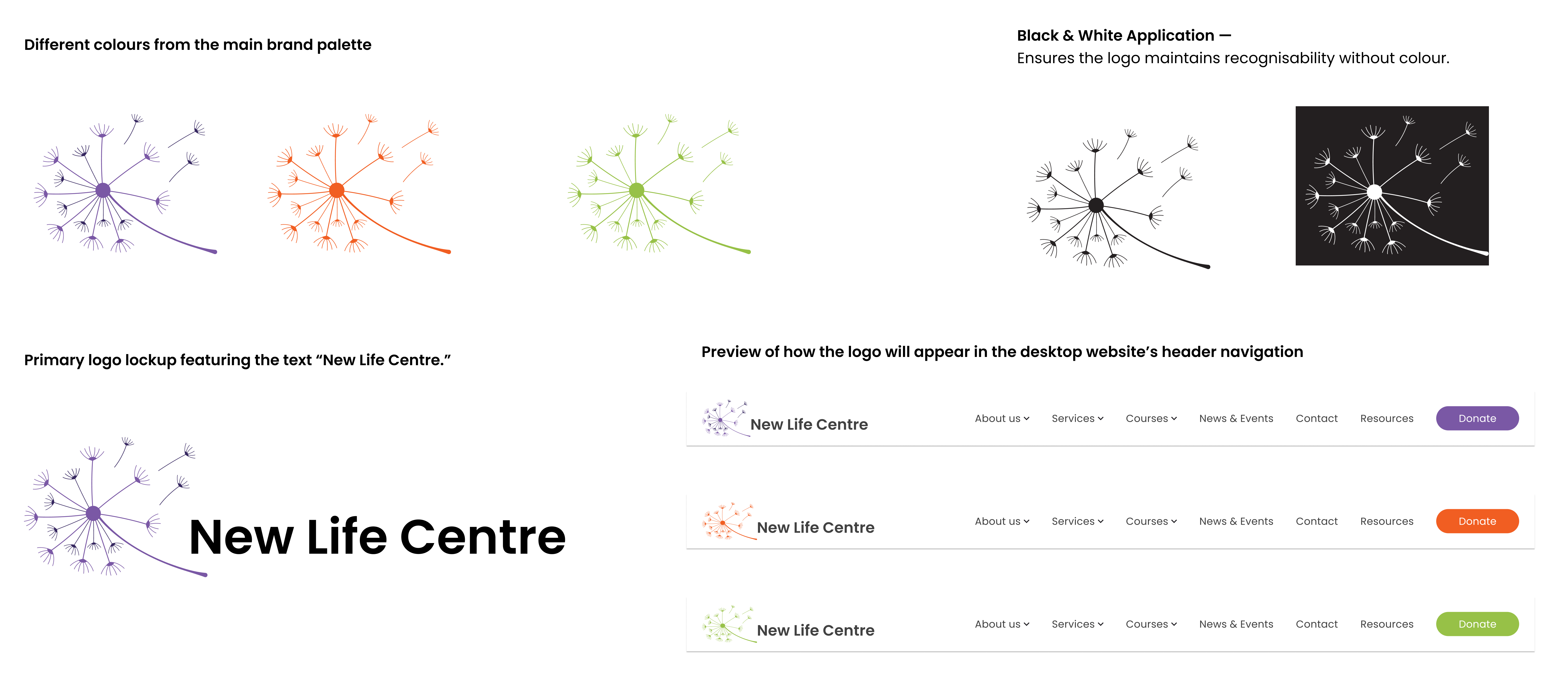
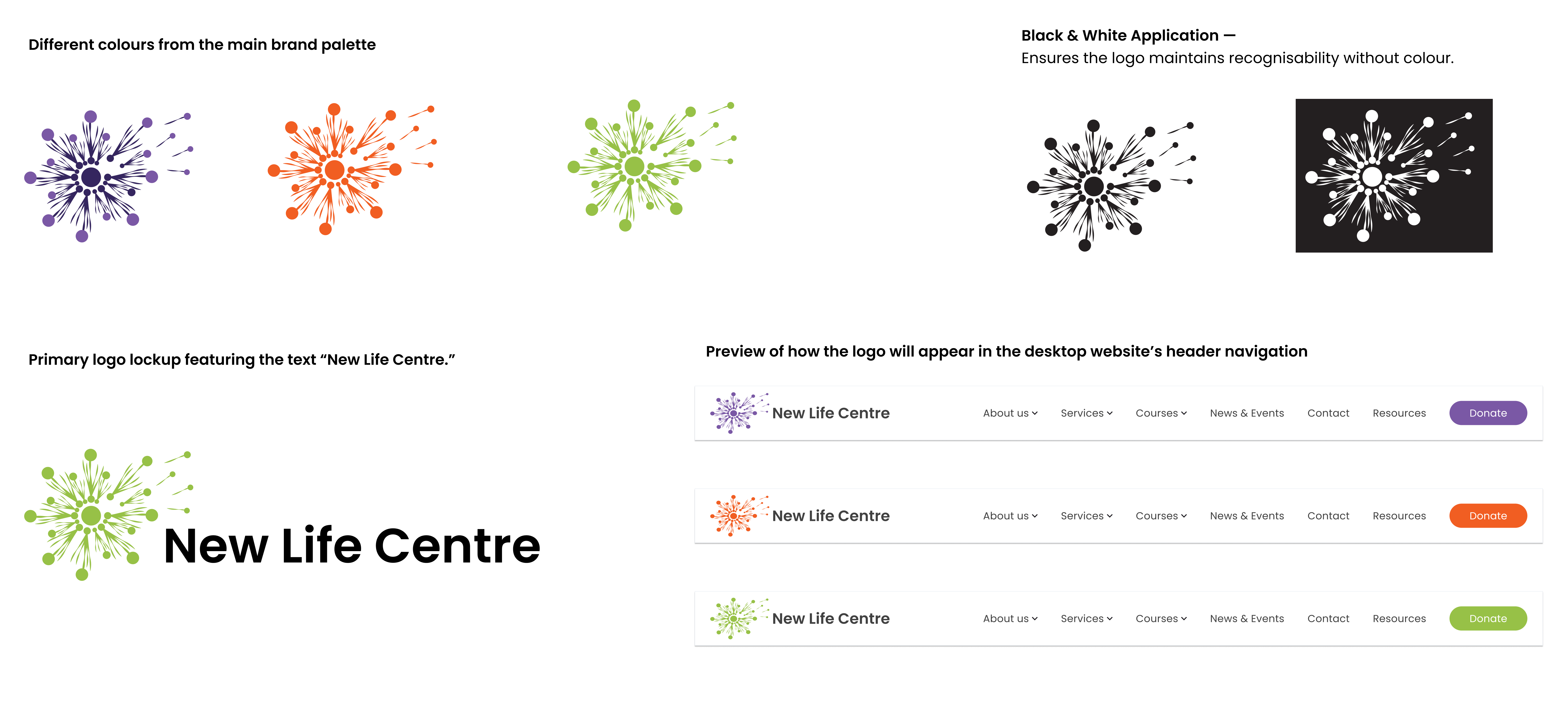
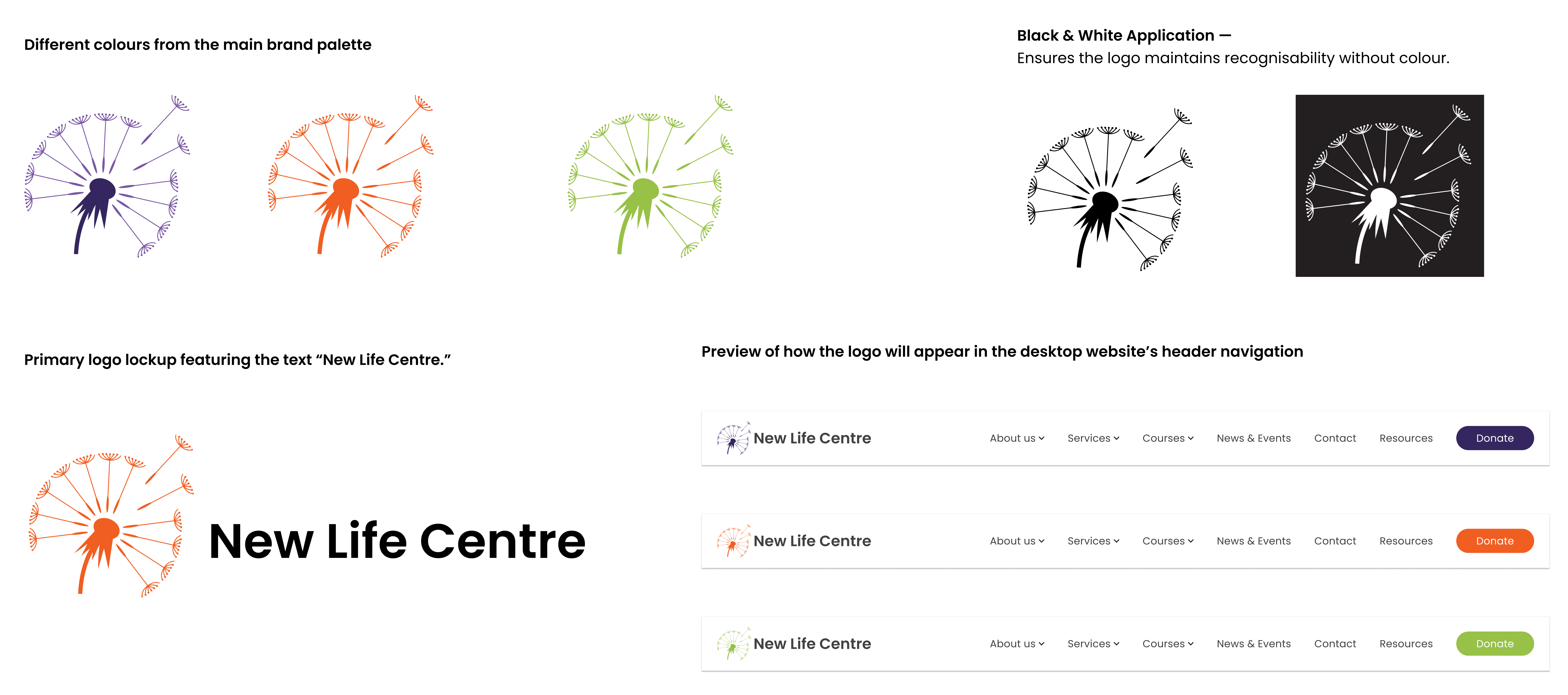
The New Life Centre’s brand identity is inspired by renewal, growth, and connection values reflected in both its colour palette and logo. The chosen colours a harmonious blend of soft purple, deep navy, golden yellow, sky blue, fresh green, and warm orange represent inclusion, optimism, and community energy.
The dandelion logo idea was taken from the current website branding. The dandelion symbolises new beginnings, with its seeds drifting outward to represent the Centre’s reach into the community , spreading support, kindness, and hope. Each seed signifies an individual or family finding strength and new opportunities through connection.
Maintaining this familiar imagery was a deliberate choice to ensure brand recognition and continuity. The New Life Centre has built strong trust and emotional connection within the Darndale community, so drawing inspiration from the existing website imagery helps current users immediately recognise and feel at home on the new site. By keeping the dandelion as a core visual element, we honour the Centre’s identity while presenting it in a refreshed, modern design. This approach bridges the old and the new, preserving the sense of belonging that the Centre stands for while making the online experience more engaging and accessible for everyonenection.
The tone of the New Life Centre’s communications should be warm, approachable, and empowering. Whether in digital or print materials, the language should feel welcoming and inclusive, encouraging people to take part, reach out, and know that help and growth are always possible. The overall style should balance professionalism with friendliness simple, human, and hopeful, just like the community it serves.
Option 1
Option 2
Options 3
Hi Fidelity Mobile Variations