Smartbox: Filters & Facets

Smartbox is a leading provider of experiential gift boxes in Europe, offering a wide range of themed gift packages such as gourmet dining, spa treatments, adventure activities, and weekend getaways. Focused on delivering memorable and unique experiences, Smartbox allows recipients to choose from a variety of activities and locations across Europe.
Project details
The Online Categories (filters & facets) project aims to enhance the user experience by helping recipients find and book experiences they will love. Currently, when a user receives a Smartbox for a stay experience, the description may indicate multiple venue types. However, upon entering the booking flow and reaching the search results page, users can only search by location or date. This limitation has led to user frustration, an increase in customer service calls, and a lower Net Promoter Score (NPS).
Smartbox intends to improve the booking process by enabling users to see and interact with specific filters associated with their gifted box. This will help them find the best experience tailored to their particular needs and desires.
Smartbox offers four main experience categories: Stay, Adventure, Wellness, and Gastro. This project will be implemented across all these categories on the booking side.
Project Phases
Phase 1: Enable users to filter experiences within their gifted box.
Phase 2: Enable users to filter experiences from the full Smartbox portfolio.
Role
Lead UX/UI designer
Team
Myself, 1 product manager, 4 product owners and 4 developers and 1QA
Project status
Phase 1: Web / mobile – live September 2023
Phase 2: Web / mobile – live June 2024
Design time frame
Phase 1: July to September 2023
Phase 2: October 2023 to January 2024
My process

User stories
Phase 1: Filtering Inside a Gifted Box: Anne’s partner gifted her a stay box, and she is looking for a unique venue with access to a gym and sauna. How can she quickly filter by online categories to find her desired experience with minimal interactions?
The goal of Phase 1 is to streamline the process for users like Anne. By enabling specific filters within their gifted box, users can easily narrow down their options based on their preferences. This will significantly reduce the time and effort required to find the perfect experience.
Phase 2: Filtering Outside a Gifted Box: John received an air adventure box from his sister, but since he is afraid of heights, he prefers a fun driving experience instead. How can he digitally find and switch to book an adventure Ferrari driving experience?
In Phase 2, users like John will be able to filter and explore experiences outside their originally gifted box. This functionality will allow them to seamlessly switch to other available options, ensuring they find and book an experience that better suits their preferences.
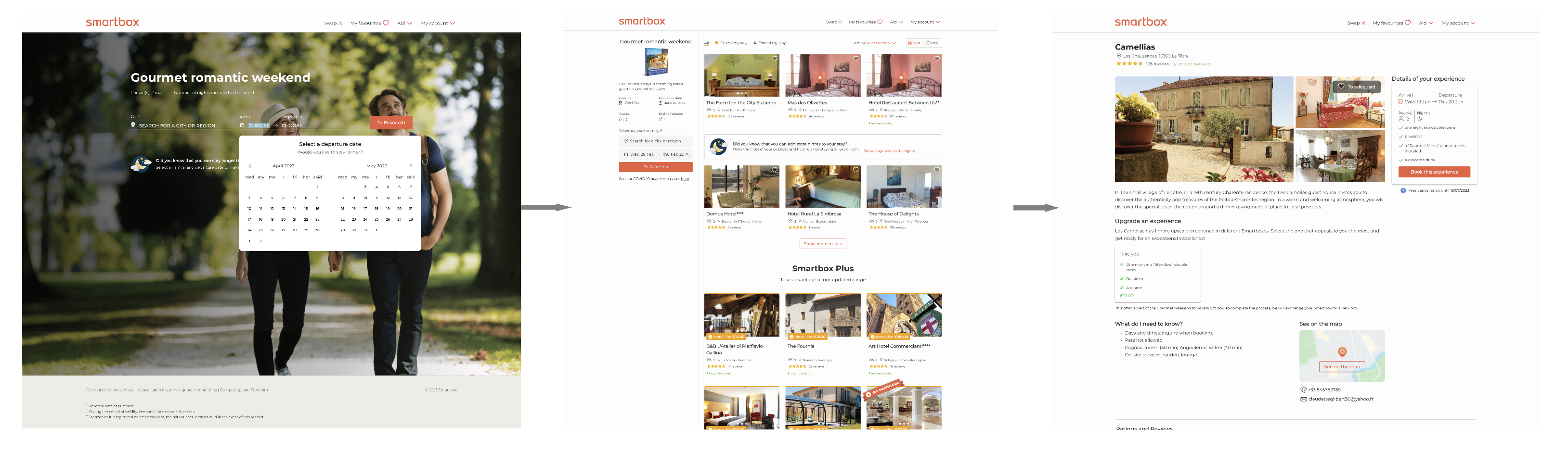
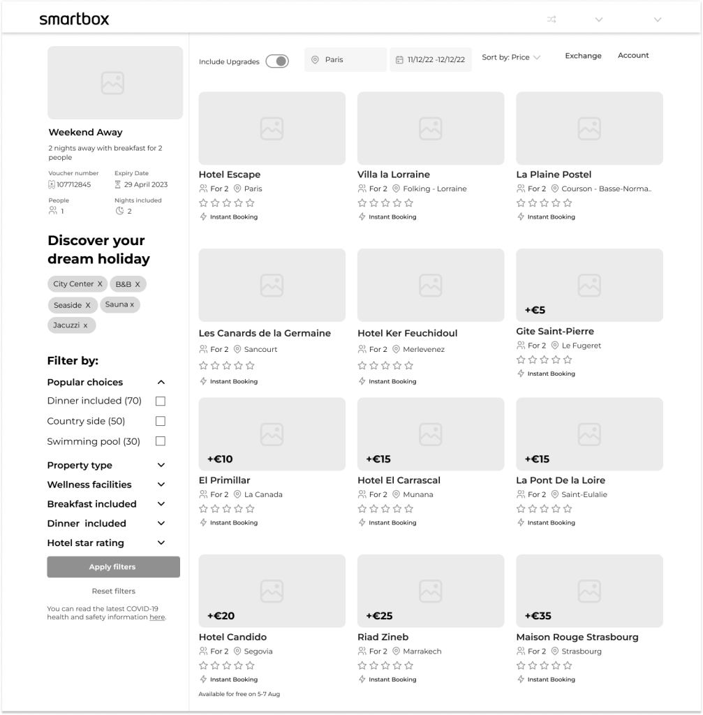
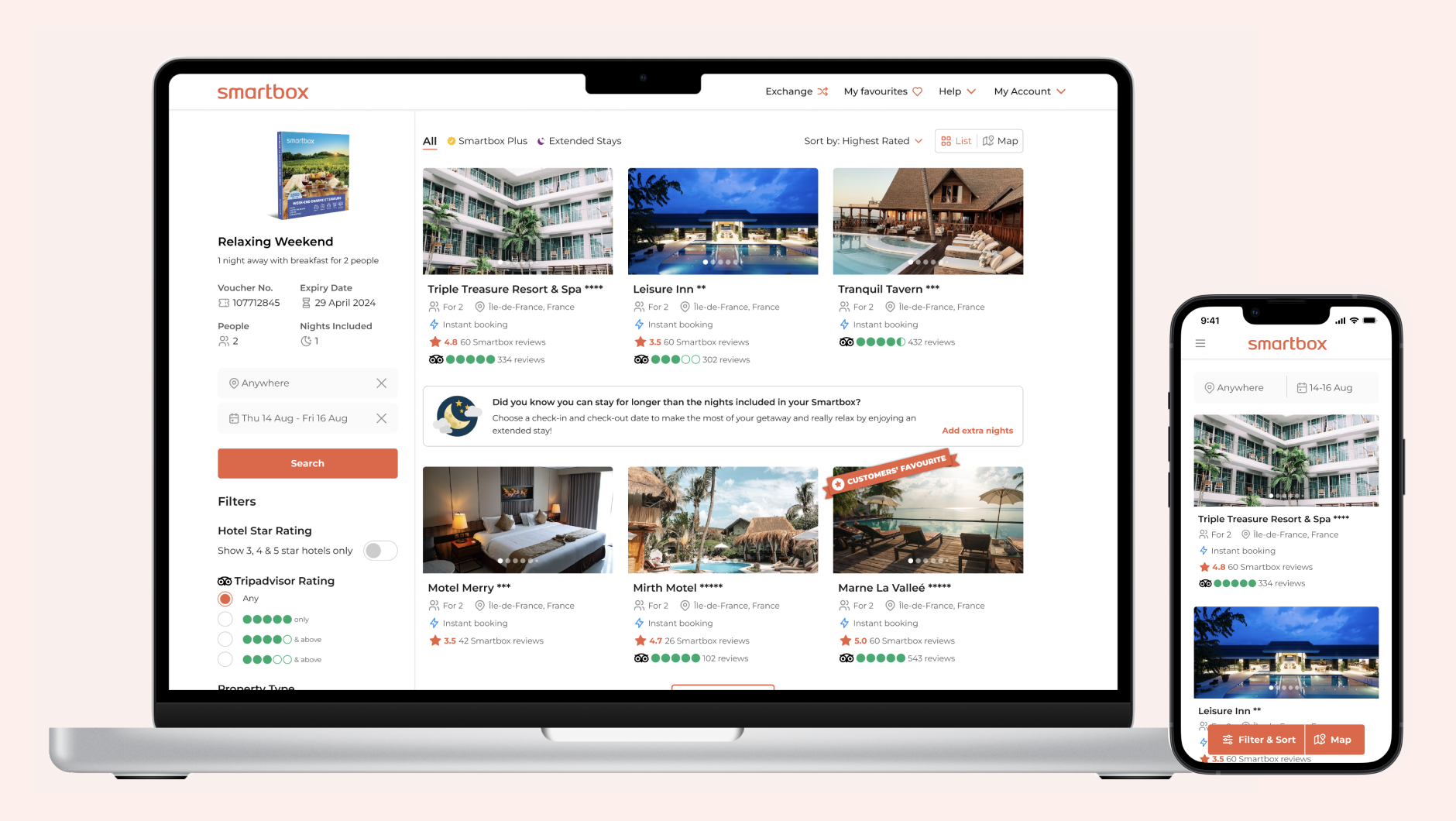
Stay booking flow as-is
Currently, to find their dream venue, users can only filter by location and dates. For example, a romantic stay box may boast 1,800 delightful stays in charming hotels, guest houses, castles, and residences of character. In many cases, users must scroll through numerous pages of options to find a particular venue.
Competitor benchmarking
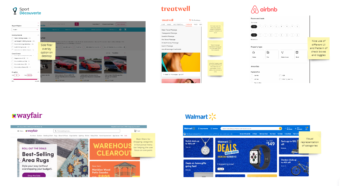
Given Smartbox’s unique business model, I conducted market research across a broad range of websites in the travel, retail, and beauty sectors. The goal was to understand how filters are presented: Are they automatically visible or hidden behind a button? Where is that button located? How are the filters displayed?
Additionally, I investigated the logic behind these filters: How do they interact with each other? Do they allow users to filter down to a single product?
Internal reasearch
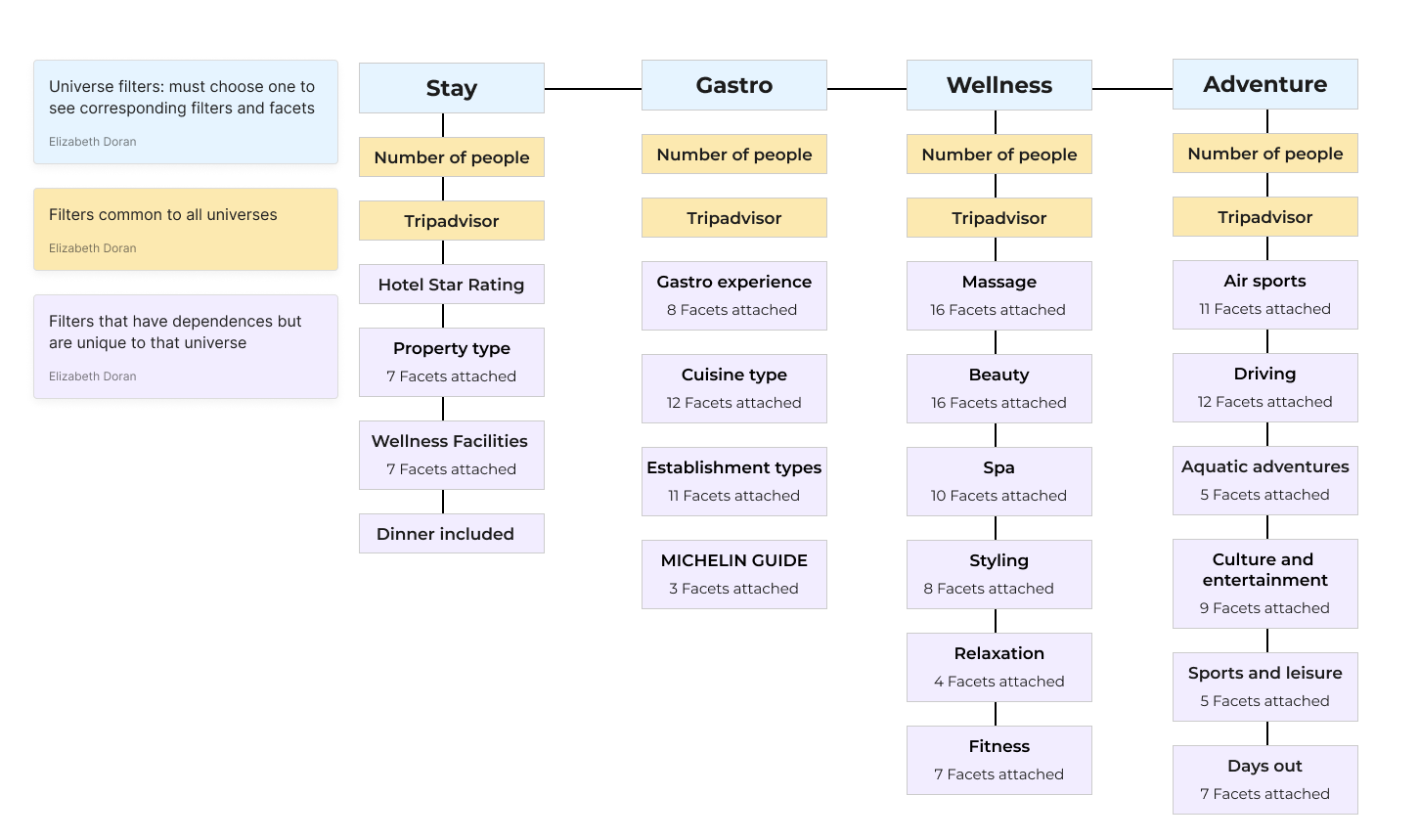
Global architecture: Smartbox relies on a robust internal system infrastructure to ensure seamless project implementation and enhance user experience. My task was to coordinate with all stakeholders to ensure alignment. The four main systems involved in this project are PIM, CATALOG, Search, and Booking (the front end).
Smartbox’s portfolio consists of gift boxes containing a variety of experiences for recipients to choose from. The internal database categorizes, filters, and adds facets to each box at three different levels: component, partner, and experience. One experience can belong to multiple boxes, making it crucial for these systems to communicate effectively.
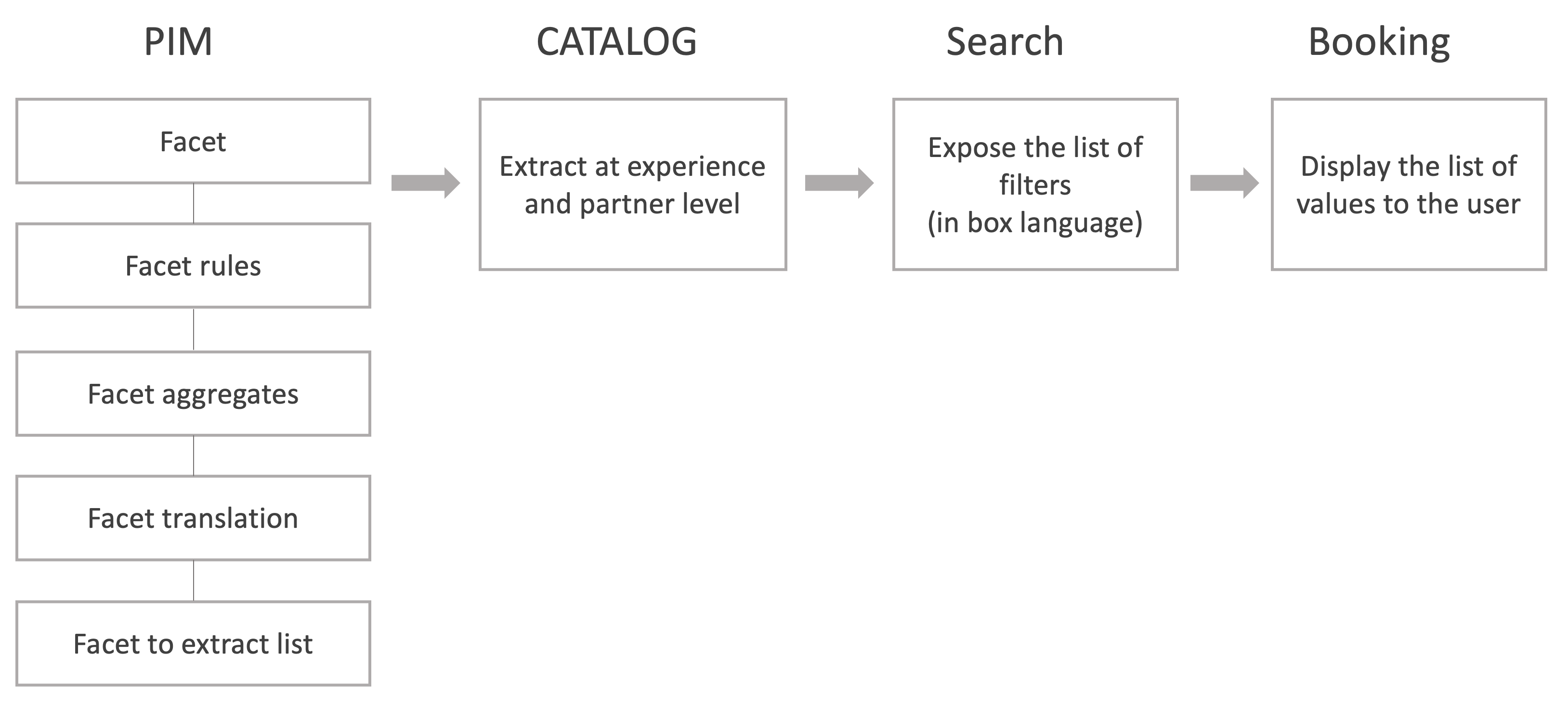
The diagram illustrates the flow from defining facets in PIM to displaying relevant values during booking, ensuring users can effortlessly find and book their desired experiences.
Persona exploration
Conducting persona exploration is essential to create a feature that truly caters to the diverse needs and preferences of our users. By understanding the different personas, we can identify their specific pain points, such as difficulties in navigating complex filters, the need for more relevant search results, and frustrations with slow or inaccurate filtering processes.

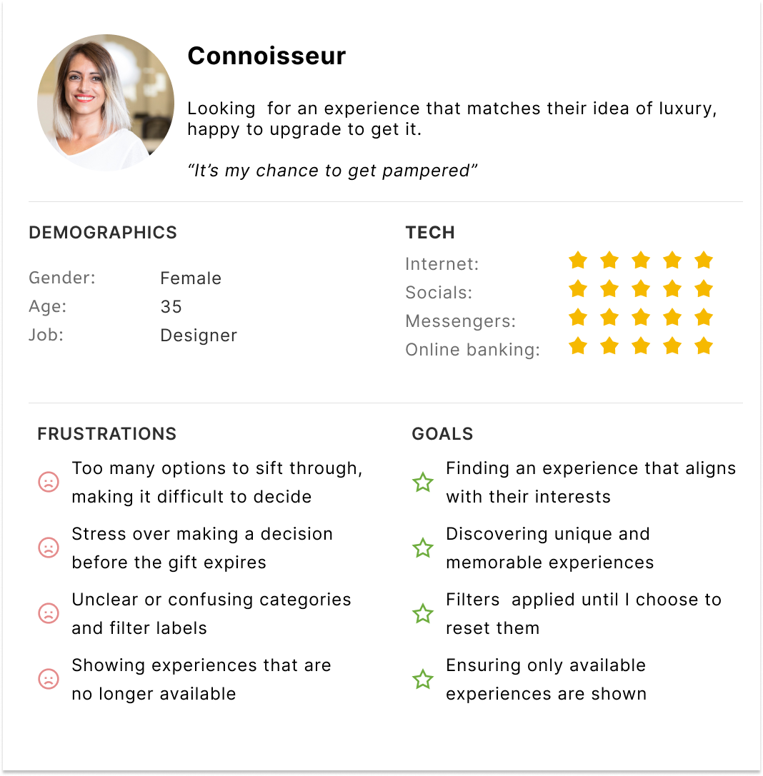
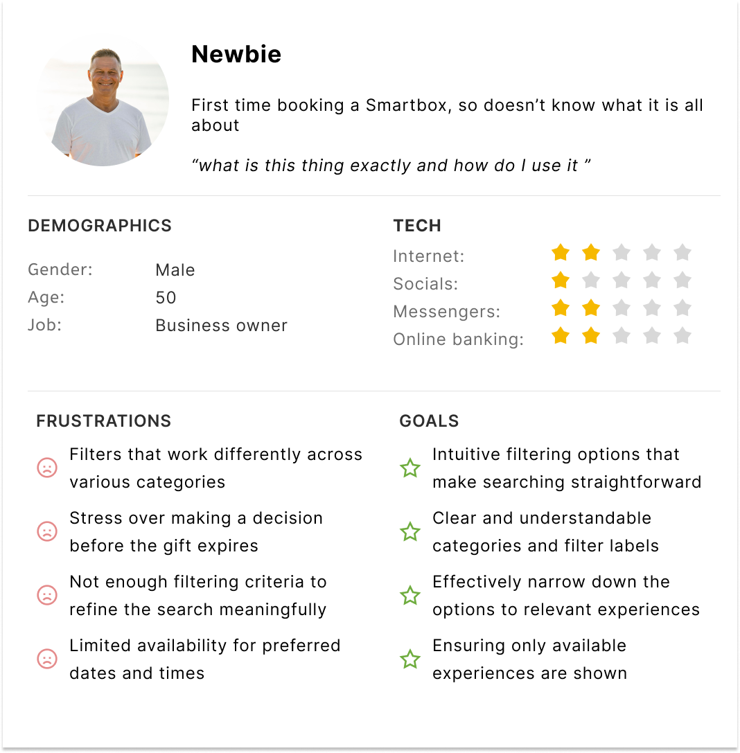
By understanding the different personas who will use this feature, we can identify common pain points, motivations, and goals, allowing us to design a more intuitive and user-friendly interface.
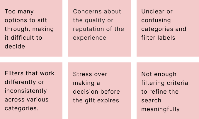
Pain points
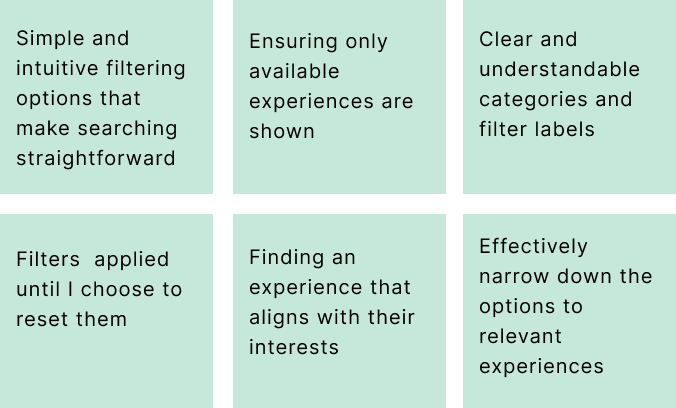
Goals
Design workshop – phase 1: broad Ideation
Objective: For this session, the goal was to encourage the team to use their imaginations and focus on high-level concepts without worrying about constraints. Armed with pens and paper, the team was instructed to quickly sketch as many ideas as possible. Some ideas will be valuable, while others might not be used again – but all contributions are important at this stage.
Kick-starters
- Handling Multiple Filters: What happens when there are multiple filters? 10? 20? Do we show them all or hide some??
- Filter Placement: Where will the filters be located? Do we need to modify the existing page to accommodate them?
- User Awareness: How do we inform users about the currently selected filters?
- Filter Interactions: Consider how filters interact: if one filter is selected, does another become available?
- Filter Components: What components will the filters use? Multi-select, toggle, radio button, or range slider?
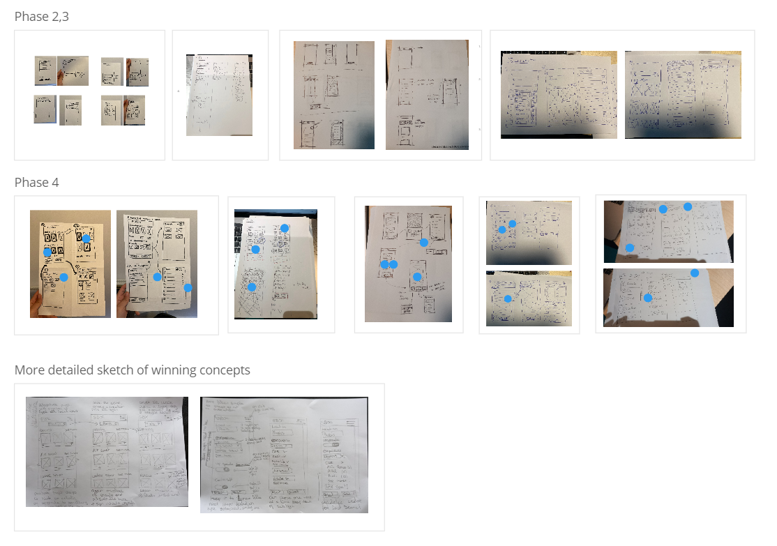
Phase 2: Focused Ideation
Take your 3 favourite ideas from the previous phase and draw them in more detail!
Phase 3: Presentations
Everyone presents their ideas, explaining what they were thinking for each idea.
Phase 4: Voting
Vote on your favourites features that you think should be brought through to low fi wires.
Card sorting
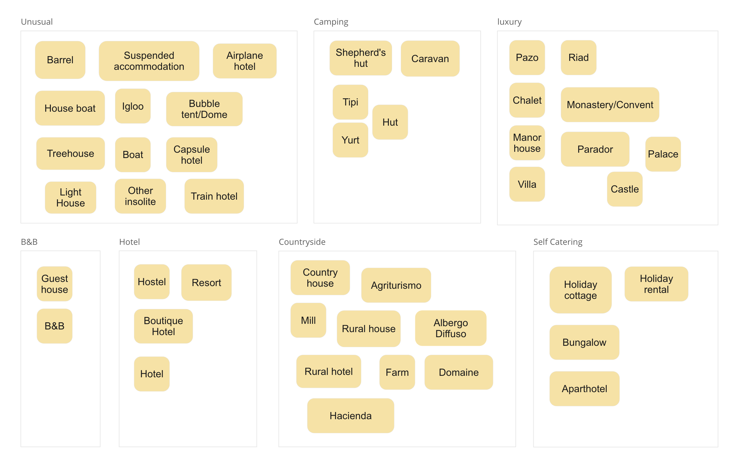
Before we advanced the designs to the high-fidelity stage, we needed to address several issues. One key challenge was dealing with the large number of types across various categories. To avoid empty searches or very low search volumes, we decided to aggregate the lists. For instance, in the “stay” category, there were 51 different property types. To effectively group these types, we used a card sorting method with six members of the UX/Product team.
In Miro, each participant received the full list and was tasked with grouping similar items and naming those groups. After everyone had completed the exercise, we analyzed the groupings to identify patterns and consolidated the 51 property types into 7 aggregated categories. This approach was applied to all four universes. Below is an example of the aggregated types for the “stay” universe.
Information architecture
Lo-fi wireframe testing
Some fantastic concepts emerged from our sketching sessions. The next crucial step was translating these sketches into Figma, a key phase in our design workflow that bridges the gap between initial ideas and polished design concepts. We completed three iterations in low-fidelity, incorporating feedback from user testing and stakeholder meetings.
Below are the designs for a stay box that advanced to the high-fidelity stage.
Objective:
To refine the design based on user and stakeholder feedback, ensuring that the stay box component is both functional and visually appealing.
Outcome:
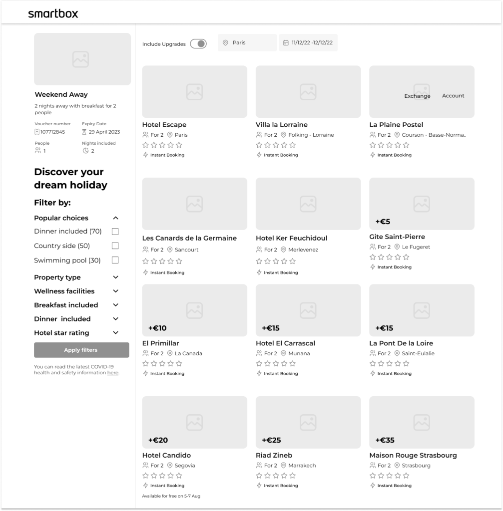
Version 1:
- Removed the title “Discover your dream holiday” as it pushed the filters down.
- Eliminated the count feature to maintain consistency.
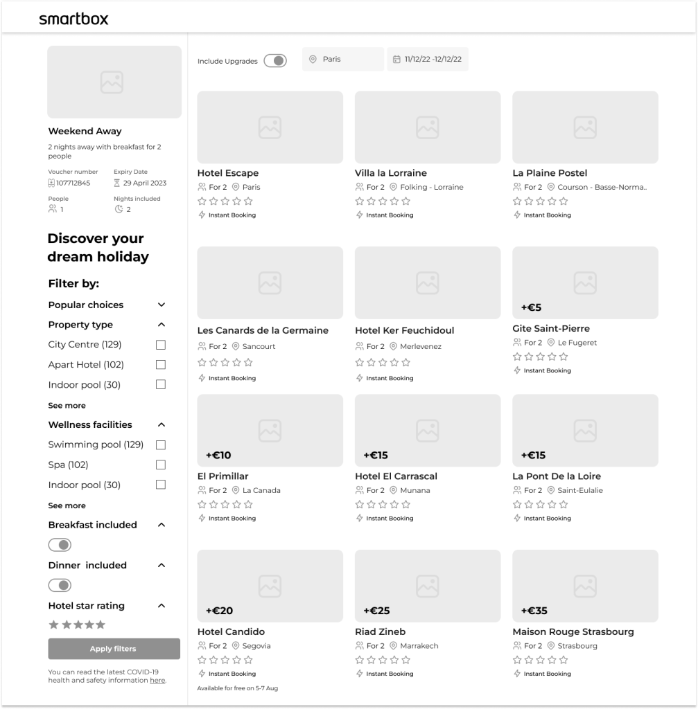
Version 2:
- Removed the upgrade toggle and adopted the “Smartbox Plus” naming convention instead of “upgrades.”
- Aligned the location and date fields with the filters.
- Removed the “breakfast included” toggle.
- Implemented a toggle for hotel star ratings to accommodate availability reasons.
The adjustments aim to streamline the user experience and enhance overall design cohesion.
Hi-fi testing testing
Through iterative design and testing, we effectively addressed key usability issues and streamlined the interface. By removing elements that caused confusion or technical challenges, we enhanced the overall user experience and ensured a more cohesive and functional design. These refinements set the stage for a more intuitive and user-friendly final product.
Objective:
The designs underwent continuous unmoderated testing loops, with iterations made based on feedback. The goal was to refine the user experience and address issues identified during testing.
Outcome:
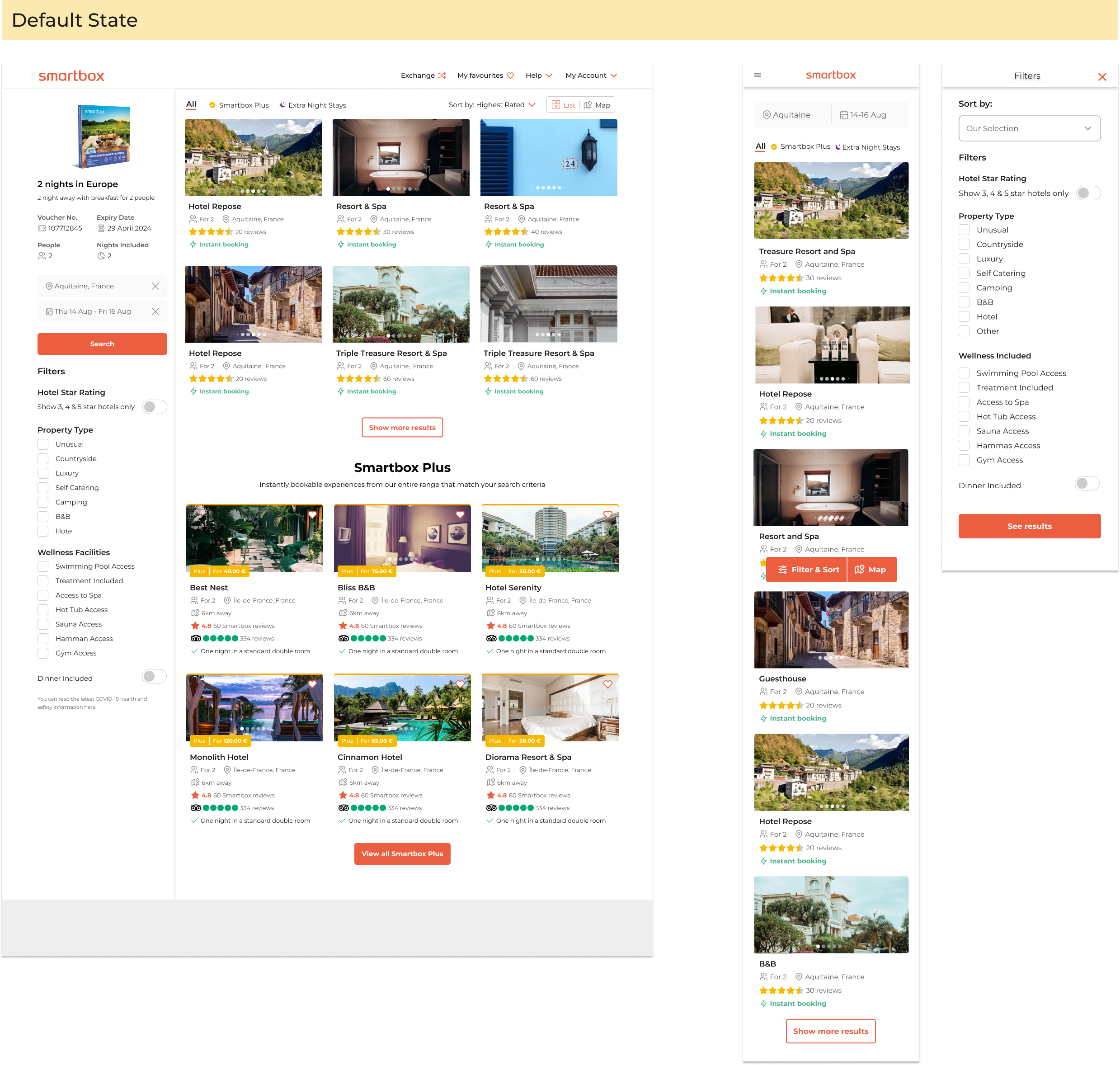
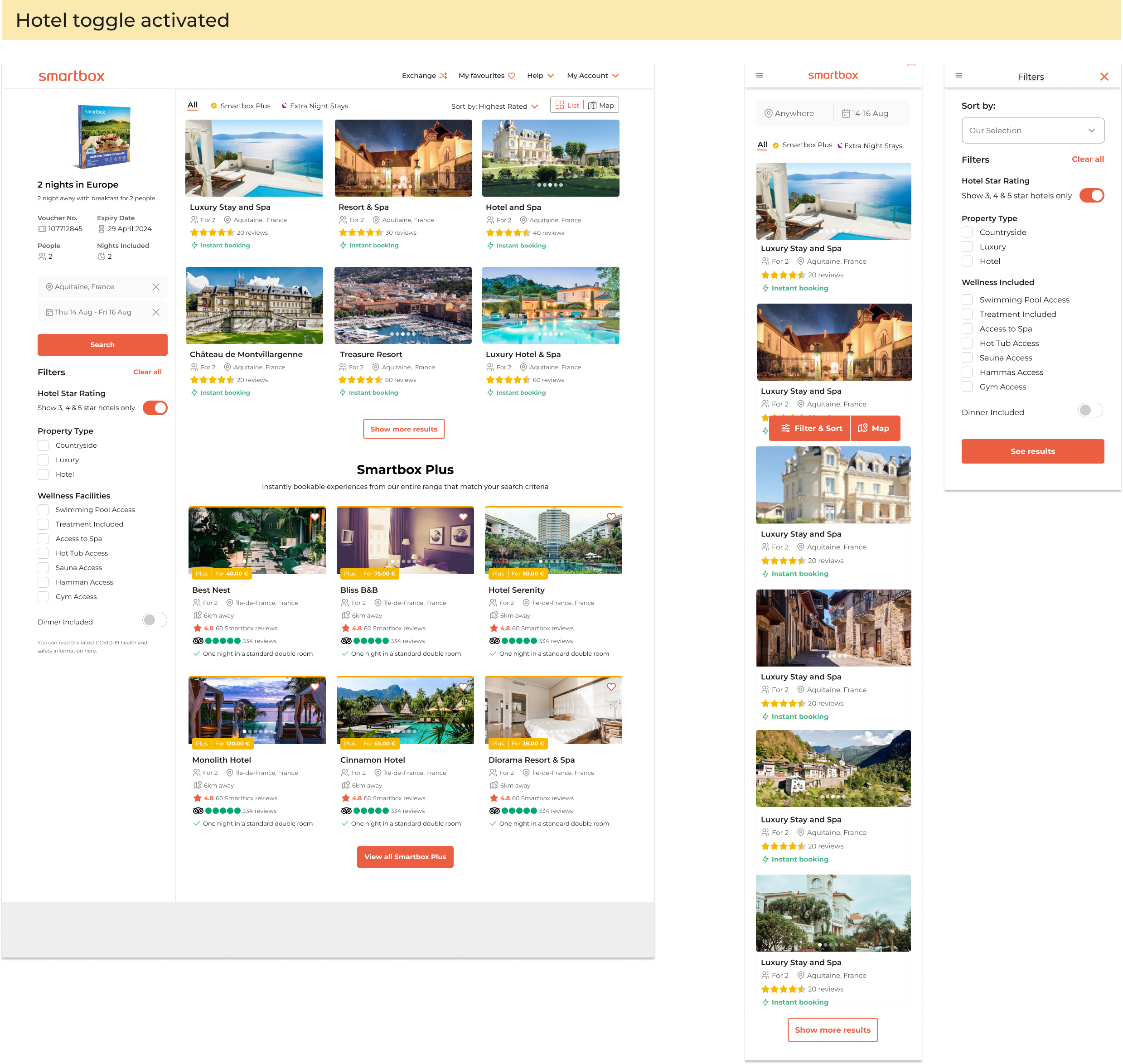
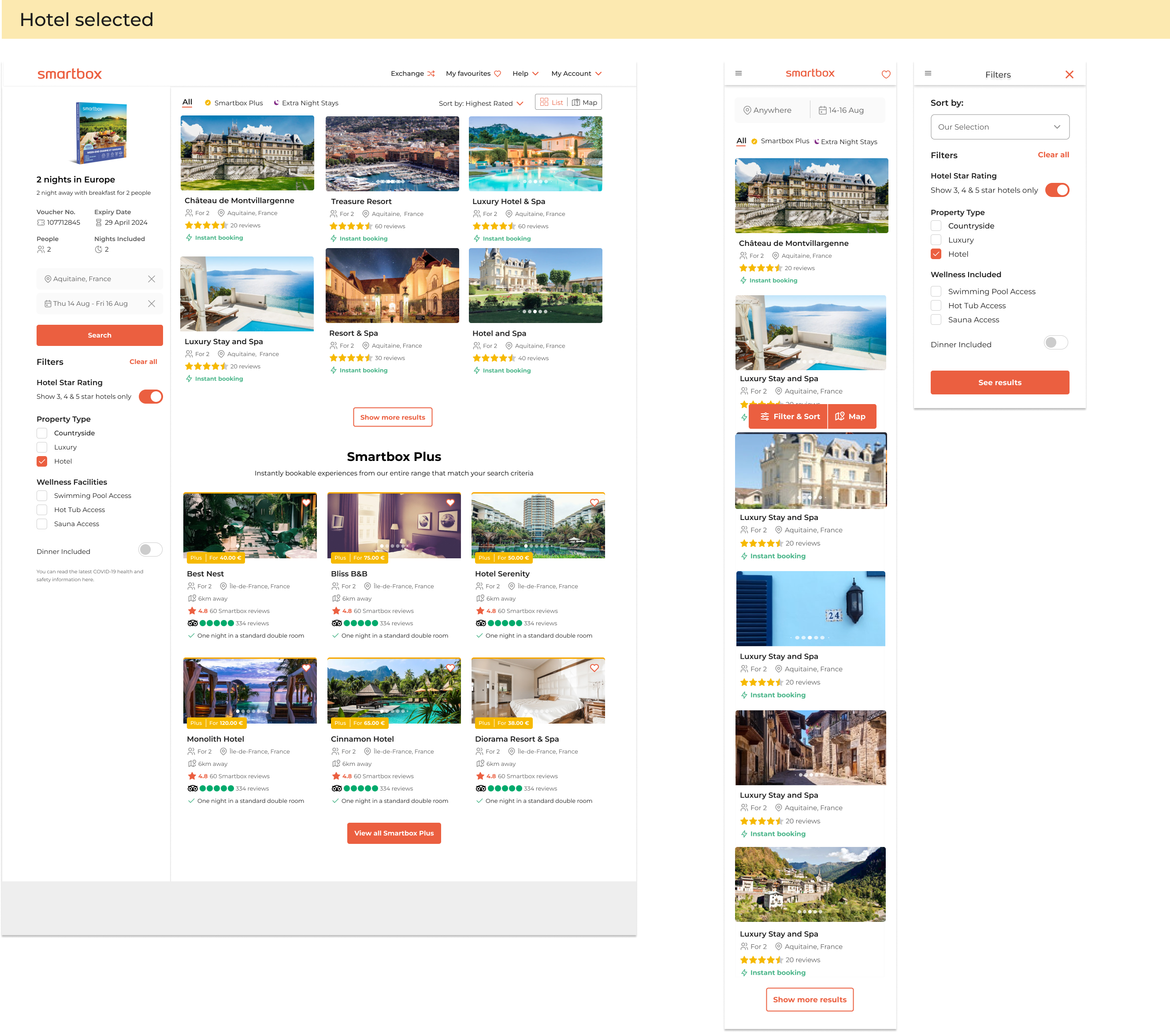
Phase 1: rules and logic
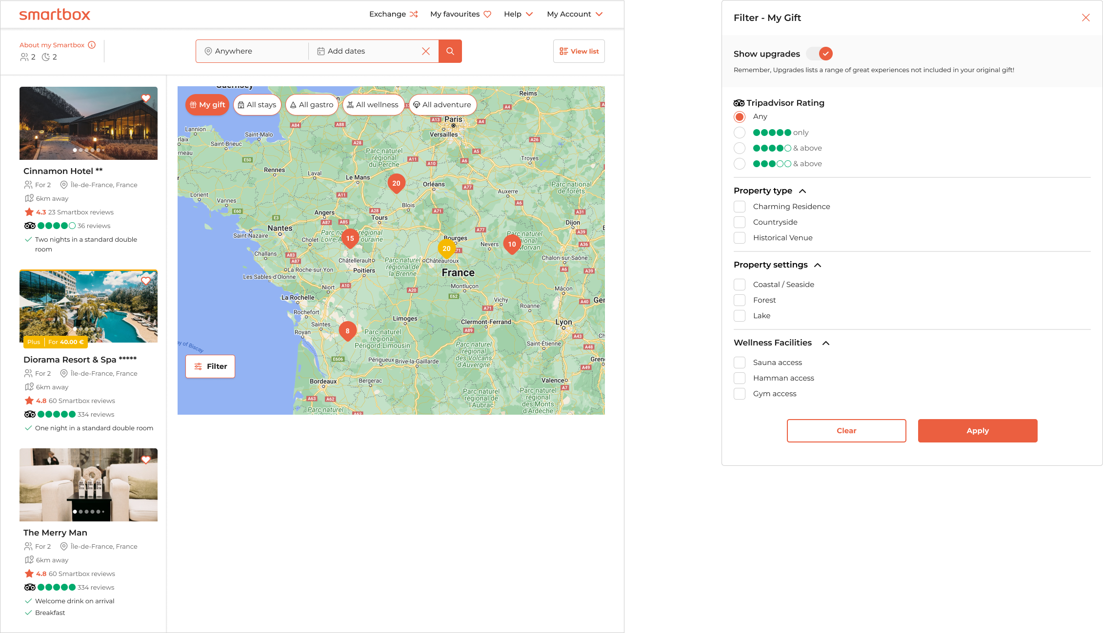
- Default State: All filters and facets are displayed, showing all options within the box
- Pax Filter: Applies to only a few stay boxes.
- “See More” Button: Appears if there are more than 6 facets in a list; all facets will show if there are exactly 7.
- “Clear All” Button: Appears once a filter is selected and resets the filters to the default state.
- Hotel Star Toggle: Shows all stars initially. When activated, it displays only 3, 4, or 5 stars due to the low volume of 5-star hotels.
- Checkboxes: Users can select multiple options in “Property Types” and “Wellness Facilities” with an “OR” logic. For example, selecting “camping” may exclude “wellness treatments.”
- Dinner Toggle: Shows hotels offering at least one dinner per stay when activated. This could include one dinner for a 2-night stay or two dinners for each person.
- “See Results” Button: Updates the “Filter” sticky with the number of selected filters.
- Mobile View: The “Filters” sticky CTA triggers a full-screen overlay with filter options. Users can select or deselect filters, but search results are only shown after clicking the “See Results” button. The “Clear All” button appears in the overlay after any filter selection.
Phase 2
In the second phase of this project, we aimed to improve the user experience within Smartbox by introducing advanced filtering options for experiences and enabling users to browse the entire Smartbox portfolio.
Given Smartbox’s dynamic environment, with multiple concurrent projects, regular updates and coordination were crucial. I worked closely with two other UX leads to maintain consistency and alignment across upcoming releases.
During this phase, we also focused on the “Map Split View” release, which involved optimizing the desktop interface. The map’s dominance on the screen had resulted in a cluttered appearance with vignettes and filters. To address this, we decided to implement overlay filters, leveraging the successful approach from phase 1 used for mobile and tablet devices. Our hypercare sessions showed a significant increase in conversion rates on mobile platforms, validating the effectiveness of this design choice in improving user navigation and result relevance.
A/B testing

Dropdown
Horizontal
Objective:
This test aimed to determine which user interface (UI) option was more intuitive. We compared a dropdown version and a horizontal version of the main universe filter over the map.
Outcome:
Out of 11 testers, 2 preferred the dropdown version, while 9 favored the horizontal version. Comments supporting the horizontal version included:
- “Easier to navigate and aligned with my expectations.”
- “Easier to absorb the information quickly.”
- “I could view more detailed information at once.”
- “It looked more minimalistic and was easier to focus on.”
Filter overlays testing
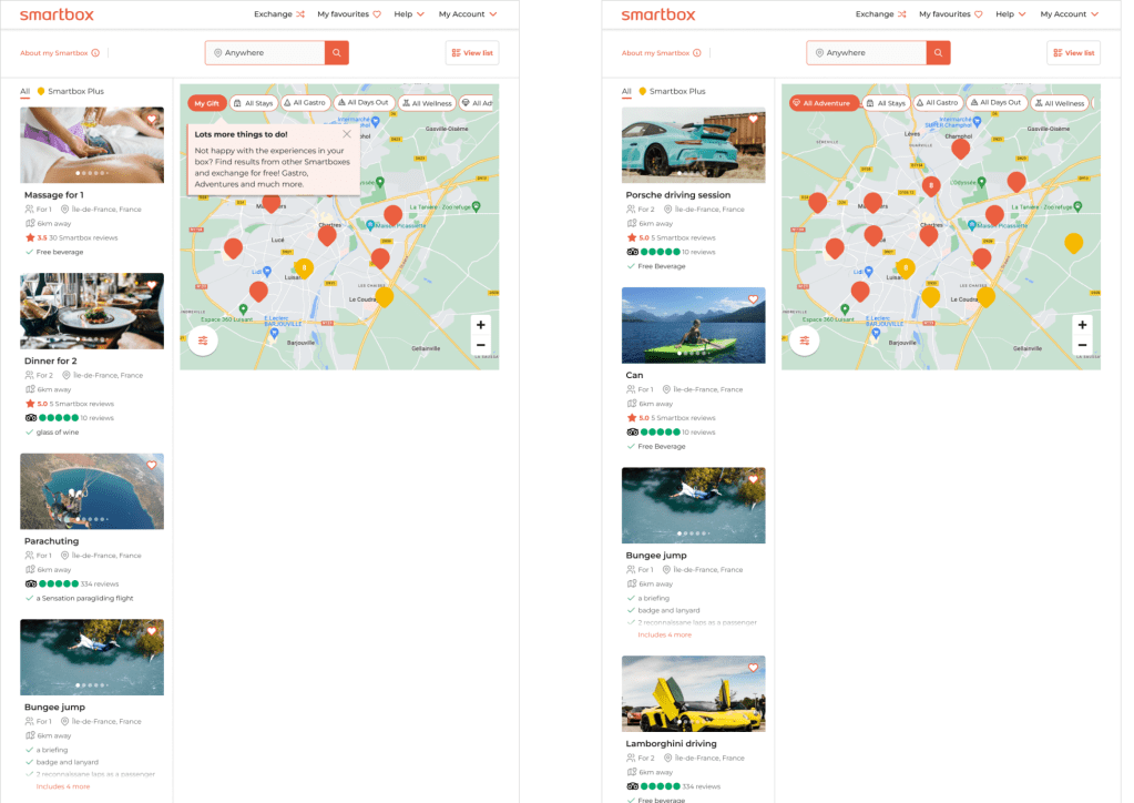
Introducing a refreshed user interface featuring sleek pill-shaped buttons and a map view for navigating experiences.
The “My Gift” button showcases both free and upgraded options, with an option to toggle off upgrades. The overlay for “My Gift” includes a subset of filters and facets from one of the “All Categories.”
The “All Category” buttons allow users to explore a wider range of Smartbox experiences, concentrating exclusively on upgraded options. This approach is designed to help users find premium experiences while also increasing company revenue.
Objective:
To ensure the revamped filter overlays and map view were effective and user-friendly, I conducted the following tests:
1. Usability Testing: I observed users interacting with the new UI elements, including the pill-shaped buttons and map view, to assess ease of use and overall experience. Key observations focused on how intuitively users navigated the “My Gift” and “All Categories” options.
2. A/B Testing: I compared different versions of the filter overlays and map view by splitting users into groups. Metrics on engagement, filter usage, and conversion rates helped determine which design was more effective.
3. Performance Testing: I tested the UI’s responsiveness and load times across various devices and network conditions to ensure smooth interactions, even with large datasets.
4. Accessibility Testing: I evaluated the interface using accessibility tools to ensure it was usable by individuals with disabilities, checking keyboard navigation, screen reader compatibility, and color contrast.
5. Exploratory Testing: I allowed testers to freely explore the new UI to uncover any unforeseen issues or bugs, revealing unanticipated user behaviors and areas for improvement.
6. User Feedback Surveys: I collected qualitative feedback through surveys and interviews to gauge user satisfaction with the “My Gift” and “All Categories” buttons and overall design, providing insights for further refinement.
These tests confirmed the new filter overlays and map view were user-friendly, effective, and aligned with both user needs and business goals.
The Solution
The final product introduces users to a new filtering method, allowing them to discover experiences beyond what they’ve been gifted. They now have the freedom to browse and upgrade to experiences that truly align with their desires.
Impact:
- By introducing comprehensive filters and facets in the booking flow, we significantly improved the user experience, leading to a reduction in customer service calls related to booking frustrations.
- The enhanced search functionality enabled users to easily find and book experiences that match their specific preferences, resulting in a increase in user satisfaction and a notable rise in our NPS score.
- Rolling out these improvements across all four main universes—stay, adventure, wellness, and gastro—ensured a consistent and seamless user experience, fostering higher engagement and repeat usage across the platform.
More Smartbox projects
Ratings & reviews
Integration of TripAdvisor, a globally recognised and trusted brand for ratings and reviews, to build trust and improve conversions.
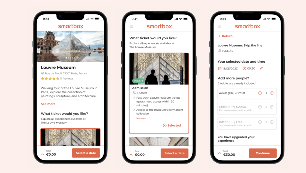
Online booking flow
Incorporating essential features like date and time selection, dynamic pricing, and upgrade options to enhance revenue.
