Smartbox: Ratings & Reviews
Smartbox is a leading provider of experiential gift boxes in Europe, offering a wide range of themed gift packages such as gourmet dining, spa treatments, adventure activities, and weekend getaways. Focused on delivering memorable and unique experiences, Smartbox allows recipients to choose from a variety of activities and locations across Europe.
Project details
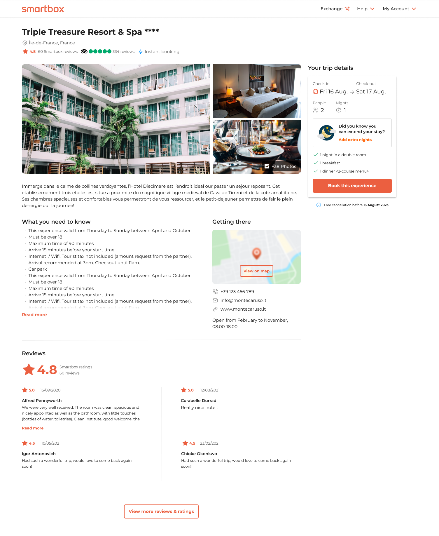
Smartbox will form a partnership with Tripadvisor, a globally recognised and trusted brand for ratings and reviews. By enabling acTo enhance both engagement and conversion rates on the booking side of the Smartbox site, we integrated Tripadvisor ratings alongside our existing branded ratings and reviews.
For this project, we recognized the need to visually distinguish between “Hotel Star Ratings,” “Smartbox Star Reviews,” and “Tripadvisor Reviews,” as all three could be used simultaneously. To address this, we revamped the Smartbox branded ratings and reviews while integrating Tripadvisor.
The primary focus was to design a layout incorporating:
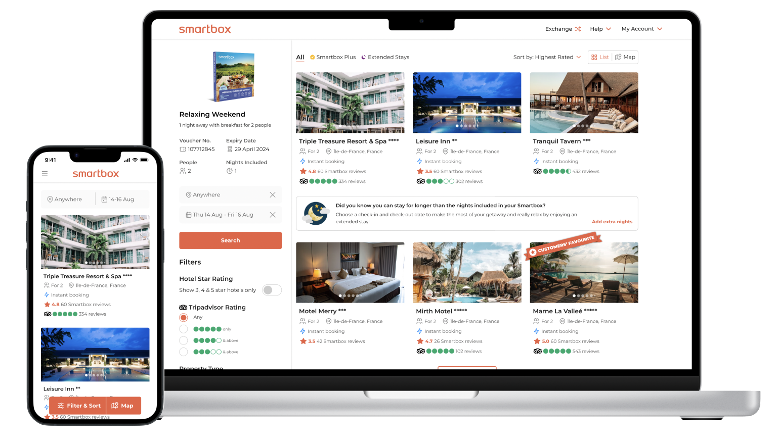
- Tripadvisor ratings in vignettes on the ‘Search Page.’
- Tripadvisor ratings with review counts on the ‘Experience Details Page.’
- Tripadvisor as a filter option.
This update will be implemented across all stay and non-stay categories within Smartbox, covering all four main universes: stay, adventure, wellness, and gastro, on the booking side of the site.
Role
Lead UX/UI designer
Team
One UX/UI designer (myself), 1 product Owners and 2 developers and 1QA
Project Status
Web/mobile – live August 2023
Design time frame
March to June 2023
(On going support till launch)
My Process
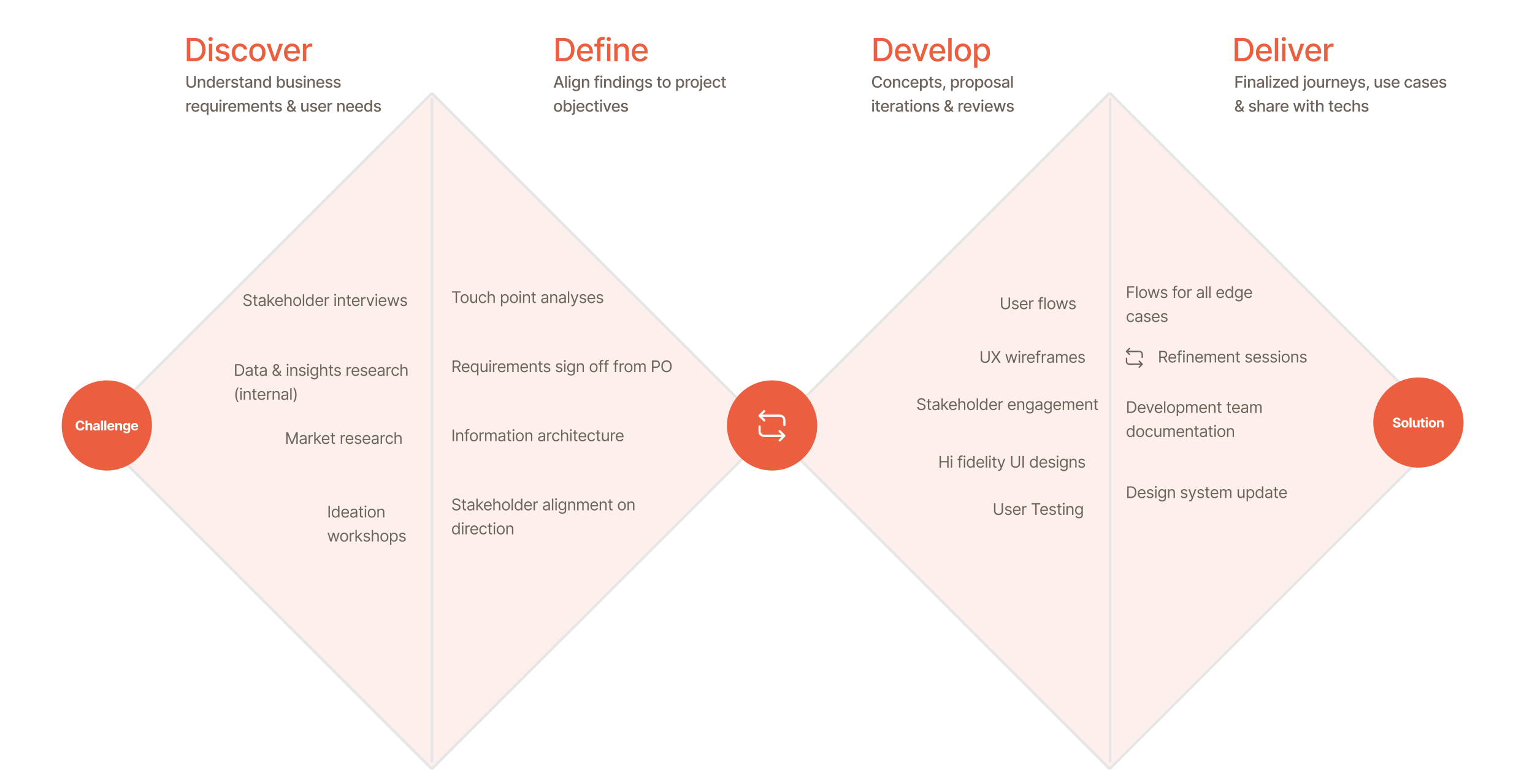
Desk research
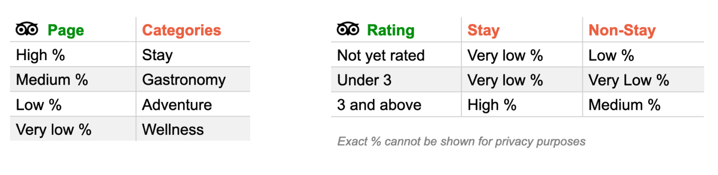
Internal research revealed that a significant portion of our stay partners had active TripAdvisor pages. Just over half of our gastronomy partners had pages, while there was a notable decline in active pages for adventure and wellness partners.
Data on partner rating scores showed that a low percentage of both stay and non-stay partners had pages with no ratings. Additionally, only a small percentage of both stay and non-stay partners had ratings of 3 or less. However, a high percentage of stay partners had ratings of 3 or more, while a moderate percentage of non-stay partners fell into this category.
Research on the impact of ratings and reviews revealed the following:
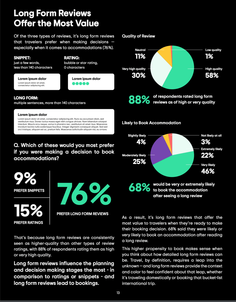
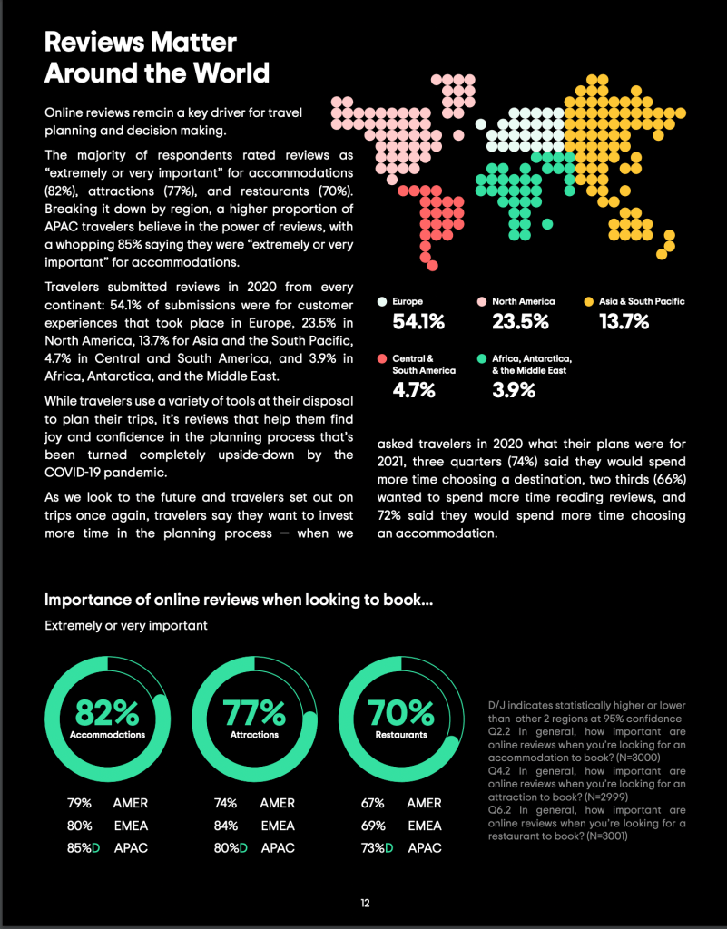
- Only 5% of users trusted brief ratings, while 78% preferred long-form reviews, which were seen as higher quality.
- 68% of people were more likely to book after reading a positive long-form review.
- Reviews had global significance, with 54% coming from Europe.
At this stage, several questions emerged about how to display ratings, their functionality, and the integration of Smartbox reviews and ratings alongside Tripadvisor.
Market reseach
Tripadvisor provided guidelines for the partnership that required two check-ins: one at the initial design stage and another before production, to ensure compliance. Given that we were also revamping our own vignettes, I conducted market research to explore how other organizations displayed Tripadvisor ratings. I aimed to understand their strategies, such as whether they prioritized Tripadvisor ratings over their own, if they had their own ratings, and how clearly they separated the two.

Here are some key findings:
- Partnering organizations often display their own reviews independently, clearly labeled to distinguish them.
- Many organizations use unique icons for their ratings, such as a sun for TUI, a bird for Lux Air Tours, and bunting for Virgin.
- Hotel star ratings are typically positioned further down the activity details page rather than in the vignettes.
- Most organizations use the Tripadvisor ratings and reviews package.
Persona exploration
Conducting persona exploration for integrating TripAdvisor was crucial to ensure the feature meets the specific needs and preferences of our diverse user base. By understanding the different personas who use Smartbox, we can tailor the integration to address their unique pain points, such as trust in the information, ease of access to relevant reviews, and clarity in decision-making.
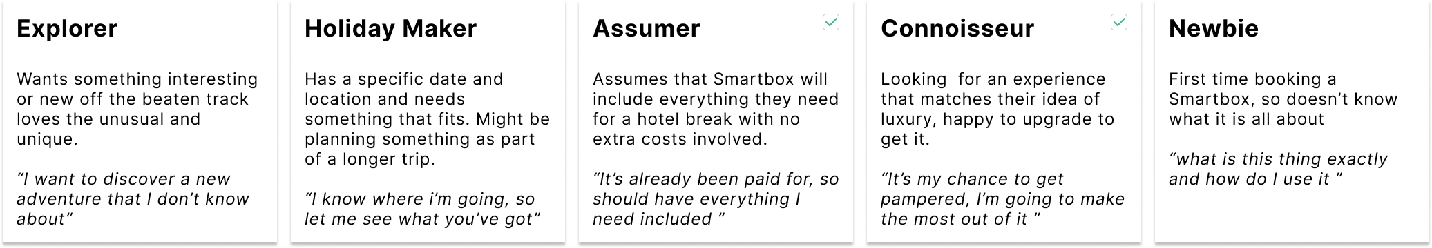
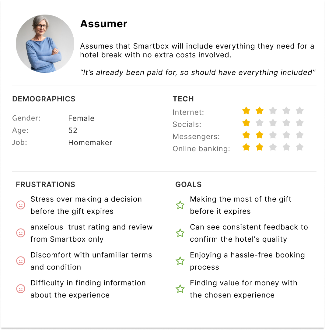
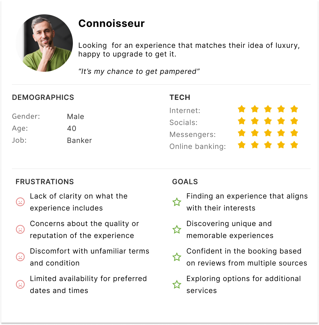
By understanding the different personas who will use this feature, we can identify common pain points, motivations, and goals, allowing us to design a more intuitive and user-friendly interface
Design workshop: vignettes
Objective:
The goal of the design workshop was to revisit the arrangement of vignettes to enhance user experience. Specifically, we aimed to address the current placement of the instant booking feature, which was situated under the star reviews. This placement conflicted with user expectations since 20% of our stay partners do not offer online booking. Additionally, with the introduction of Tripadvisor ratings, we sought to modernize Smartbox’s 5-star review representation, which had become confusingly similar to hotel star ratings.
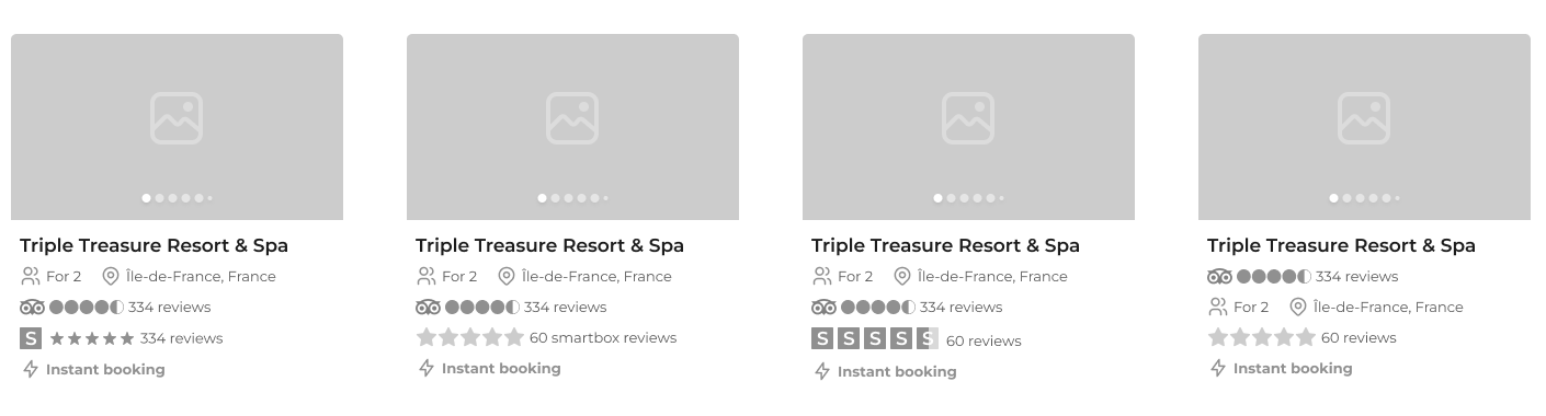
Outcome:
During the workshop, we explored various styles, colors, and arrangements for the vignettes, experimenting with the placement of “Smartbox Reviews.” We decided to consolidate information about the stay partner at the top of the vignette, with ratings and reviews placed underneath. Tripadvisor ratings were positioned at the bottom to reduce confusion and minimize layout jumping, accommodating the fact that some partners do not have a Tripadvisor page. This new arrangement aimed to provide a clearer and more cohesive user experience.
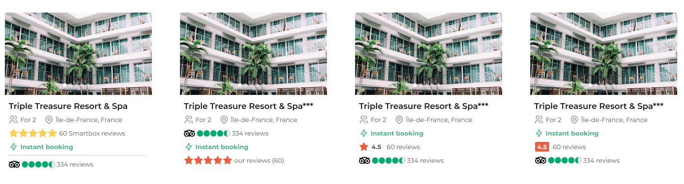
High fidelity testing
Objective:
To gauge user preferences, we conducted a preference test with the question: “Which review style do you think best fits the Smartbox brand?” Users were shown three design options.
Outcome:
Muti – Star = 30%
Single Star = 70%

Box Outline = 0%
Diving Deeper:
Objective:
We were happy with the results of the preference test however we wanted to dive a little deeper to ensure our users understood what the single star symbolized and that the Smartbox branded orange colour did not represent a low or a high ranking.
We showed the testers the following images and asked some more detailed questions. The results were pretty conclusive and we were happy to proceed with this design.
Outcome:
- First Impressions of Rating Presentation: 9 out of 10 participants found it easy to distinguish between the two types of reviews. Only 1 participant found it somewhat confusing, but this was due to the similarity with the 5-star hotel rating system.
- Perception of the Single Star: 9 out of 10 participants believed the single star represented Smartbox ratings/reviews. Only 1 participant associated it with the hotel star rating system.
- Significance of Smartbox Ratings Color: 8 out of 10 participants recognized that the orange color was part of the Smartbox brand. The remaining 2 participants thought the color indicated mid-level reviews.
Logic and rules
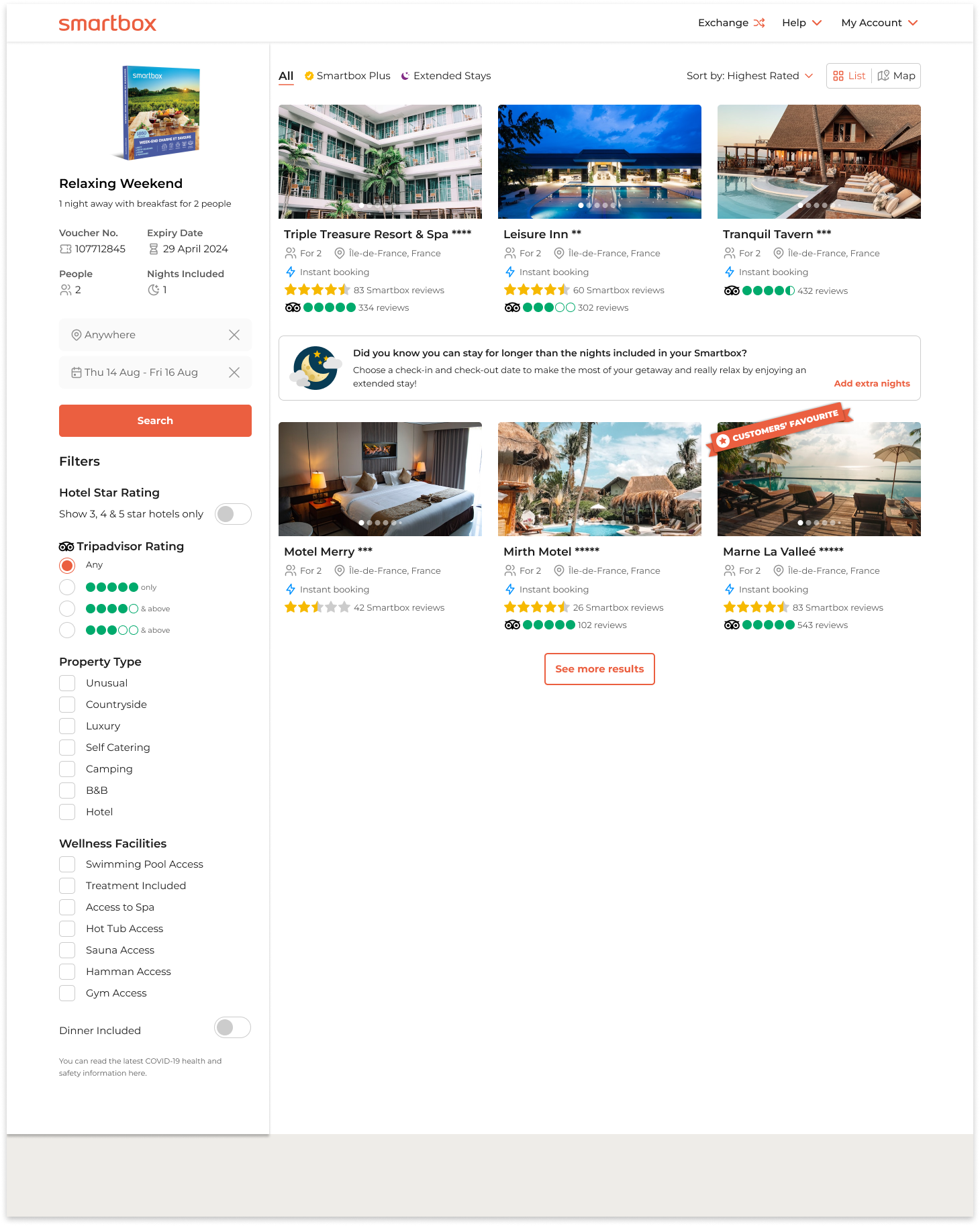
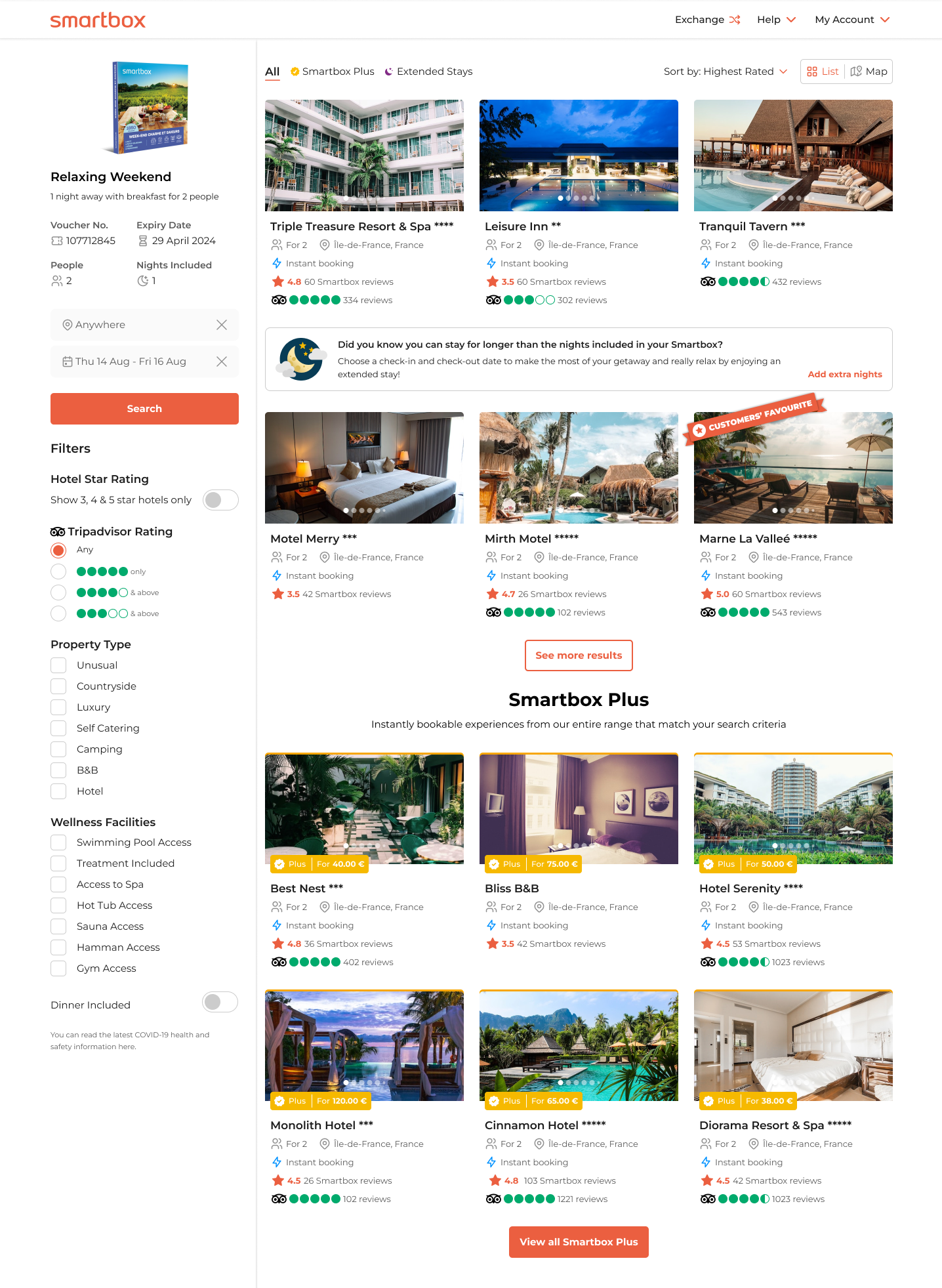
Search results page:
- Tripadvisor logo in the filters title
- Radio buttons instead of checkboxes, as only one can be selected at a time
- “Any” is pre-selected , all experiences with or without a Tripadvisor score will show
- If 5 is selected only experiences with 5 will show
- If 4 is selected 4 & 5 will show, represented by “& above”
- If 3 is selected 3, 4 & 5 will show, represented by “& above”
- In the vignette when the partner has both reviews Smartbox will show first
- If there is no Smartbox review Tripadvisor shifts up
- Activity details page:
- Clicking on the Smartbox reviews brings the user down to the review section.
- Clicking on the Tripadvisor reviews opens a new tab to the partners Tripadvisor page
- Content shifts to the left when one of the reviews at not present
The solution: final design
Tripadvisor a globally recognised brand was integrated into Smartbox own branded ratings and reviews to strengthen the brand name and build trust with its customers.
