Smartbox: Online Booking Flow
Smartbox is a leading provider of experiential gift boxes in Europe, offering a wide range of themed gift packages such as gourmet dining, spa treatments, adventure activities, and weekend getaways. Focused on delivering memorable and unique experiences, Smartbox allows recipients to choose from a variety of activities and locations across Europe.
Project details
The focus of this project is to design an online booking flow for all “Days Out” experiences catering for fundamental requirements such as date/time selection, persons attending, dynamic pricing and product upgrades.
A decision was taken to integrate with “Tiqets”, an online ticketing platform aggregating; cultural tours, museums, theme parks, water parks, stadium tours etc.
This journey must also take into account extra charges may occur along the way, a running price breakdown will need to be introduced and be easily accessible at any point in the journey, so there are no surprises for the user at checkout.
Role
Lead UX/UI designer
Team
One UX/UI designer (myself) and 1 product Owner
Project status
Web/mobile – Schedule for development late 2024
Design time frame
December 2022 to March 2022
My process

Competitor benchmarking
I examined the complete booking flow across four similar platforms, from the venue page to added extras, payment, and the final confirmation page. My focus was on how each platform presented essential venue information and offered additional options. I evaluated the persuasiveness of these offers and noted whether they struck the right balance between enticing the customer with extra options and overwhelming them to the point of abandonment.
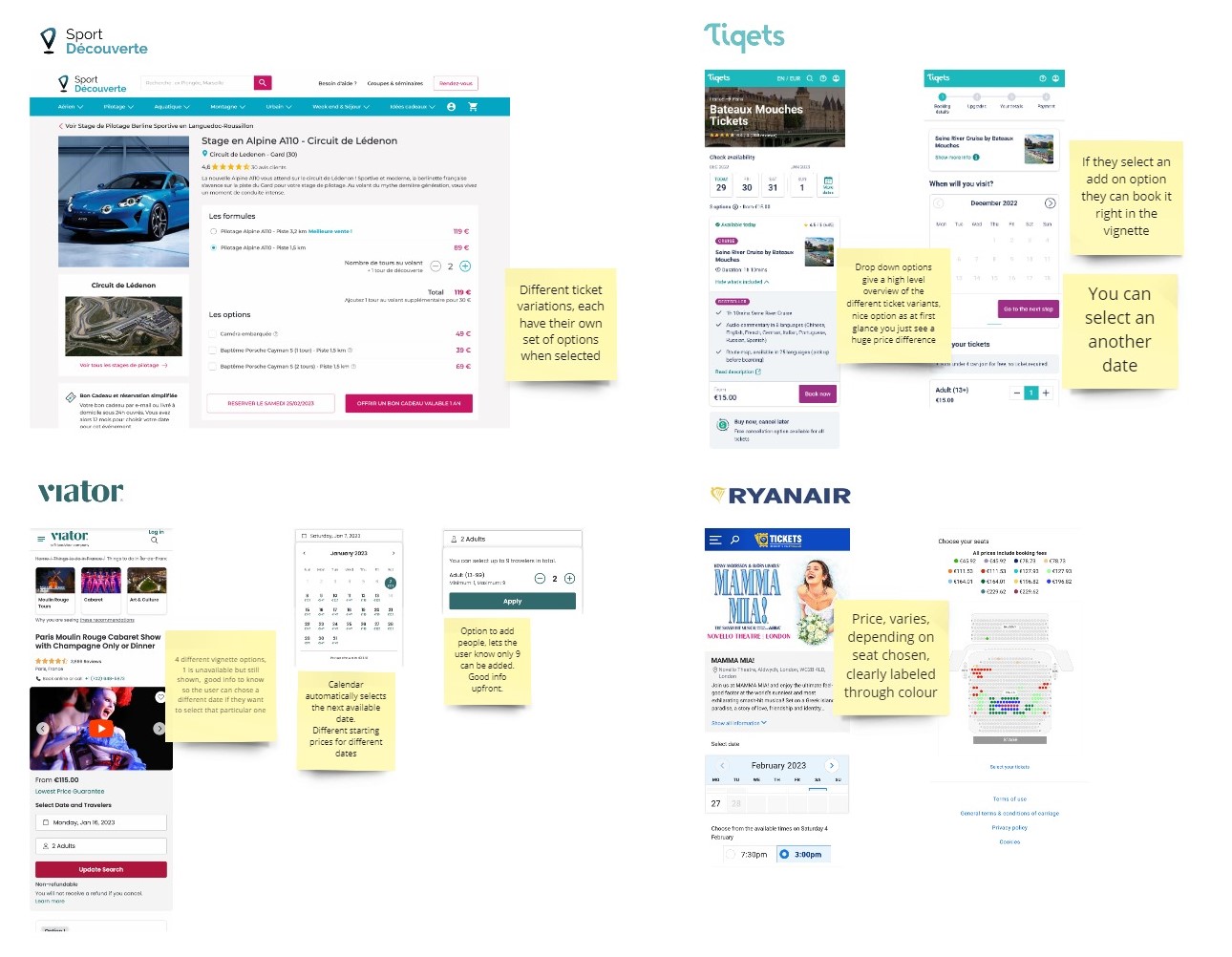
Key findings
- Most sites followed a similar flow;
Time/Date/People > Extras > Personal Info > Payment > Confirmation - Next available dates highlighted
- Price variations clearly defined and labeled
- Cancelation/Refund Policies clearly stated from the start
Persona exploration
This process helped to ensure that the booking feature addresses real user concerns, such as ease of navigation, clarity of information, and convenience, thereby enhancing the overall user experience.
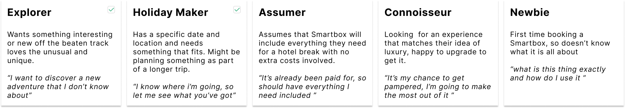
I operate on the premise that there are five distinct persona types, and for this project, I focused in-depth on two of them.
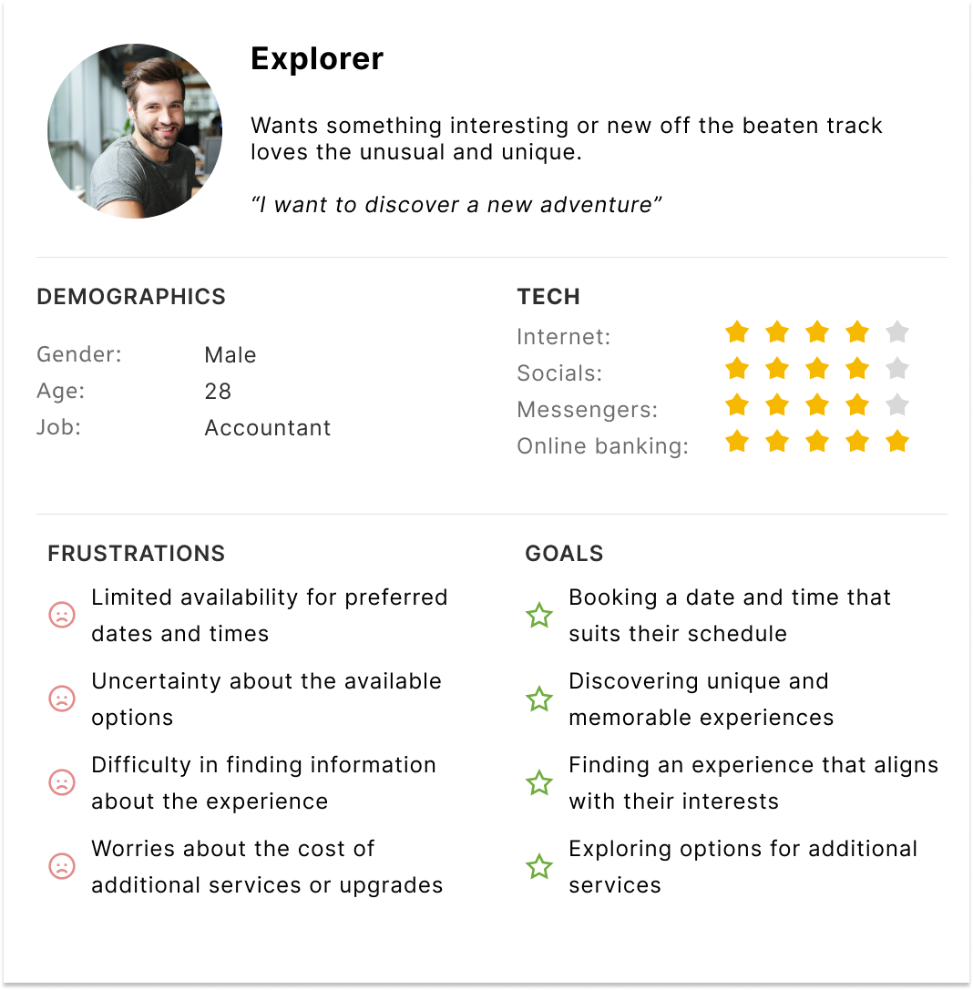
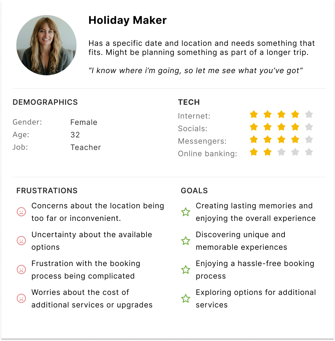
By understanding the different personas who will use this feature, we can identify common pain points, motivations, and goals, allowing us to design a more intuitive and user-friendly interface.
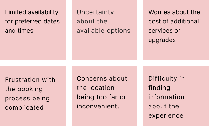
Pain points
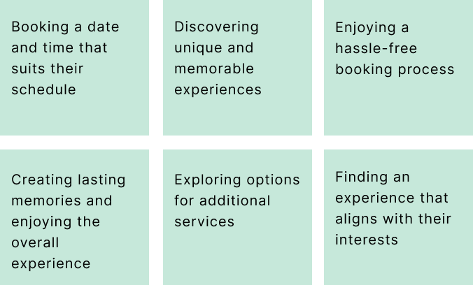
Goals
As-is booking flows
Currently, Smartbox focuses primarily on the booking flow for the stay universe. For all other experiences, customers must directly contact the partner hosting the experience or reach out to Smartbox’s customer service. This process is time-consuming for both the customer and the business. However, there is an exception for select “days out” venues that are part of a pilot scheme.
Offline booking flows
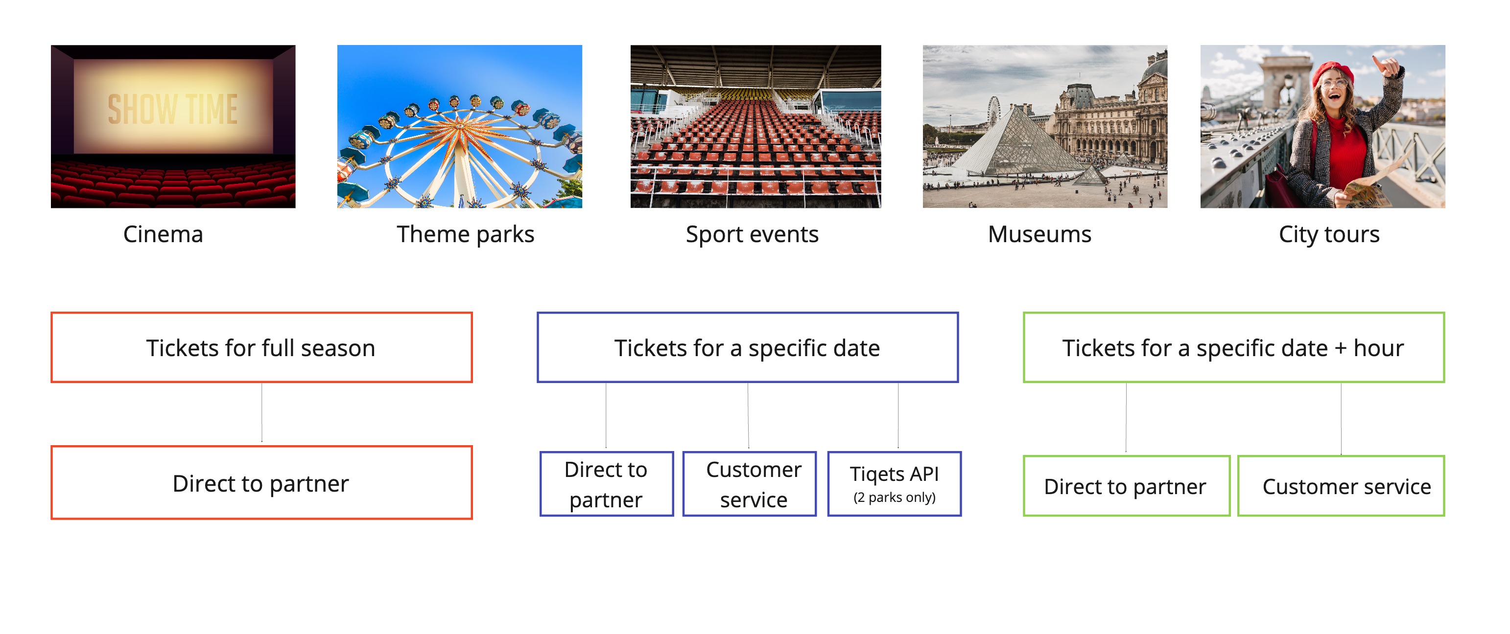
Online booking flow (2 parks only)

Proposed primary flow
The aim of this project was to bring the user from the activity details page to the confirmation page, enabling them to book a time and date while enticing them to upgrade along the way. So, based on internal research and competitor bench marking, I created the ideal flow.
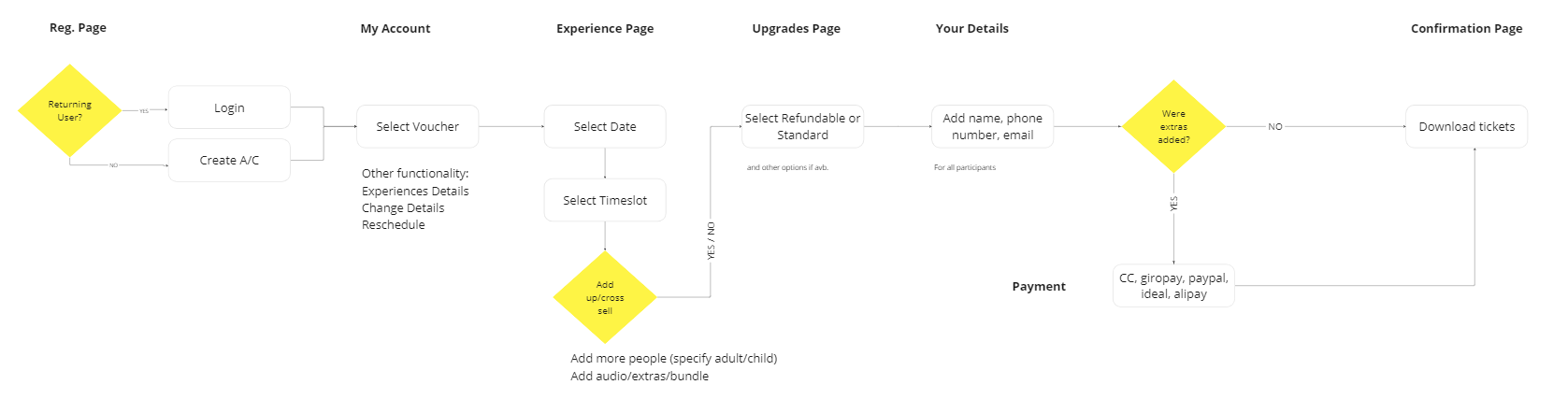
Proposed Booking Flow: Time/Date/People → Extras → Personal Info → Payment Confirmation
Key Features:
- Clear Cancellation/Refund Policies and USPs: Ensure policies and unique selling points are prominently displayed throughout the booking process.
- Sharing Options: Include options for users to easily share their bookings.
- Prioritized Date Selector: Focus on the date and time slot selectors, making them highly visible and user-friendly.
- Dynamic Calendar: Display different prices for different dates and automatically highlight the next available date.
- Suggested Extras/Add-ons: Recommend additional services or other experiences in the area.
- Optional Cancellation/Amendment: Provide an option for cancellation or amendments.
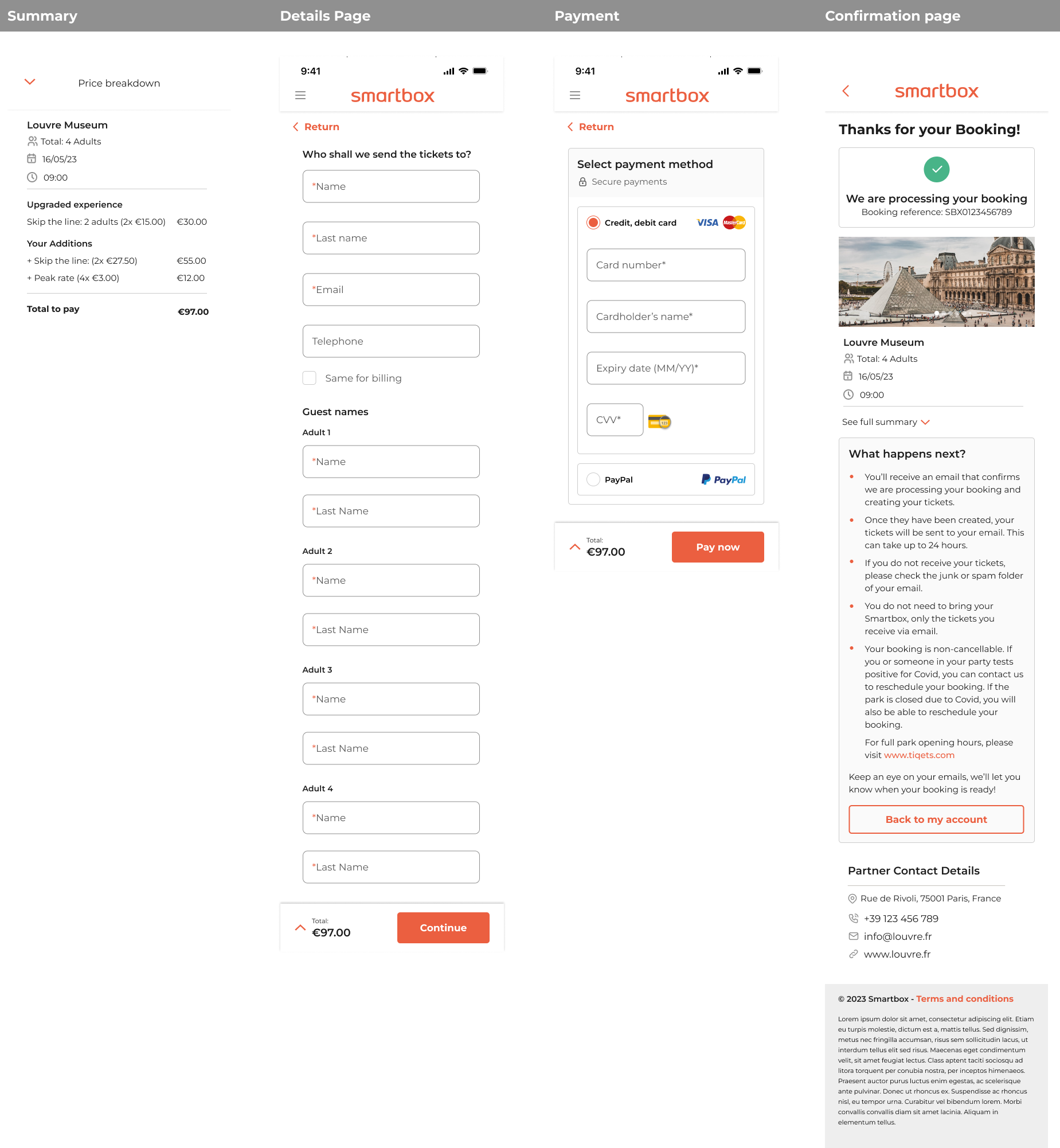
- Summary and Price Breakdown: Offer a clear summary and detailed price breakdown before finalizing the booking.
- Confirmation: Send confirmation details to the user’s account and email.
- Rescheduling Options: Allow users to reschedule and change details through their account.
Sketching it out
Once the flow was approved by the Product Owner, I began sketching. Starting at a high level, I created a broad overview to serve as a visual aid and foundation for developing the low-fidelity wireframes.
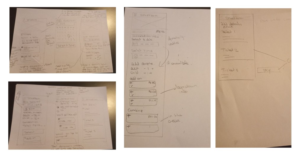
Lo-fi wireframes
The next step was to translate all my research and sketches into Figma, providing my Product Owner with a visual representation of my recommendations and rationales. Before moving on to the high-fidelity designs, we made a few necessary adjustments to the flow, but overall, it was ready to proceed to testing.

Stakeholders check-in: changes needed for hi-fi
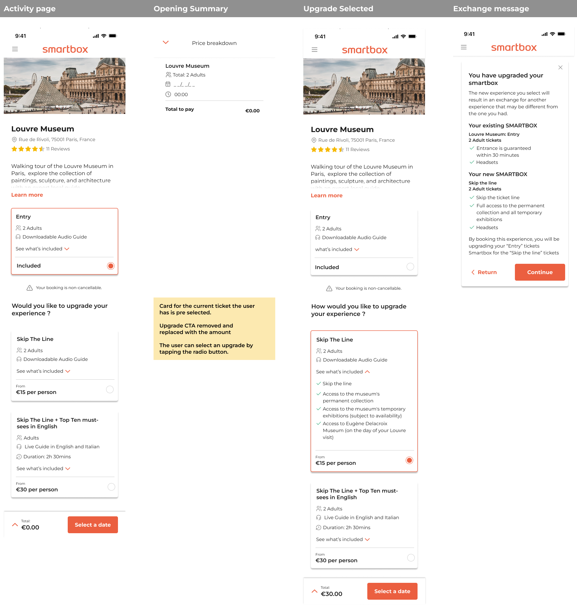
- Add pop-up modal after upgrade selection: After an upgrade is selected, introduce a pop-up modal that clearly explains the exchange process to the user.
- Include module overlay for price summary: Add a module overlay that provides a detailed price summary for better clarity and transparency.
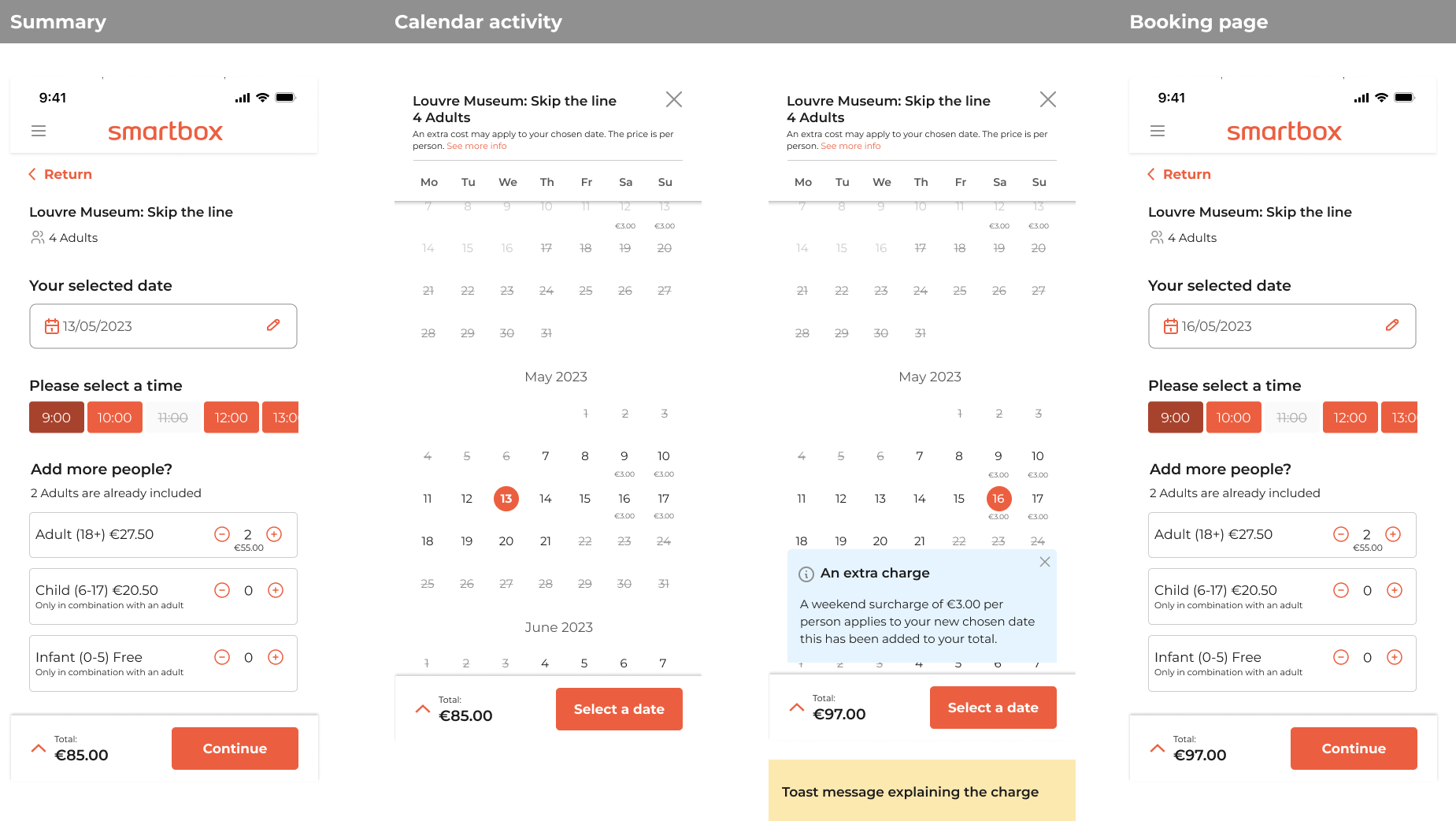
- Redo calendar as scrolling: Redesign the calendar to a scrolling format for improved usability, referencing the new calendar design in the CICO (check-in/check-out) system.
- Add surcharges on calendar with clear messaging: Display surcharges directly on the calendar and include clear, concise messaging to ensure users understand any additional costs.
- Provide further description on age ranges and cancellation: Enhance the descriptions related to age ranges and the cancellation policy to provide users with comprehensive information.
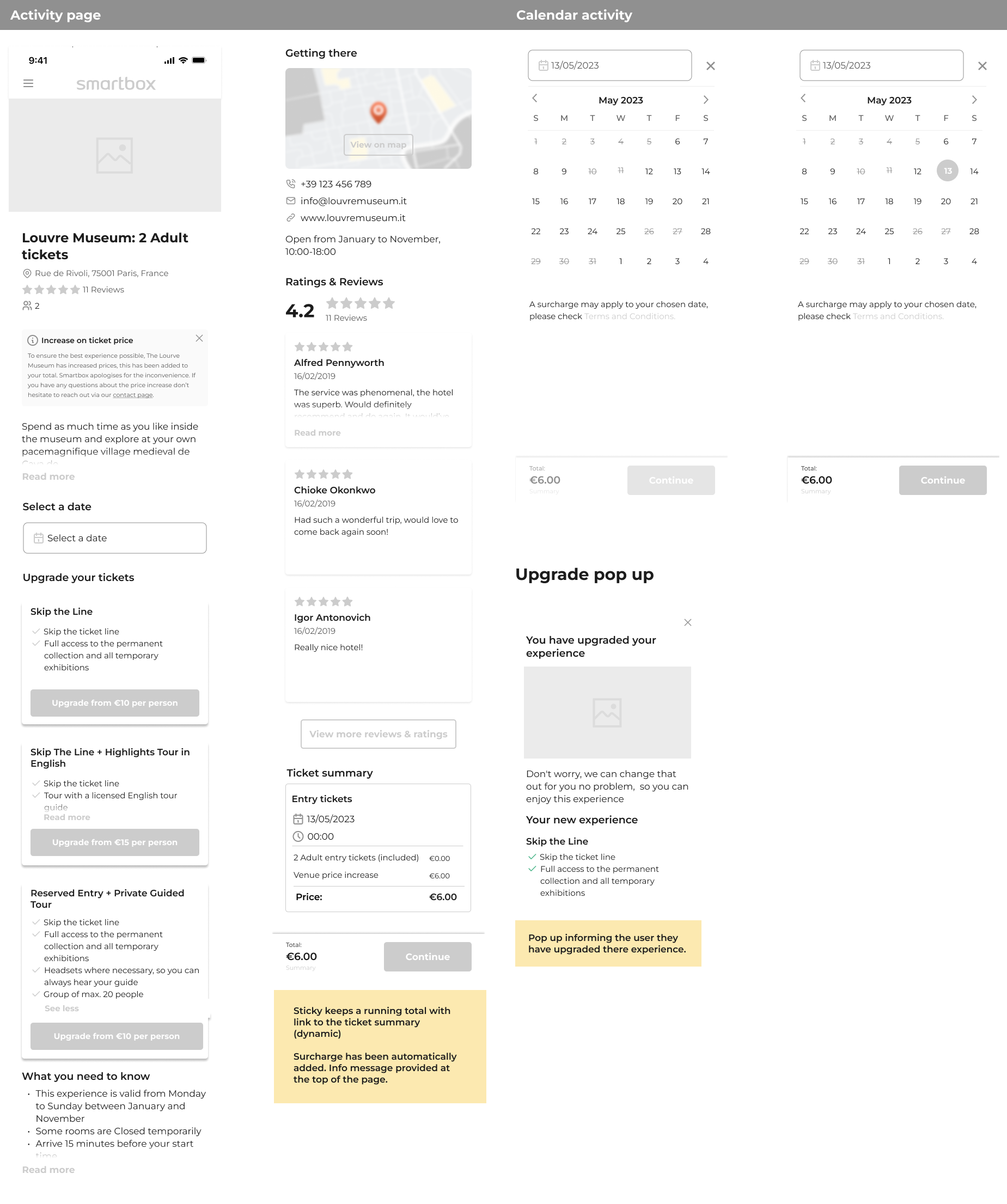
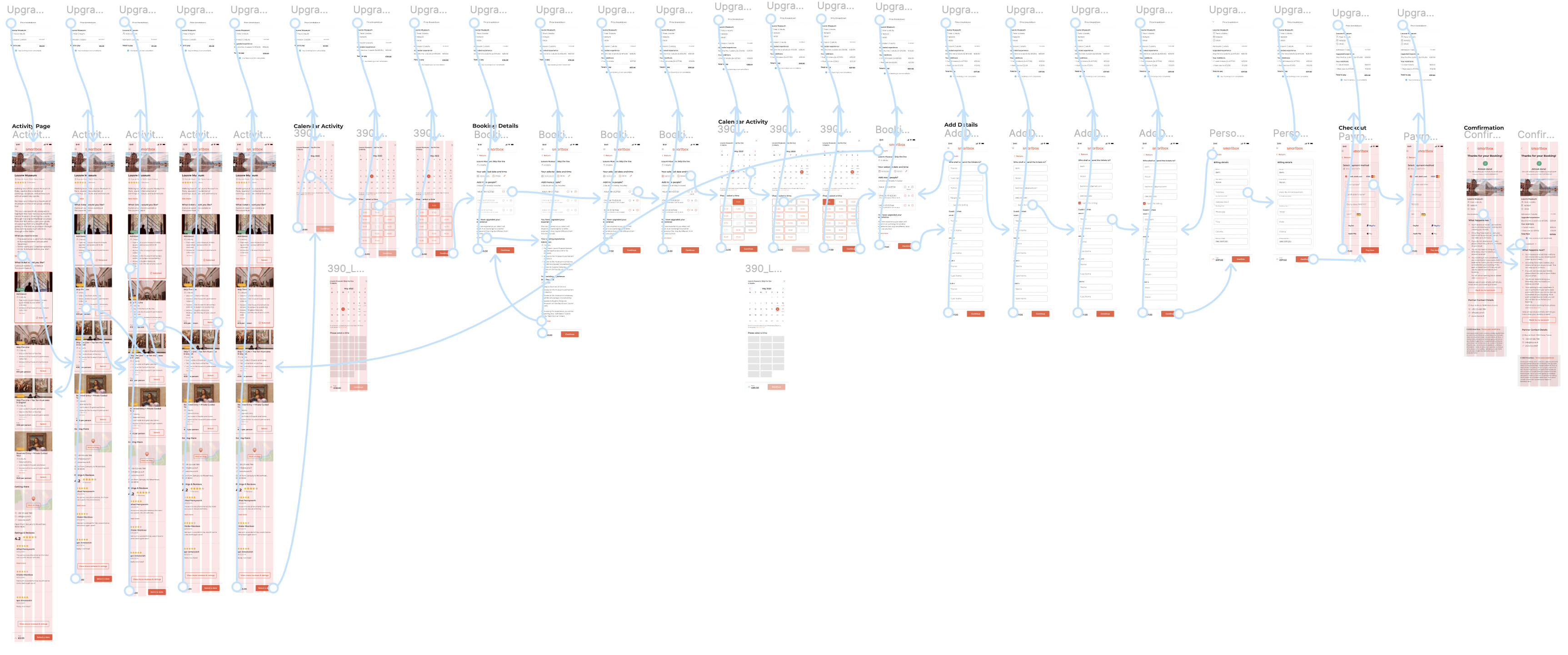
Hi-fi design testing
With the informational architecture and flow established from the low-fidelity wireframes, I moved on to creating detailed designs in Figma. These designs were then presented to the wider organization to ensure alignment with cross-functional teams and to prepare for user testing.

Stakeholder check-in: changes needed for testing
- Remove the cancellation options, as they are too complex from a system perspective.
- Remove the surcharge, as it might confuse the user.
- Create a first experience above upgrade options and show it as selected, e.g., Louvre Museum: Entry for 2 Adults.
Prototype: user testing round 1
Objective: This user testing round aimed to validate the usability of the high-fidelity designs, focusing on the informational architecture, the calendar and time selection, upgrade options, and the information provided in the price breakdown. The goal was to identify potential areas of confusion and gather feedback on the overall user experience. This testing sought to ensure that the features and design improvements aligned with user expectations.
Participants: 7 participants engaged in unmoderated testing.

Outcome: To improve the user experience based on the feedback received, the following changes will be implemented:
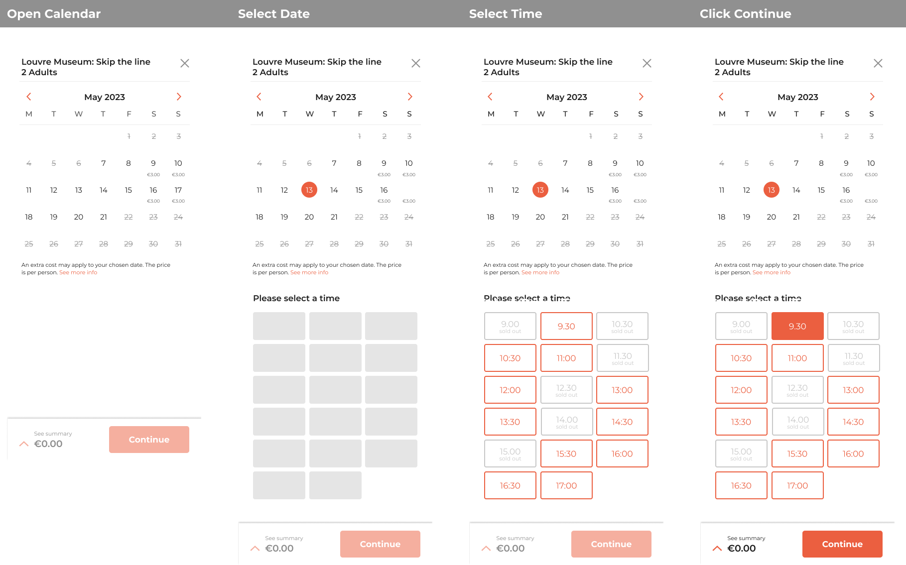
- Integrate Calendar and Time Selection:
- The calendar will include both date and time selection. Once a date is selected, the available time slots will appear, providing a more dynamic and intuitive user experience.
- Redesign Experience Cards:
- Experience cards will be redesigned to include images of the venue for both the current experience and upgrades. This visual enhancement will help users better understand what is included in their experience and the benefits of potential upgrades.
- Clarify Summary and Price Breakdown:
- More detailed information will be added to the summary and price breakdown sections, ensuring users clearly understand the costs and inclusions associated with their booking.
By addressing these issues, we aim to create a more seamless and user-friendly booking experience that meets user expectations and improves overall satisfaction.
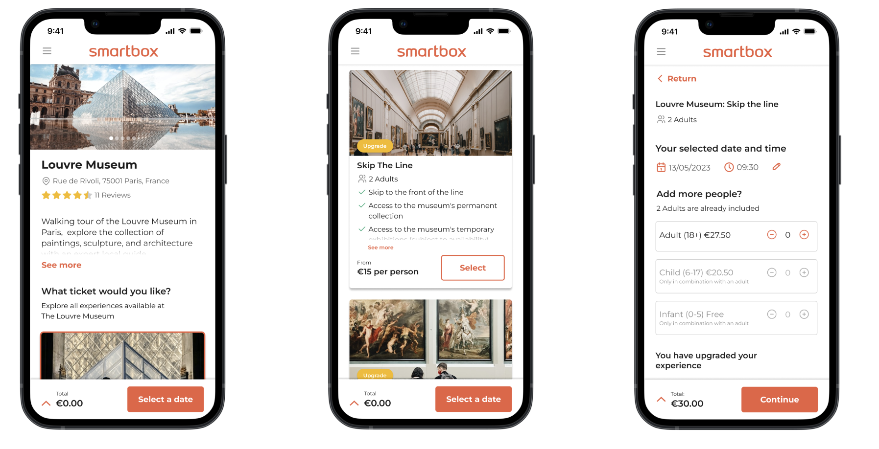
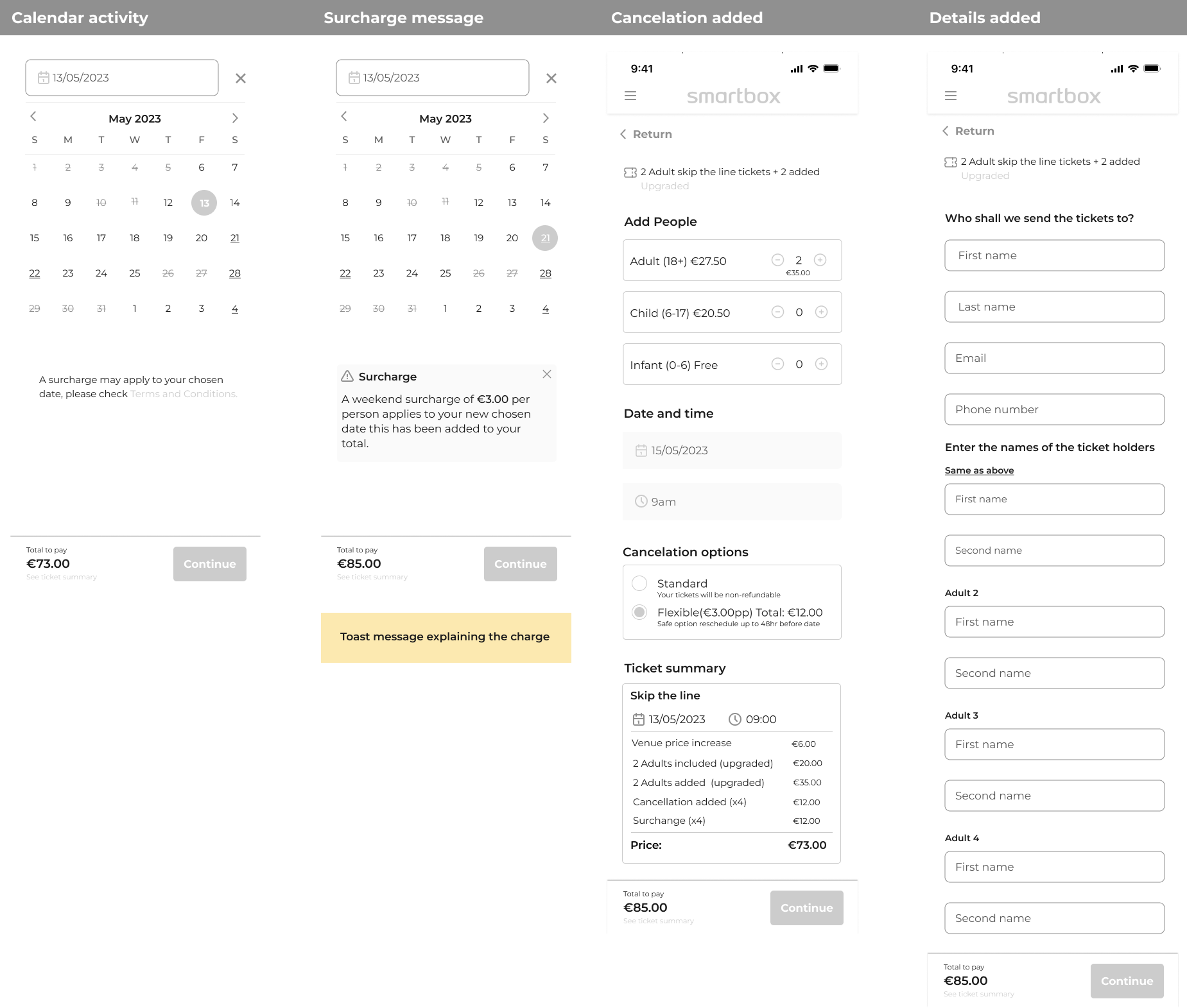
Calendar redesign
New calendar includes:
- Ticket information at the top: Display the name and number of tickets at the top of the calendar.
- Extra charge notice: Show a notice of any extra charges under the calendar.
- Month-by-month slider: Implement the calendar in a month-by-month slider format for easier navigation.
- Surcharges display: Indicate surcharges under the respective dates.
- Time slot availability: Show all time slots once a user selects a date. Display unavailable time slots at 50% opacity with a “sold out” label.
- Date change behavior: Reload time slots when the user selects a different date.
- Active state for selected time: Highlight the selected time slot in an active red state.
- Activation of continue button: Make the continue button active once both a date and time are selected, allowing the user to proceed to the next step.
Card redesign
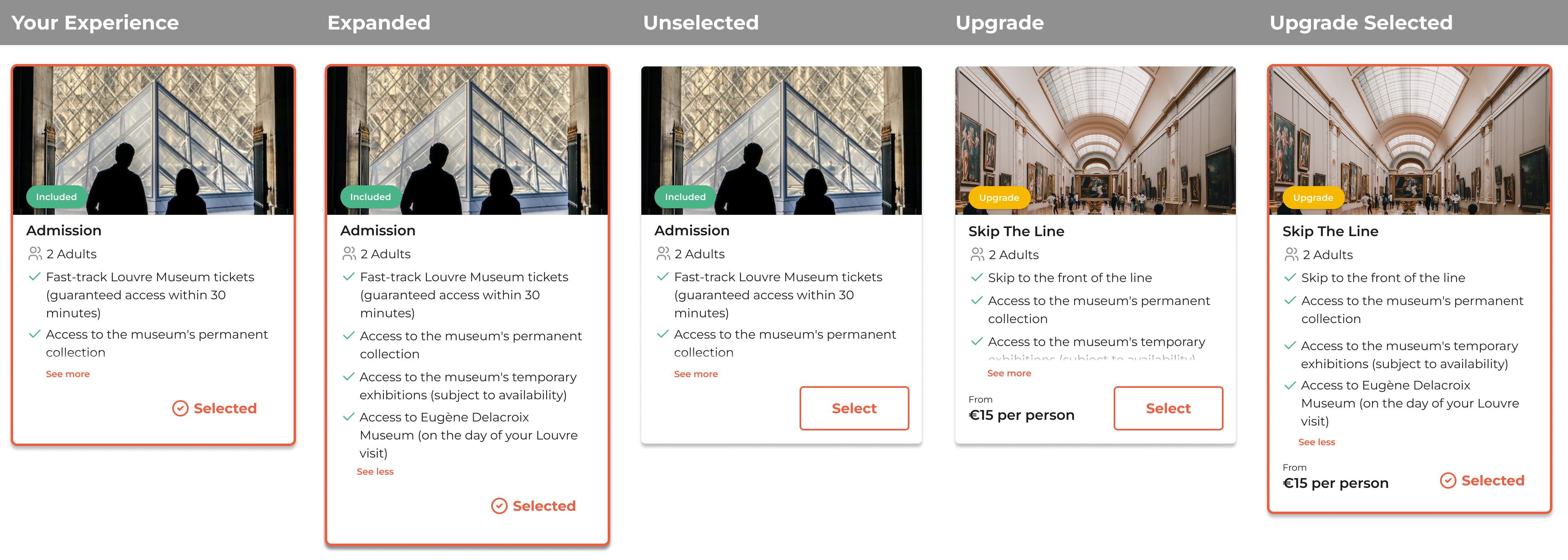
New experience card includes:
- Highlighting included experience:
- The included experience is highlighted with the Smartbox brand and marked with a tick to show it is selected.
- Clear “Included” indicator:
- A green pill labeled “Included” clearly indicates there is no extra cost for this option.
- Detailed view option:
- A chevron allows users to see more details about what’s included in their experience.
- Deselect and reselect option:
- If another experience is chosen, the card will deselect, but users can still reselect it with a CTA.
- Upgrade indicators:
- Upgrades are marked with a yellow pill labeled “Upgrade,” matching the Smartbox Plus branding. The price is clearly stated at the bottom, with a CTA labeled “Select.” Once selected, the card is highlighted, and the price is added to the total.
User testing round 2
Objective:
The objective of this user testing round was to validate the usability and effectiveness of the high-fidelity designs with the implementation of two new features: the integrated calendar and time selector, and the visual experience cards. The aim was to ensure that these features enhanced the user experience by making the process more intuitive and engaging, and to verify that users could effortlessly interact with the new elements and understand the available options and upgrades.
Outcome:
This user testing round was highly positive. Testers interacted with the new calendar and time selector effortlessly, with no issues in updating the date or time from the details page. The visual experience cards received positive feedback as well; the selected card was instantly recognizable, and upgrades were easily identified. The added images made the experience feel more real and engaging. Overall, the second round of testing confirmed that the new features significantly improved the user experience, aligning well with user expectations and needs.
The solution: final design
This prototype envisions the future of “Days Out,” demonstrating a seamless flow where beneficiaries can easily upgrade their admission tickets, book a date and time, and add friends along the way.
To ensure transparency, any additional charges from these add-ons are clearly displayed, with a live running total accessible at any point in the journey via the bottom sticky. This feature is designed to eliminate surprises at checkout.
Our goal is to enhance the overall Smartbox experience, thereby increasing Net Promoter Score (NPS) and Booking Value (BV) by delighting beneficiaries with these convenient and easy-to-use extras.
