World Vision: Donation Funnels

Project details
World Vision Ireland is part of World Vision International, the largest privately funded NGO in the world. The Irish office would be considered a small support office, and in 2019 joined a World Vision collective called World Vision United.
This collective provided a website template through Drupal along with updated branding and a certain amount of technical support. However, each support office had to populate and maintain their own countries website. With no permanent in-house person in the Irish office to do this, the website was only a shell. The website had menu pages instead of dropdown menus making content hard to find. Donation forms and checkouts were not keeping up with competitors, huge drop off were seen through Google Analytics and Hotjar.
This decision was made to redevelop on Umbraco. My job was to work with the Untied team and maximize the capabilities of this framework. Help design and implement features that are essential for the Irish market and could also be implemented in the other European countries.
The objective is to educate the Irish public about World Vision’s mission and inspire them to donate. This will ultimately contribute to the organization’s goal of boosting revenue, enabling them to continue their vital work assisting children and families in third-world countries.
Project took place from Feburary to December 2020.
Website went live in Jan 2021.
Updated and maintained until April 2022.
My Process

Discovery and Research:
Lead and conduct UX research to develop a deep understanding of World Vision Ireland, its user’s goals & needs and what the organisation’s needs are to achieve these goals.
Methodologies
Stakeholder Interviews
Usability Testing
Customer Survey
Competitor Analysis
Sketching + Wire-framing
Prototyping
Testing loops
Stakeholder Interviews
Some noteworthy user quotes that came up during my stakeholder interviews:
“People don’t know what we are about. We come across as blurred vision, I would like to see a section that tells the public who we are, what we do and where we do it.”
“With our last website and payment system, if the donor chose the direct debit option they were able to choose the date and frequency their donation would come out of their bank, we don’t have that option since we change to stripe. The money comes out of their account then (or up to 3 days ) and every month on that day thereafter.”
“We need to have a simple sign up process, our forms are fussy and have too many steps.”
Competitor Analysis
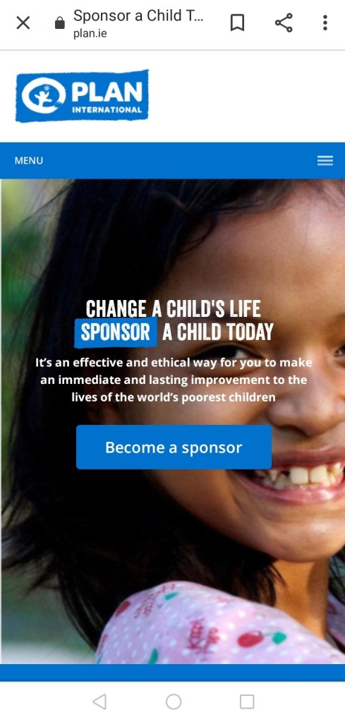
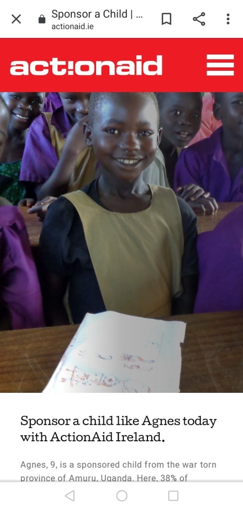

An extensive competitor analysis was conducted with 2 organisations directly related to child sponsorship: plan.ie and actionaid.ie, as well as one of the biggest NGO’s in Ireland Concern.net. I looked at how they told the story of the organisation, the donation process, information structure, navigation, layout, tone, and overall content.
I signed up for child sponsorship with Plan to really get an insight into their overall user journey.
Online Survey
In conjunction with the Charities Regulator of Ireland we conducted a survey to find out the top 3 types of information users want to see before donating to a charity organisation.
88% Want to know what donations are being used for
80% Want to know organisations recent accomplishments
77% Want to know the mission/ purpose/values of the organisation
Usability testing
Objective
The objective of this usability testing was to evaluate the user experience on the current site, focusing on three key areas:
- Signing up for the child sponsorship program.
- Making a one-time donation.
- Finding information about the organization’s mission and policies.
For these key areas I created 3 different test scenarios
Scenario 1: You are visiting a friend and they tell you about World Vision’s sponsor a child program. You are really impressed about the information updates your friend has received, and how the child has benefited through the program. You think it’s a great cause and would like to get involved.
Scenario 2: World vision Ireland have launched an appeal to help children with education in worn torn Syria. You see a sponsored Facebook ad on the appeal and feel compelled to make a once off donation.
Scenario 3: You want to start donating to a charity and want to find out more about world vision Ireland.
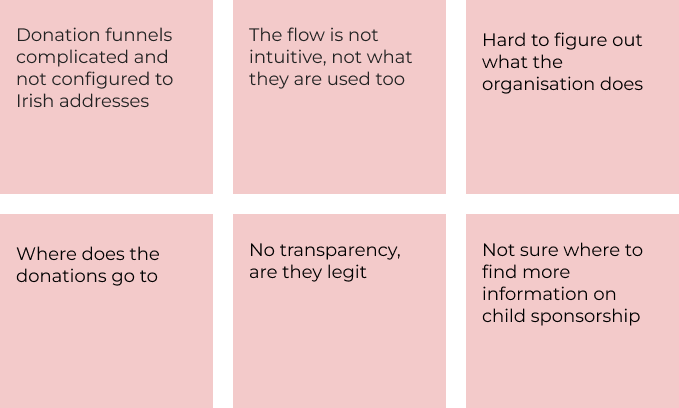
Key findings: The usability testing revealed several pain points experienced by users in each scenario. These insights highlighted specific areas needing improvement to enhance the overall user experience on the site.
Pain Points
Goals
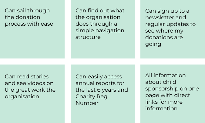
User Persona’s
The research so far enabled me to create two user personas which I felt crucial in ensuring the effectiveness and relevance of the sites features. Firstly, by developing personas, I could humanize our target audience, gaining insights into their demographics, behaviours, needs, and goals. Secondly, having multiple personas allowed me to explore various user journeys and scenarios comprehensively.


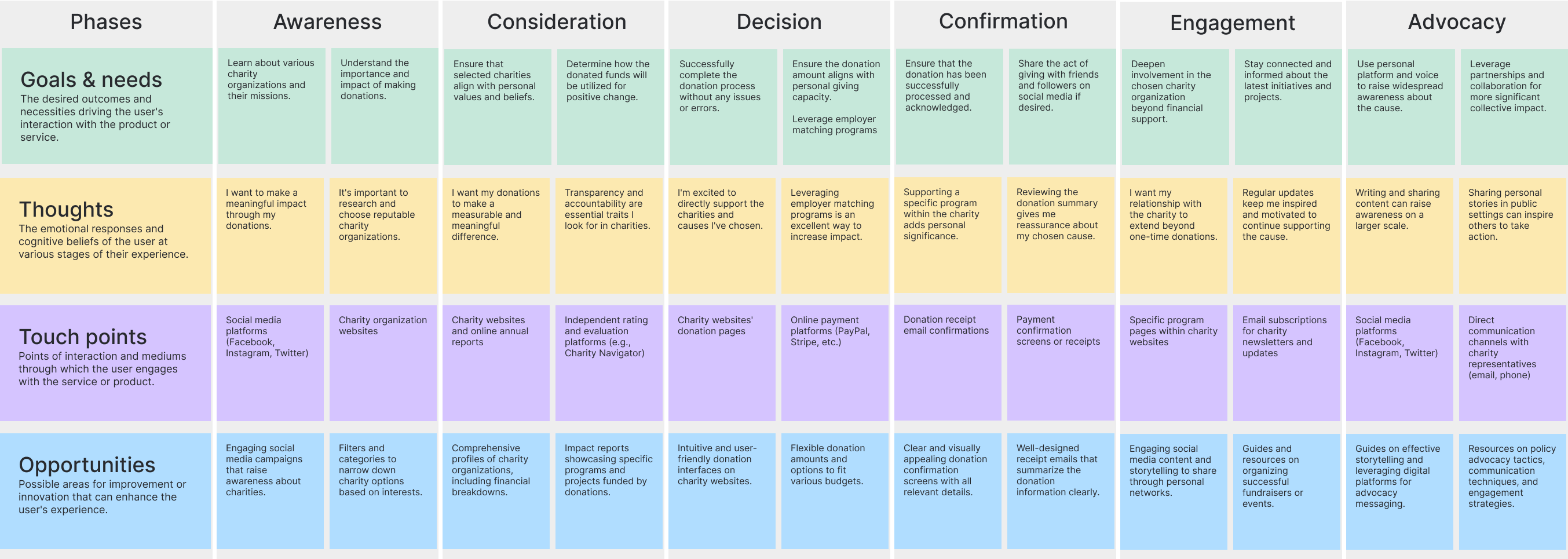
Donor Journey
Creating a donor journey was an essential step for me to see how to guide potential supporters through a meaningful and engaging experience. By mapping out the steps a donor might take from initial awareness to becoming a dedicated contributor, I can better understand their motivations, concerns, and needs at each stage. This insight will enable me to tailor the website’s content, design, and functionality to effectively address these factors, fostering trust, connection, and ultimately, encouraging action.
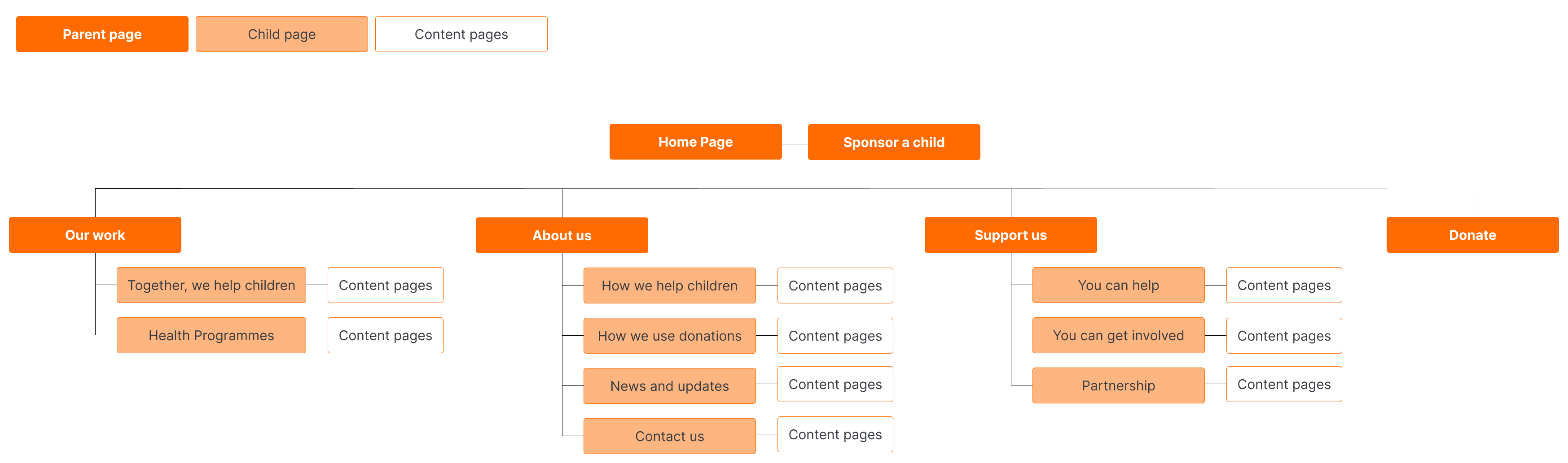
Information architecture
I designed a navigation Information Architecture to enhance trust and simplify the donation process. I structured the site for easy access to stories showcasing the impact of donations and financial transparency. By implementing clear donation pathways and straightforward steps, my goal was to make supporting the charity effortless and rewarding. This new design was intuitive to the user and in line with competitors.
Testing
World Vision Ireland possesses a vast database of supporters whom we are always keen to assist. Testing sessions were held at our Rathmines offices, where users were assigned the task of organizing information based on its importance to them. This step was crucial in my process to address usability issues encountered in previous tests on the old live site
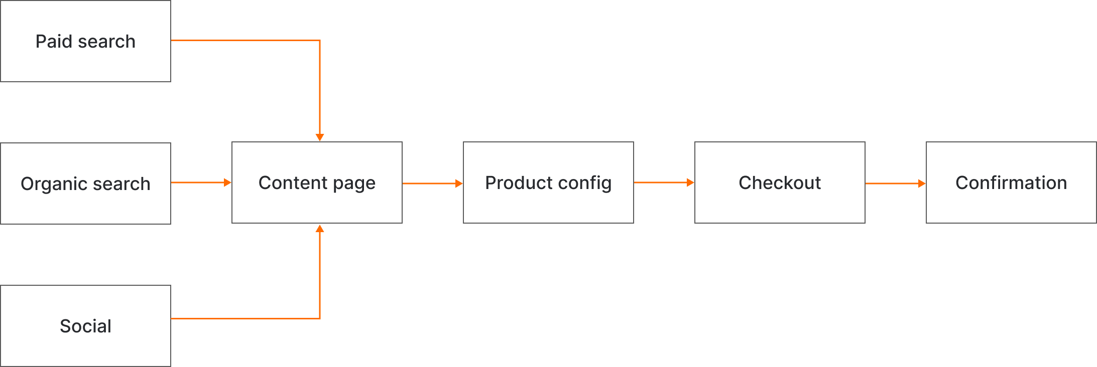
User Flow Diagram
I created a User Flow Diagram for the donation funnel on the charity website to streamline the donation process and maximise conversion rates. This diagram helps visualise the steps users take from landing on the website to completing a donation, ensuring a smooth and intuitive experience. By mapping out the user journey, I aimed to identify potential bottlenecks and optimise the flow to encourage more donations.
Donation forms
Time to sketch! At this stage, we’ve mapped out and tested the Information Architecture (IA) to find the most effective route to guide users to the donation page. Myself and two other World Vision Ireland staff members started sketching at a broad level, drawing inspiration from the competitor analysis we conducted. This stage is truly exciting because innovative ideas naturally emerge, bridging the gap to the next stage of wireframes.
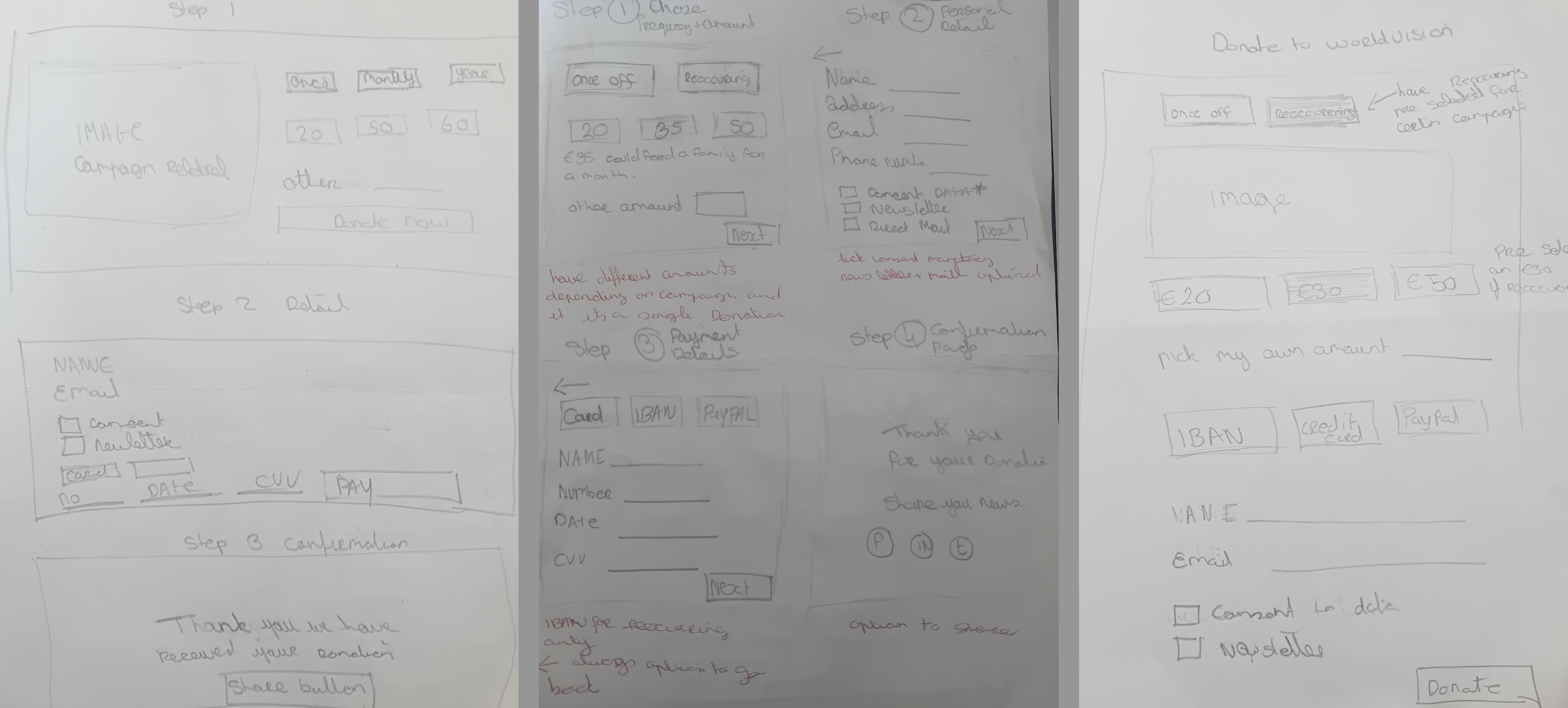
Lo-fi wireframe testing
The objective of the wireframe testing was to evaluate the effectiveness of the step-by-step/wizard form approach, which breaks down complex processes into manageable stages. This testing aimed to ensure that the design guided users smoothly through each interaction stage and to identify any market-specific adjustments needed before transitioning to high-fidelity designs
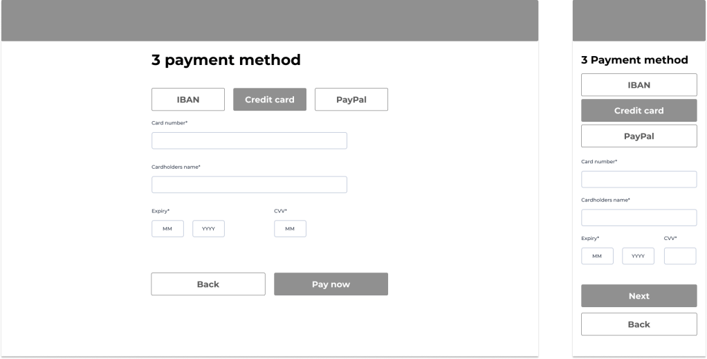
Outcome: Following the initial A/B testing, the decision was made to move forward with the step-by-step/wizard form design. Testing was conducted internationally, with a focus on the step process. During this phase, several adjustments were identified for the Irish market:
- Content and opt-in marketing needed to be more precise.
- The address field required reconfiguration.
- Payment methods needed to be tailored to Ireland.
After implementing these changes, additional testing confirmed that the designs were intuitive and user-friendly for Irish users, paving the way for the transition to high-fidelity designs.
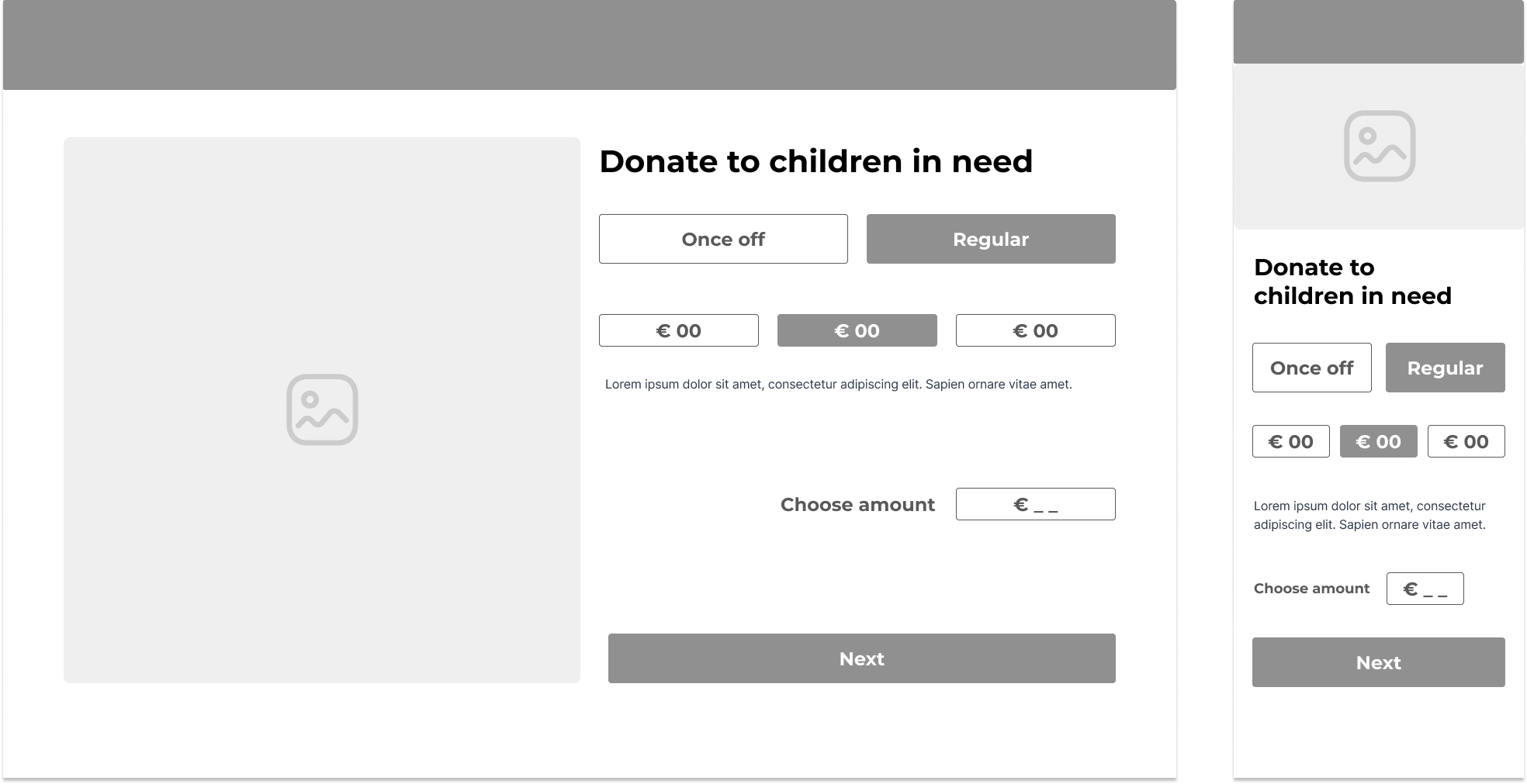
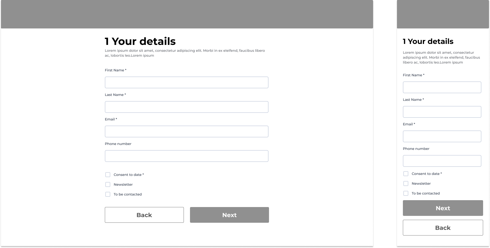
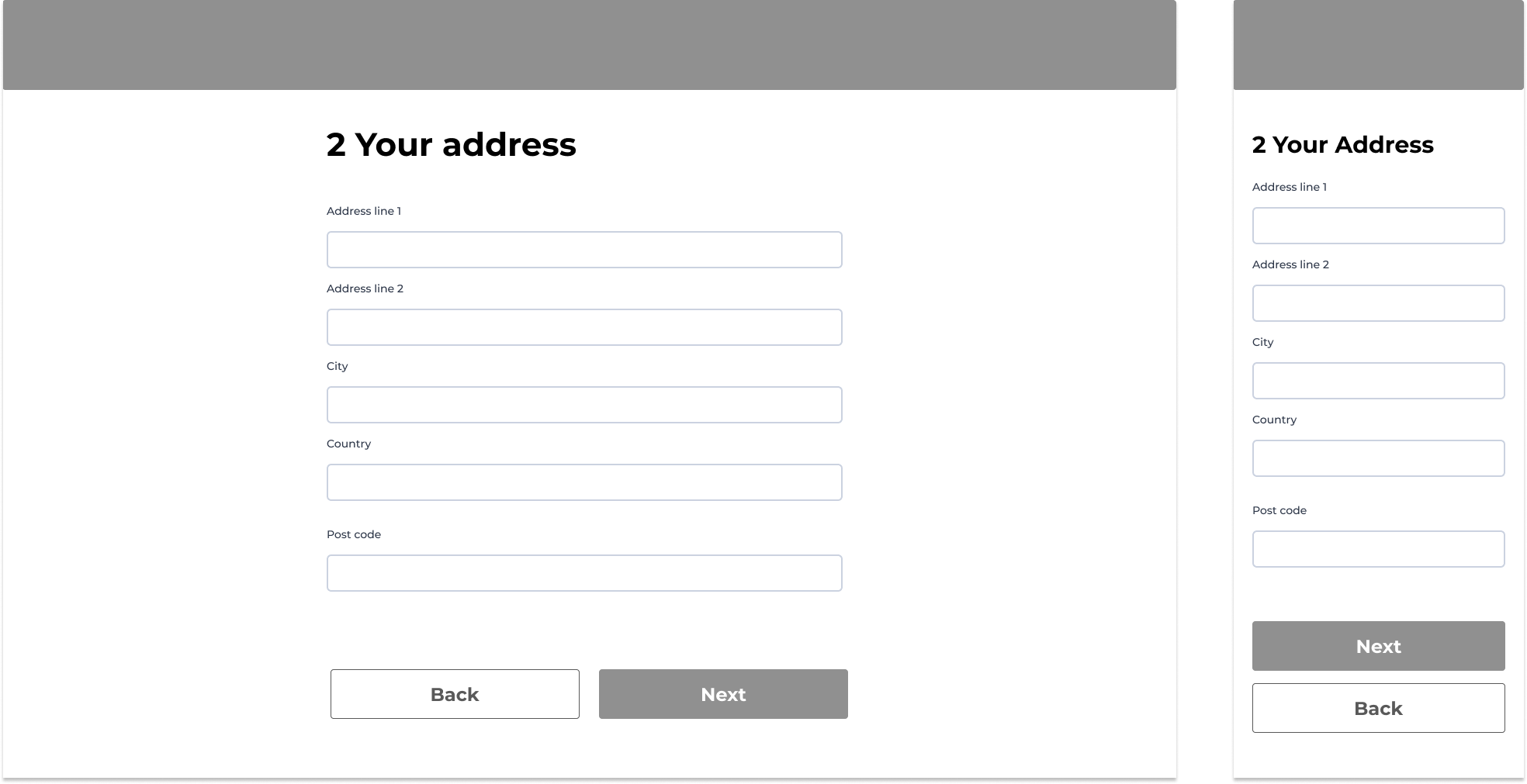
Hi-fi testing
The objective of the hi-fi testing was to evaluate the functionality and user engagement of the new donation form. The form was designed to be customizable for different campaigns, with dynamic interactive elements to enhance user experience and engagement. The testing aimed to ensure that the step-by-step process was intuitive, to determine user preference between static and interactive elements, and to optimize the donation process by testing various design configurations.
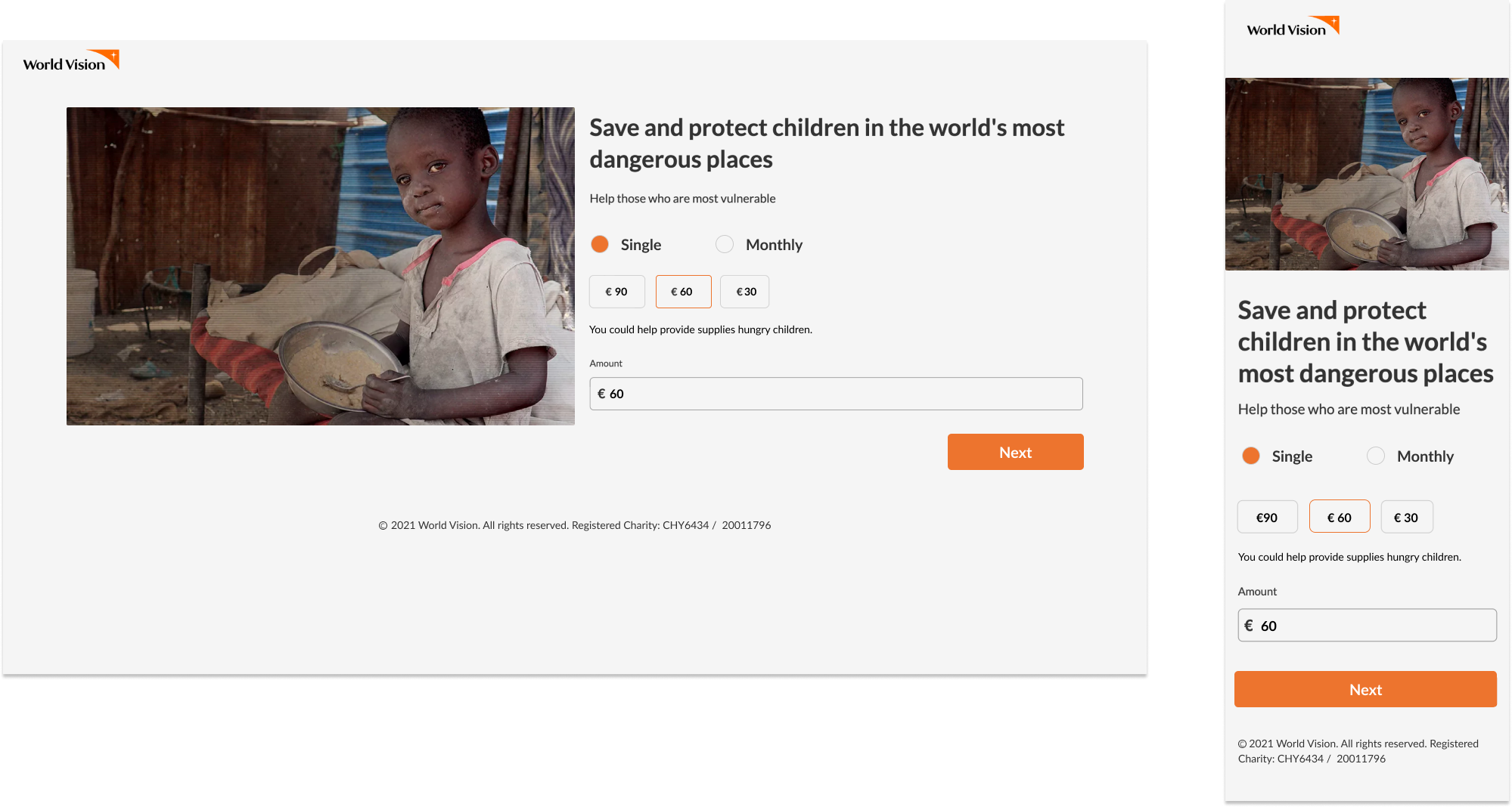

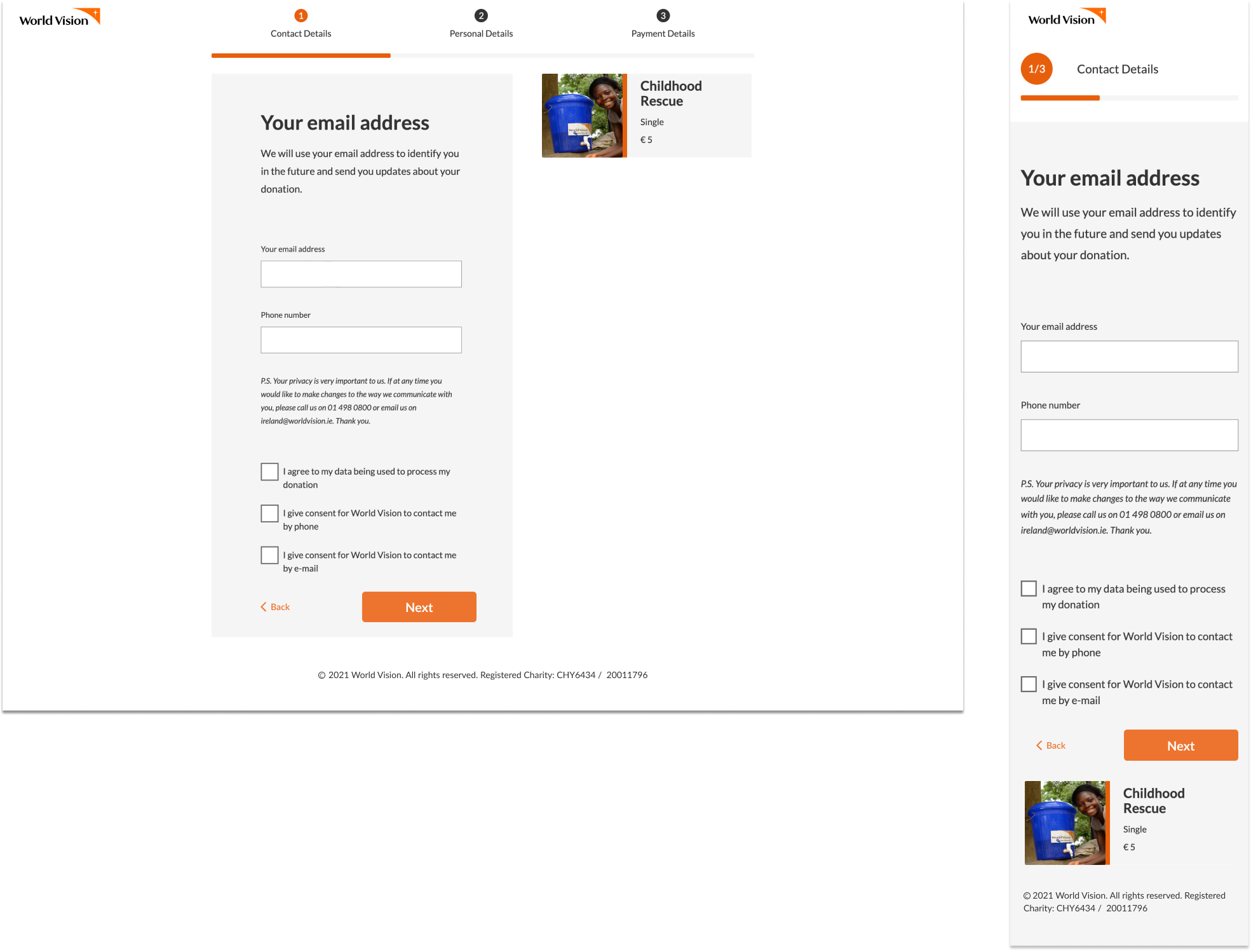
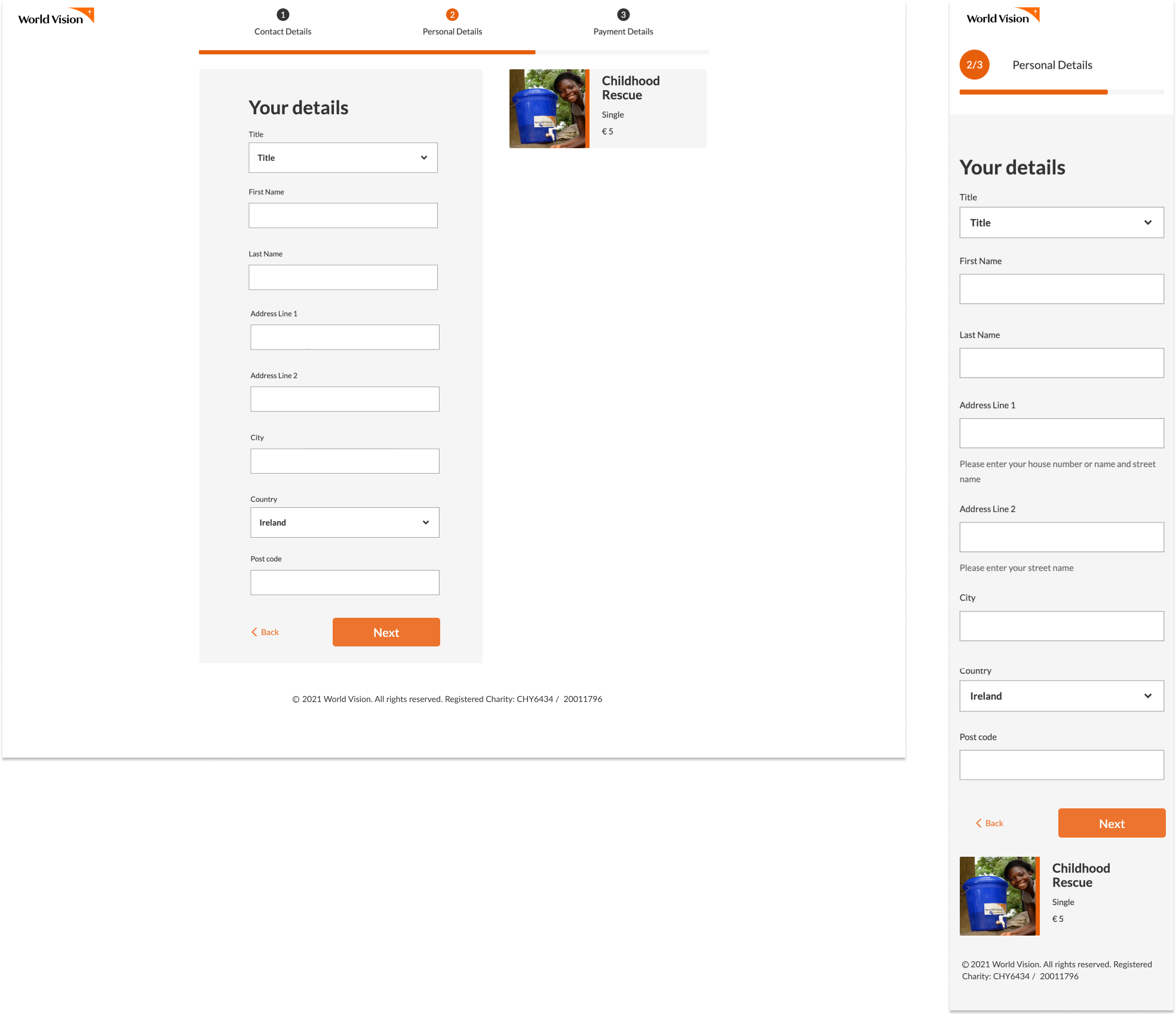
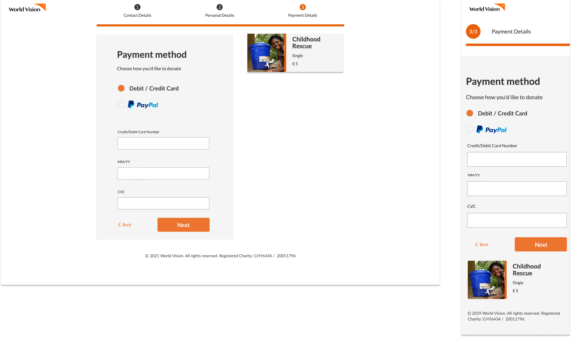

Outcome: Extensive country-level testing of the hi-fi prototype validated the effectiveness of the step-by-step process and flow, confirming that it was intuitive for users. Preference tests showed a strong user inclination towards interactive elements over static images and wording. Users were more engaged and motivated to donate when interactive images and messages highlighted the impact of their contributions.
A/B testing revealed that removing the header from the donation form led to fewer drop-offs, streamlining the process and reducing distractions. Additionally, testing the preselection of donation amounts demonstrated that the “high to low” approach was the most effective in encouraging donations. These findings guided final adjustments to optimize the donation experience before launch..
Birthday card product
Lo-fi wireframe testing: The objective of the lo-fi wireframe testing was to evaluate the integration of interactive features, such as images and messaging, into the card product design. This integration aimed to enhance user engagement while also exploring the feasibility of internally managing features previously outsourced, potentially reducing overhead costs. The testing sought to ensure that the functionality met user expectations and to identify any issues related to additional payments or user experience.
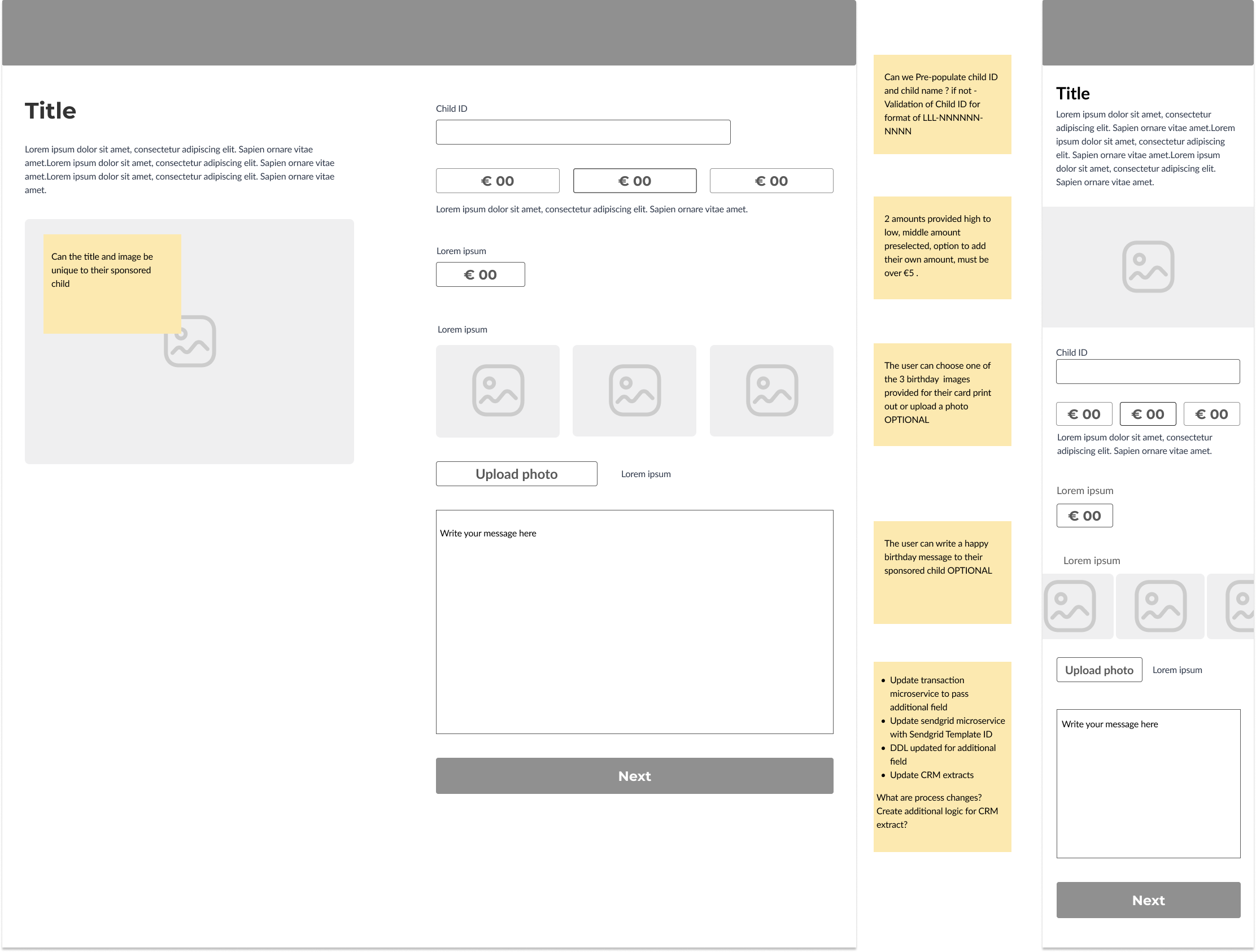
Outcome: During extensive system-level testing, it became clear that achieving the desired interactive functionality—similar to the donation forms—was not feasible due to the complexity and variability of managing child sponsorship programs across multiple countries.
Testing with users revealed that many were confused about locating the child ID, and those who found it considered the process cumbersome. As a result, users suggested that the child ID should be included by default on the form to simplify the process. This feedback highlighted the need for adjustments to improve user experience and streamline the integration of interactive features into the card product design.
Process flow
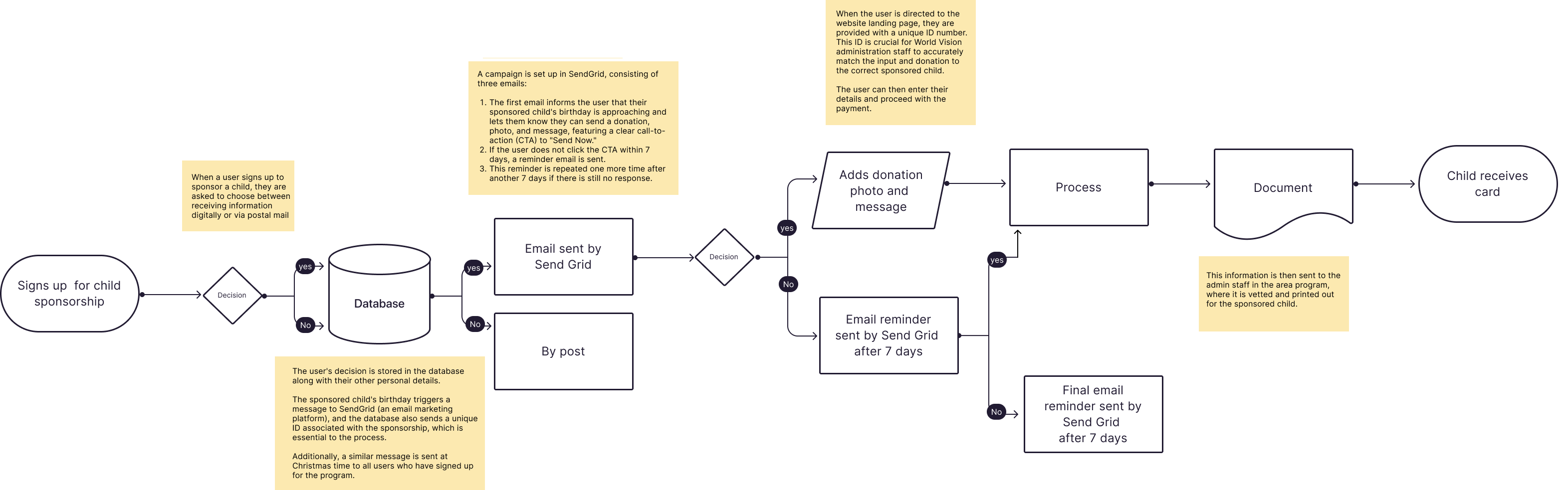
Prototype testing
Objective: The objective of the hi-fi testing was to evaluate the functionality and user experience of the new digital donation process. This involved testing the flow from receiving an email with a personalized link to making a donation, uploading a message, and writing to a sponsored child. The goal was to ensure the process was intuitive and effective, ultimately saving time and reducing costs compared to manual posting.
.
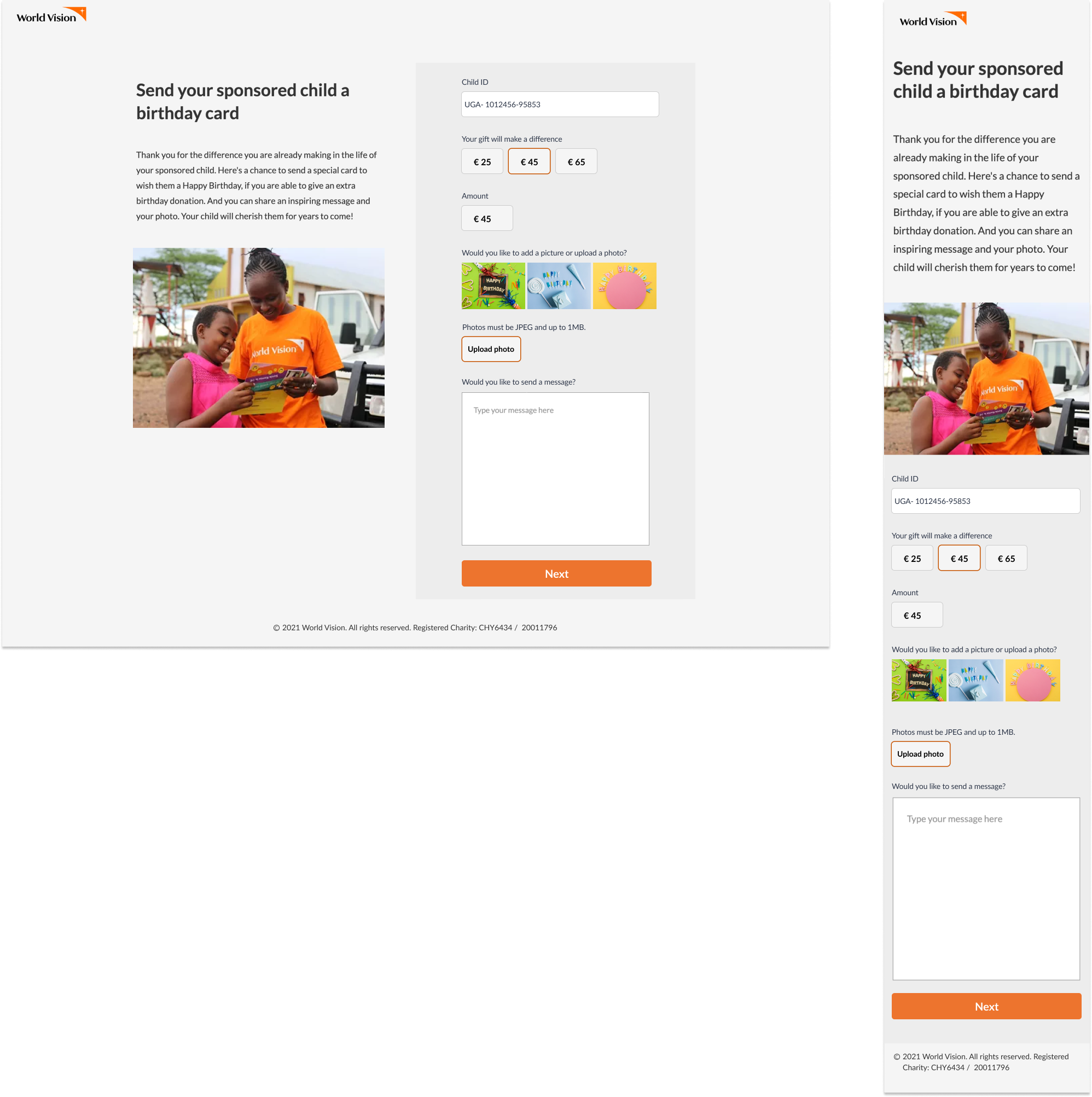
Outcome: Two rounds of prototype testing confirmed that the donation flow was intuitive, with only minor adjustments needed for wording. Comprehensive QA testing verified that the product functioned correctly and that communication and updates were seamless across all systems.
After the product launch, A/B testing on donation variations showed that removing the word “optional” next to photo and message inputs led to an 80% increase in users uploading or inputting a message. Given the importance of messages from sponsors, we decided to remove the word “optional” to encourage more user engagement and enhance the overall impact of the donation process.
The solution
This fully functioning e-commerce website features two clear donation funnels and a well-designed information architecture that educates visitors on World Vision Ireland’s work, enticing them to support its mission.
Impact of the Project:
- The new e-commerce website for World Vision Ireland led to an increase in user engagement, as visitors now have access to comprehensive information and impactful stories that educate and inspire support for the organization’s mission.
- The prominently featured Sponsor a Child program on the homepage resulted in a rise in sponsorships, directly contributing to the organization’s outreach and impact in the developing world.
- The introduction of the Birthday/Christmas card product not only fostered deeper connections between sponsors and children but also generated additional yearly donations, boosting overall fundraising efforts.
