EmotionsBite App
Project details
EmotionsBite is a self-tracking app designed to support individuals struggling with emotional eating and those seeking a more mindful relationship with food. While most food apps focus on calorie counting or weight loss, they rarely address the emotional triggers behind eating behaviors. My research revealed a clear gap: users wanted tools that helped them reflect on why they were eating, not just what they were eating.
In response, I designed EmotionsBite as a supportive, non-judgmental space that combines meal, mood, and thought logging with mindfulness resources. The app encourages self-awareness, stress regulation, and healthier habits without restrictive tracking. The long-term vision is to integrate AI-driven insights, recipe suggestions, and a support network to provide personalized guidance in a safe and compassionate way.
- Phase 1 (MVP): Food and mood logging, daily emotion check-in, and mindfulness resources.
- Phase 2: AI-driven insights and recommendations, meal planning, and recipe features.
- Phase 3: Support network functionality, data export, and extended personalization features.
Team
Myself: Founder, Lead UX/UI Designer and trainee Flutterflow developer
Support & Advisors:
- Psychiatrist: guidance on language, safety, and user wellbeing.
- Dietitian: evidence-based input on mindful eating and nutrition content.
- FlutterFlow coach: technical mentorship on app architecture and component logic.
Design: Ongoing (Initial MVP build started May 2025)
Build and Implementation: With the support of a developer, I built the solution in FlutterFlow and connected the front-end components with Firebase to enable real data flow. This collaboration ensured the final product was both functional and user-friendly, while staying true to the design vision.
The Double Diamond approach
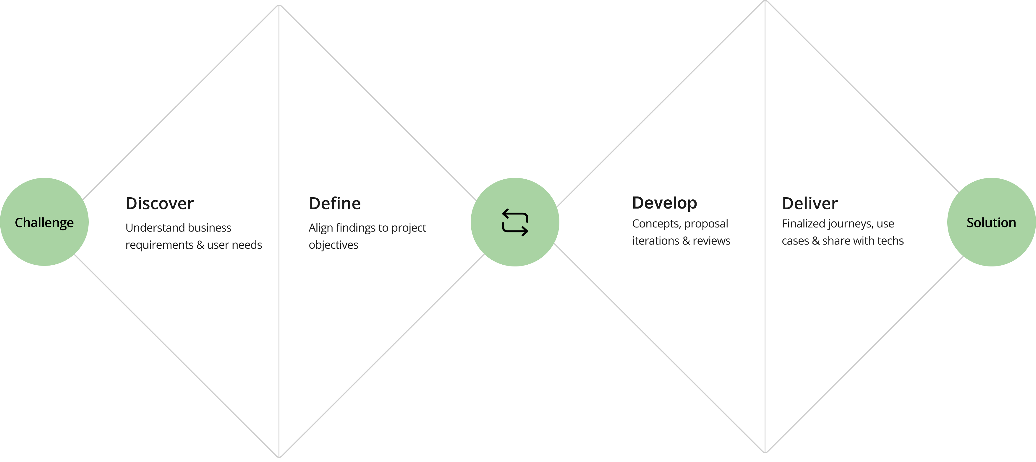
I applied the Double Diamond approach for EmotionsBite to tackle the complex nature of emotional eating. This process helped me explore widely through research, define the core challenges, and then iterate and refine solutions. It ensured that the app’s features, like logging, planning, awareness tracking, and mindfulness support were grounded in user needs and evidence-based insights.
User research
In the early exploration phase, I focused on understanding the lived experiences of people struggling with emotional eating. Through a mix of informal interviews, desk research, and analyzing existing forums and articles, I uncovered recurring themes of frustration, guilt, and the lack of supportive tools.
Interview participants highlighted how calorie-tracking apps rarely address the emotional side of eating. As one person noted, “I’ve tried calorie-counting apps, but they don’t address the emotional side. I want something that helps me understand the why behind my choices.” Others described stress or boredom as common triggers for mindless eating, while several mentioned feelings of guilt afterward. These insights guided key design decisions: logging emotions alongside meals, and using a non-judgmental, supportive tone.
Emotional Eating Cycle
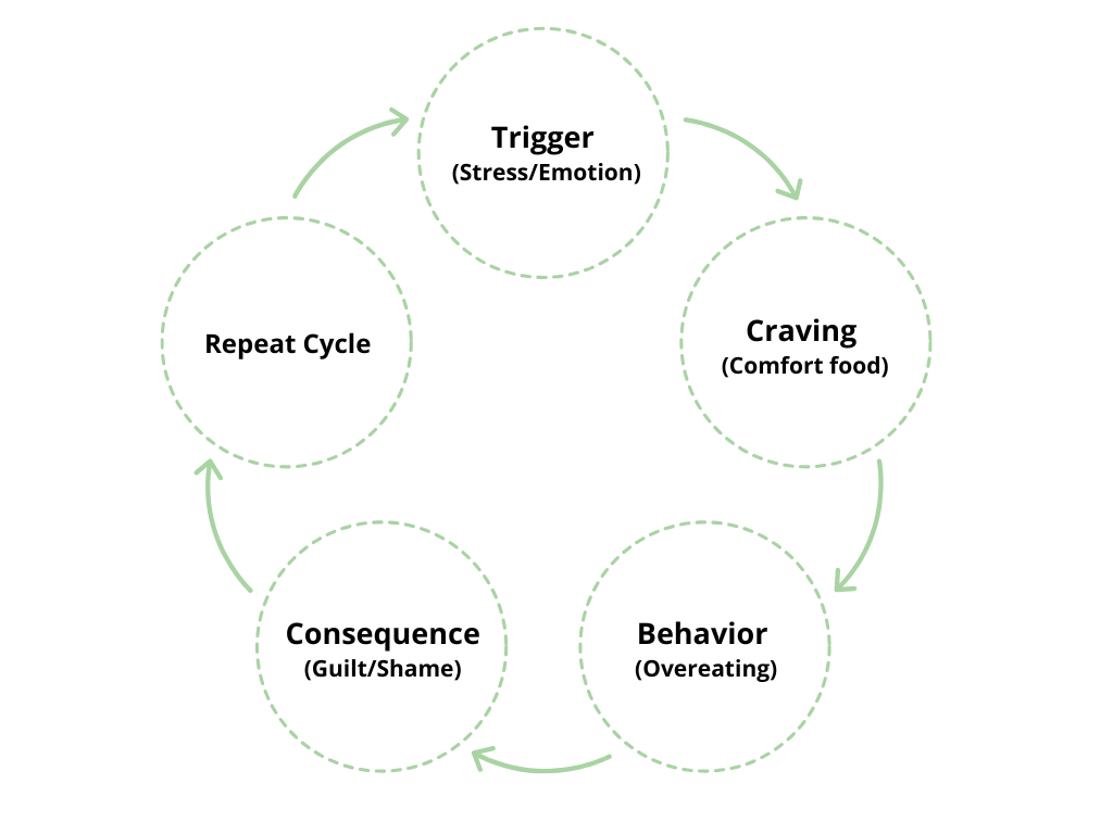
Food–Mood Loop
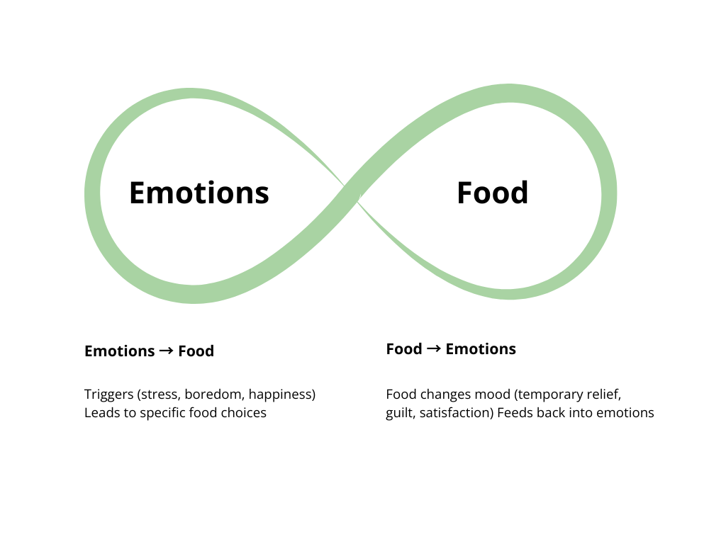
The aim of the EmotionsBite app is to break these cycles with awareness, tracking, and mindfulness support.
To validate these findings, I conducted a survey with 30 participants. Results showed that while only 17% tracked daily, over 60% tracked occasionally or weekly, confirming the need for flexible logging supported by reminders. Daily food + mood records were rated as the most appealing feature, and participants also requested mindfulness tools and weekly pattern insights. Subscription pricing in the €4–6 range received the strongest support.
Together, the interviews and survey results confirmed the opportunity for EmotionsBite to move beyond calorie obsession and instead prioritize emotional awareness, self-reflection, and compassionate design.
Market research
The wellness and food-tracking app market is crowded with tools for eating disorder recovery, general mindfulness, or calorie and fitness tracking. While effective in their niches, they leave a gap for users seeking gentle, everyday support with emotional eating and food–mood awareness. Out of the many apps I tested, I’ve highlighted four here with a brief summary of their key features.
Recovery Record: Eating Disorder
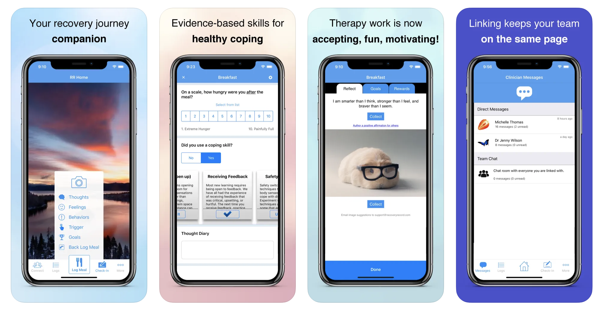
- Focus: Partnered with clinicians to support eating disorder recovery.
- Features: Food diary, mood tracking, goals, secure sharing with therapists.
- Strengths: Evidence-based; integrates into professional treatment plans.
- Limitations: Aimed at recovery patients; not designed for everyday emotional eaters.
Headspace: Mindfulness
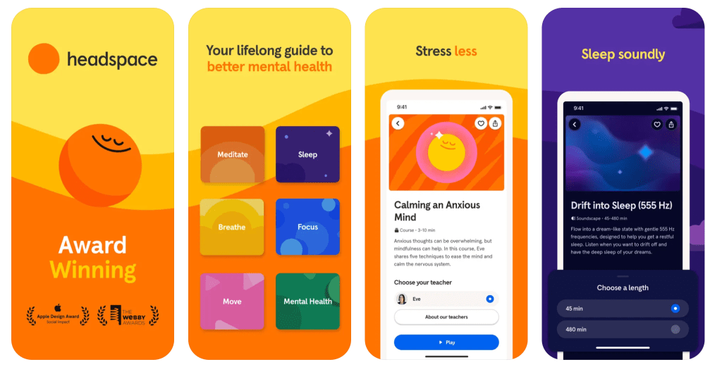
- Focus: General mindfulness, meditation, and stress relief.
- Features: Guided meditations, sleep support, breathing practices.
- Strengths: Well-known, trusted, beautifully designed.
- Limitations: Mindful eating is a very small part; no food/mood tracking integration.
MyFitnessPal: Fitness/diet
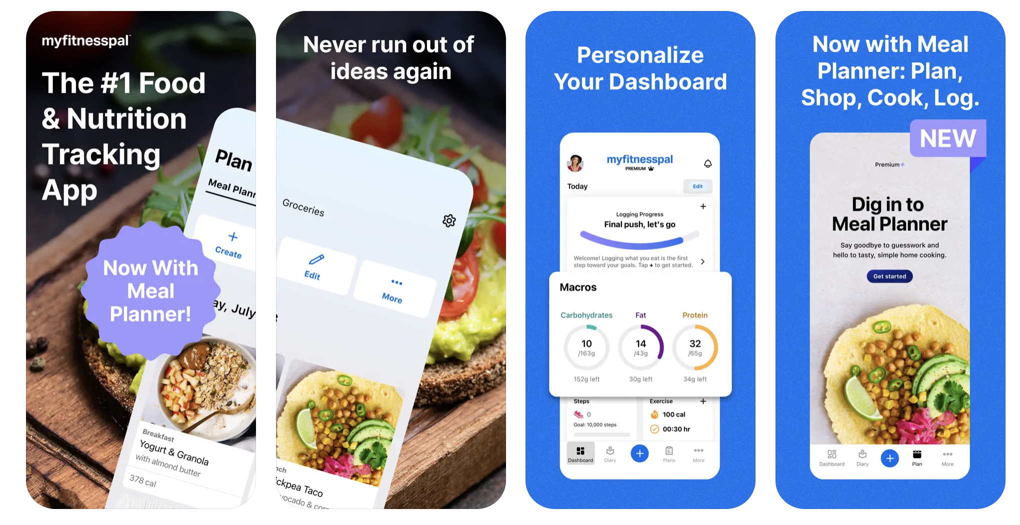
- Focus: Calorie counting, nutrition, and fitness tracking.
- Features: Massive food database, calorie/macro tracking, exercise logs, community forums.
- Strengths: Market leader; powerful for weight management and fitness goals.
- Limitations: Heavy focus on calorie restriction; can reinforce diet culture. Offers little support for the emotional side of eating.
MindDoc: Mental Health Support
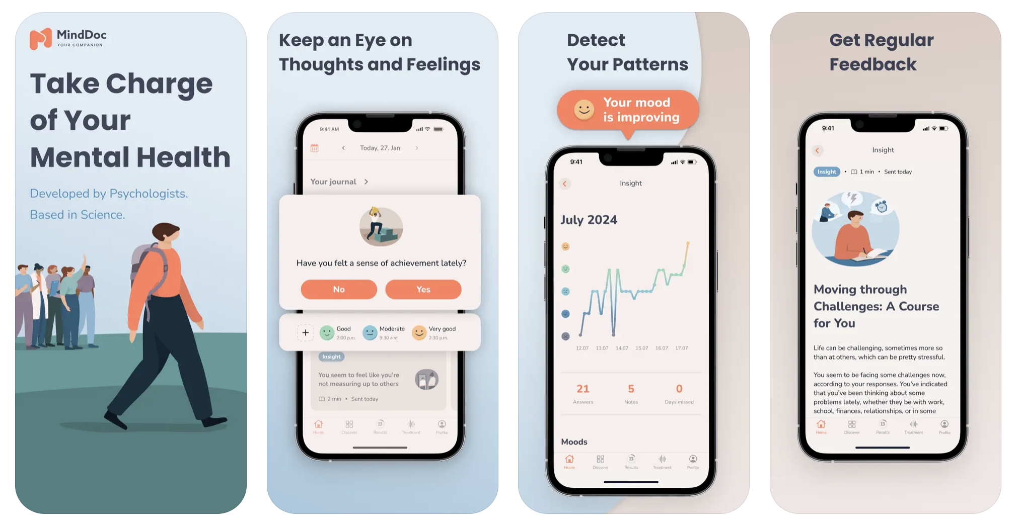
- Focus: Mental health check-ins and emotional awareness.
- Features: Daily mood reflections, mental health assessments, exercises for anxiety/depression.
- Strengths: Excellent for emotional awareness; sleek, engaging design.
- Limitations: Not food-focused; emotional eating not addressed directly.
Key Market Gap
- Eating disorder apps → too clinical and therapist-driven
- Mindfulness apps → barely touch eating
- Fitness apps like MyFitnessPal → focus narrowly on calories, not emotions
EmotionsBite’s am is to fill this gap with a gentle, non-diet approach that blends food & mood tracking, AI insights, and mindfulness tools, supporting everyday emotional eaters and those seeking a healthier relationship with food, without judgment.
Personas exploration
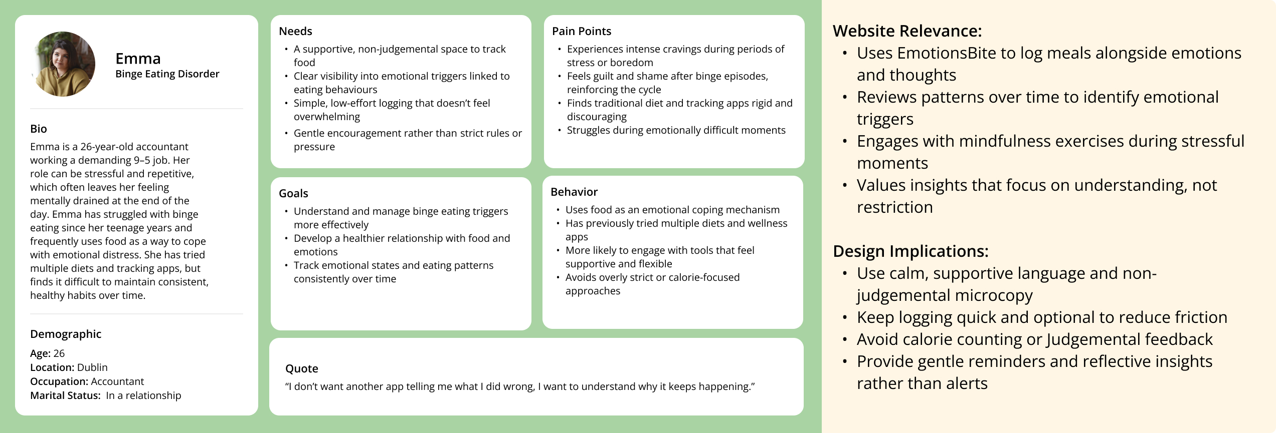
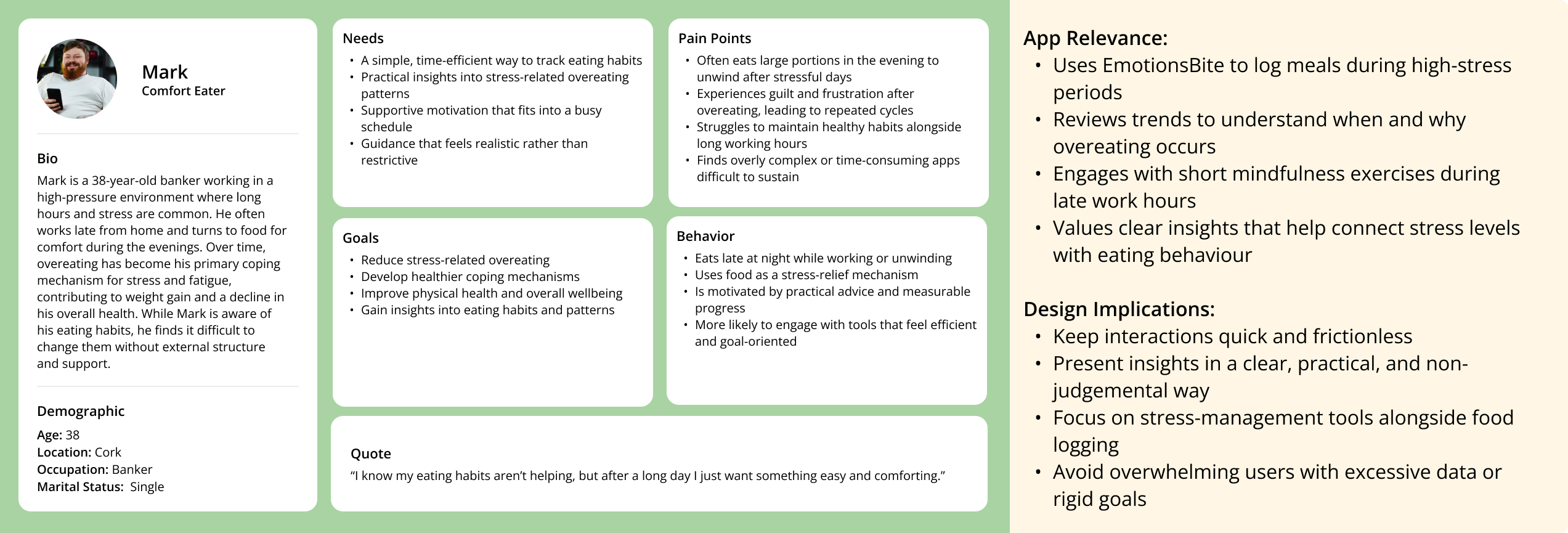
To develop these personas, I combined insights research on emotional eating, The interview and survey data, and an analysis of common eating behavior patterns (binge eating, emotional snacking, and stress-related overeating). This process allowed me to identify two representative user types: Emma the Binge Eater and Mark the Overeater each with distinct goals and challenges. By returning to these personas throughout the design process, I can evaluate whether design decisions truly align with user expectations and provide meaningful, empathetic support.
User Journey Mapping
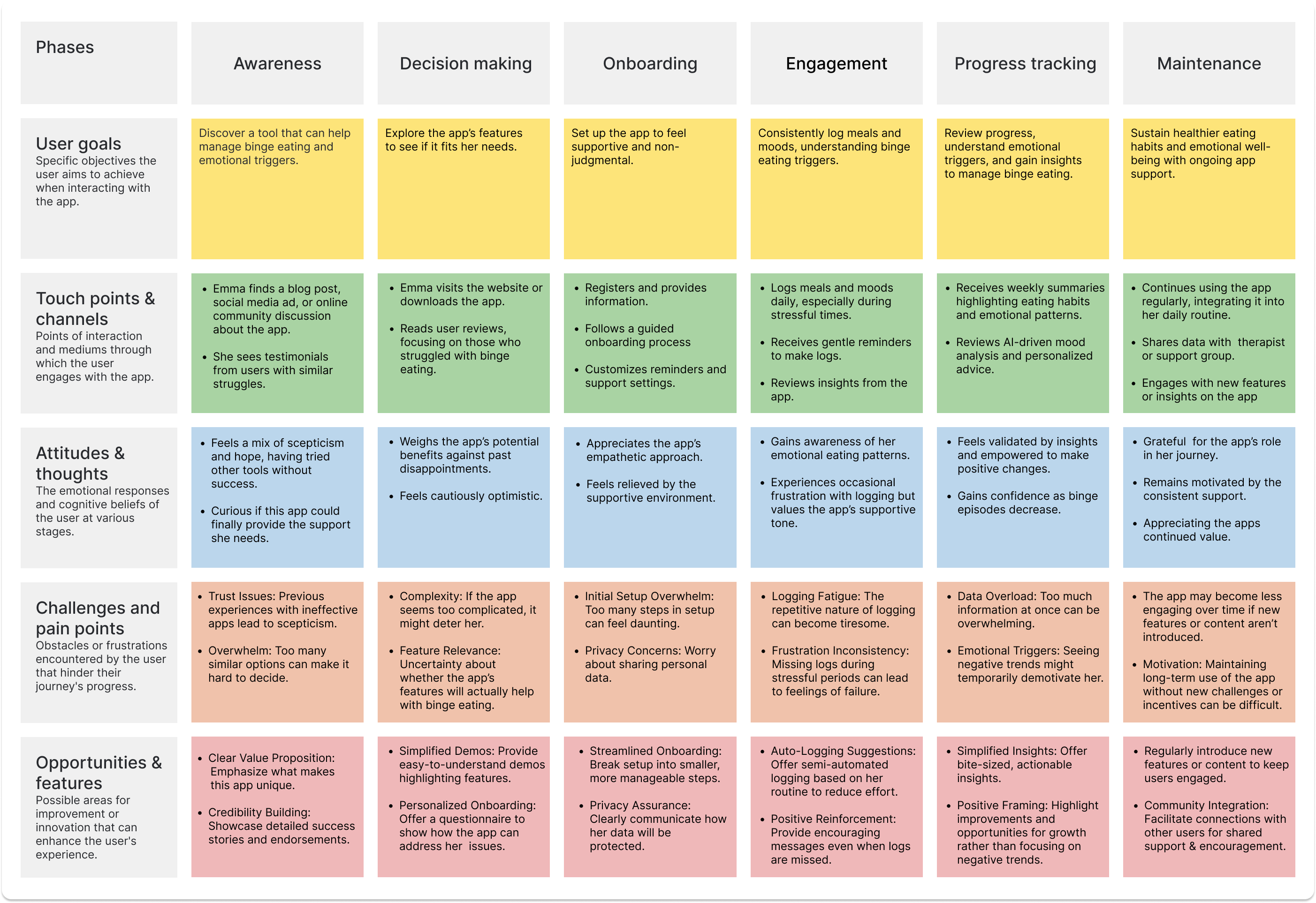
A detailed User Journey Map was done on Emma The Binge Eater, with Pain Points and Opportunities for Improvement It helps to understand user needs, identify challenges like logging consistency or emotional barriers, and spot areas for enhancement. This approach ensures that the app effectively supports users, improves retention, and clearly communicates the vision to stakeholders.
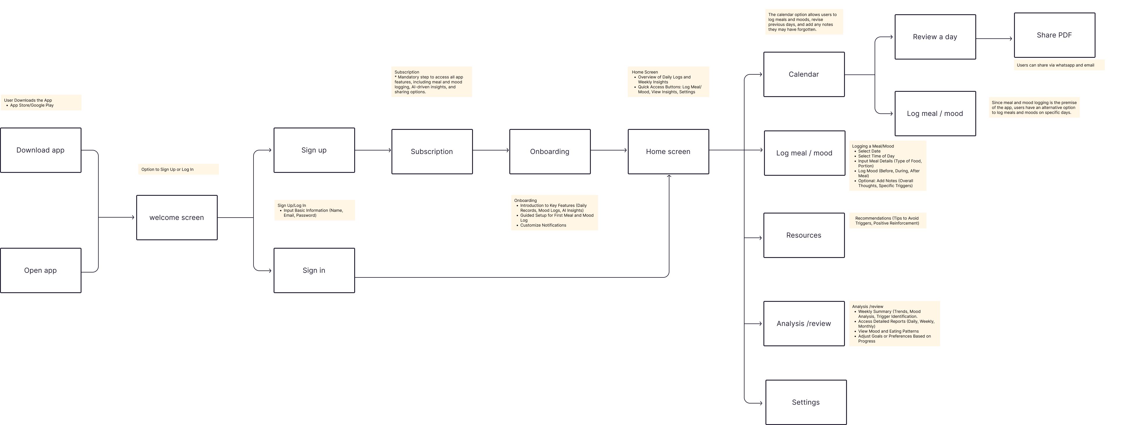
User flow diagram
This user flow demonstrates the journey a user takes through the EmotionsBite app, from the initial download to engaging with the core features. The flow reflects insights from my research, user personas, and journey mapping, ensuring the design aligns with real user needs.
- Frictionless Start: Clear paths for both new and returning users.
- Habit Formation: Onboarding introduces features gradually to avoid overwhelming users.
- User-Centric Core: Logging food and emotions sits at the heart of the app, directly supporting the app’s purpose.
- Value Feedback Loop: Insights and reviews give users immediate value from their entries, encouraging continued engagement.
- Sharing: Exporting logs as PDFs supports users who may want to share progress with therapists or support networks.
Conceptual wireframe
The conceptual wireframe defines the app’s screen architecture and navigation logic for EmotionsBite, bridging the high-level user flow to concrete screens and patterns for the MVP.
Objectives
- Translate the end-to-end user flow into screens and navigation.
- Establish page hierarchy and core patterns ahead of low-fi prototyping.
- Safeguard clarity across onboarding, logging, and insights.
- Align with clinical/support advisors (Psychiatrist, Dietitian).
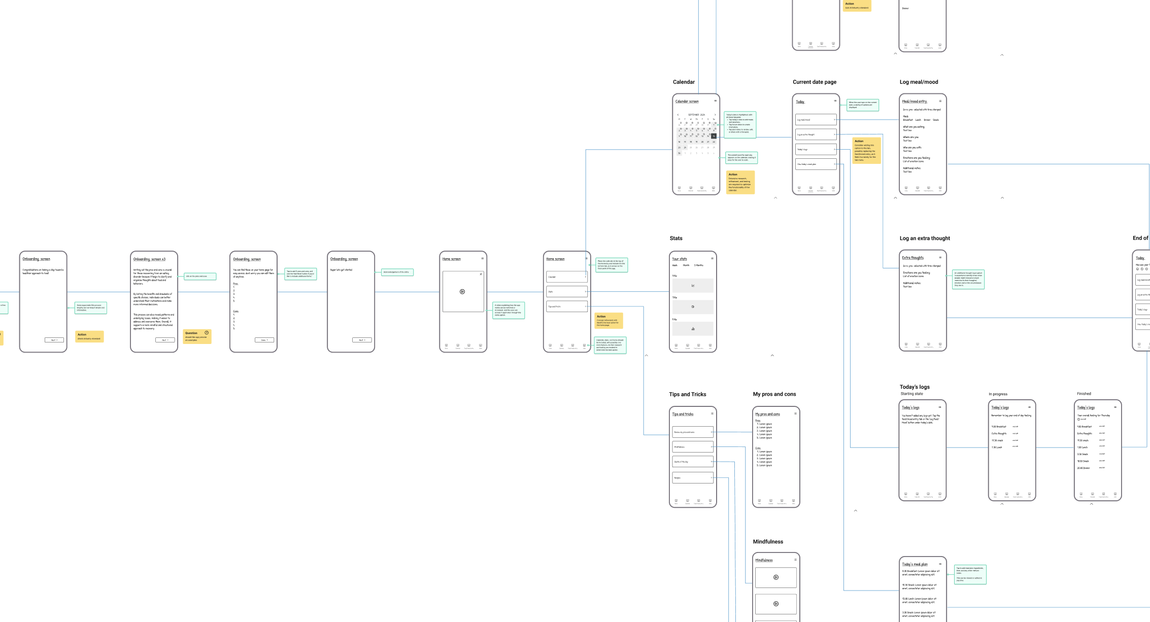
Assumptions to validate in low-fi
- Entry path: calendar-first vs. a dedicated Log button.
- Home content: keep/rename Tips & Tricks; assess redundancy of Today’s Goals.
Low-fi Wireframe
Next, I translated the concept into low-fidelity screens to pressure-test our assumptions—specifically, the entry path for creating a log and the information architecture of Home. The prototype compared a calendar-first flow with a one-tap Log CTA
Objectives
- Validate entry path to create a log (calendar-first vs dedicated Log CTA).
- Make the primary action immediately discoverable from Home.
- Reduce steps/cognitive load on Home.
- Align naming with brand tone (supportive, mindful).
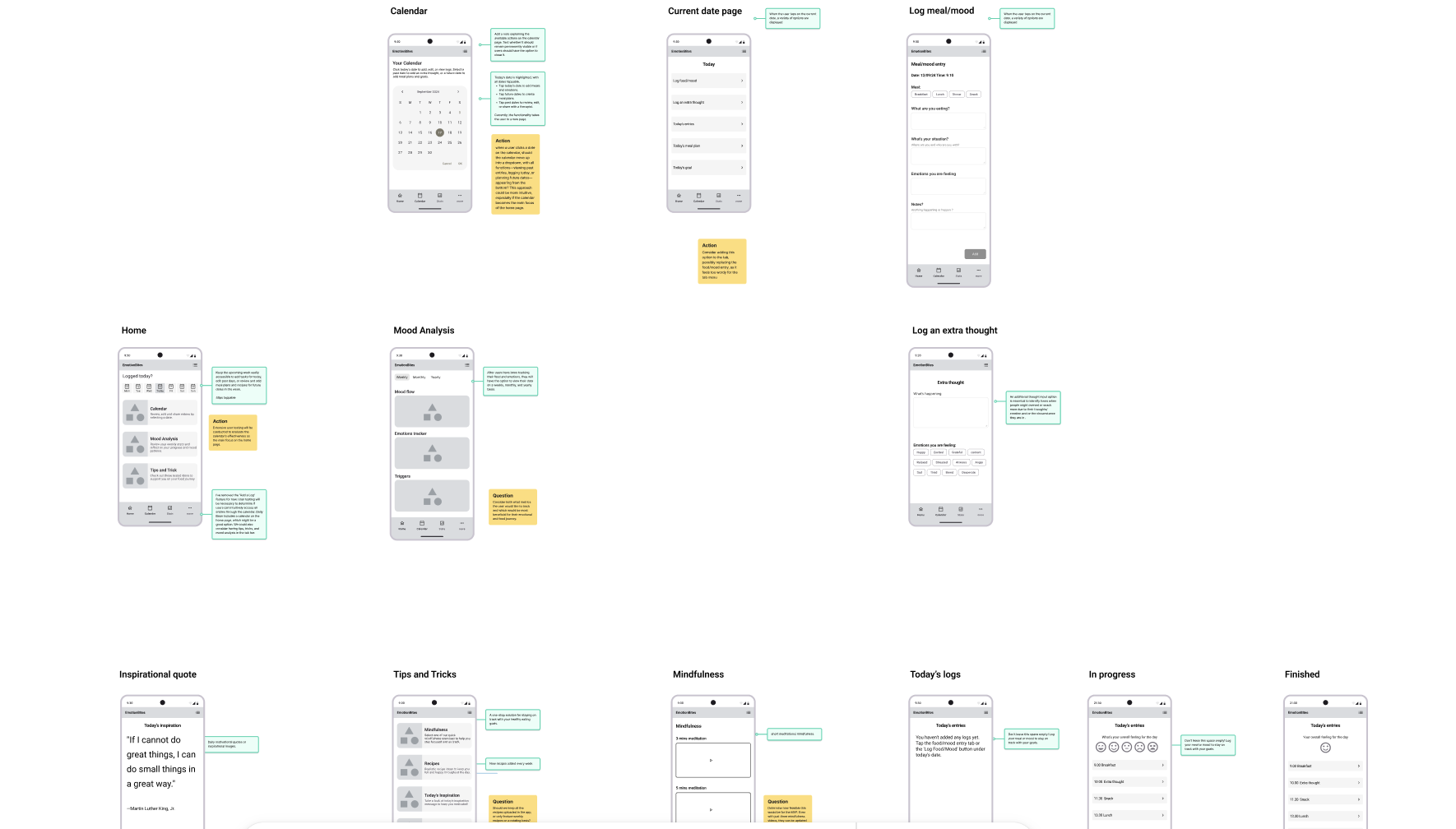
Findings
- Testers expected a clear Log action; the calendar step felt like unnecessary friction.
- Tips & Tricks read as generic/how-to content;
- Today’s Goals duplicated intent.
Decisions
- Remove “Today’s Goals.”
- Remove Calendar from Home.
- Add a dedicated Log button on Home and in the tab bar (one-tap start).
- Rename “Tips & Tricks” → “Mindfulness.”
Home Screen Iterative Design & Testing
This section highlights the iterative design and testing of the EmotionsBite Home screen. User feedback and usability testing informed each iteration, gradually reducing complexity and improving clarity. The final design prioritises time-based orientation, gentle guidance, and reliable core actions in preparation for MVP testing.
Iteration 1: Initial Hi-Fi Concept
Testing objective
Understand whether users could interpret the Home screen’s purpose, identify the primary action, and begin logging without guidance.
Method: Early qualitative testing using a clickable Figma prototype.
Key Observations
- Users paused before interacting
- Primary action was not immediately clear
- Screen felt informative but busy, some users felt pressure to “do everything”
Insight:
Presenting multiple features at once led users to hesitate rather than engage. When users felt emotionally uncertain, the number of options increased decision fatigue and created pressure to “do everything,” instead of guiding them toward a single, achievable action.
Design implication:
The Home screen needed to guide users gently, not present all possibilities upfront.
Iteration 2: Reducing Friction
Testing objective
Assess whether simplifying layout and hierarchy improved clarity, confidence, and speed of action.
Method
Remote usability testing via a Figma prototype, with a small group of users recruited through UserTesting.com.
Key Observations
- Users identified the main action more quickly
- The screen felt calmer and more approachable
- Some users still lacked a clear sense of time or daily context
Insight:
Simplifying the interface reduced visual overwhelm and helped users identify the primary action more quickly.
However, without a clear sense of time, users still lacked confidence about whether they were logging for the correct day or reviewing past behaviour.
Design implication:
Simplifying the interface improved clarity, but time context remained unclear.
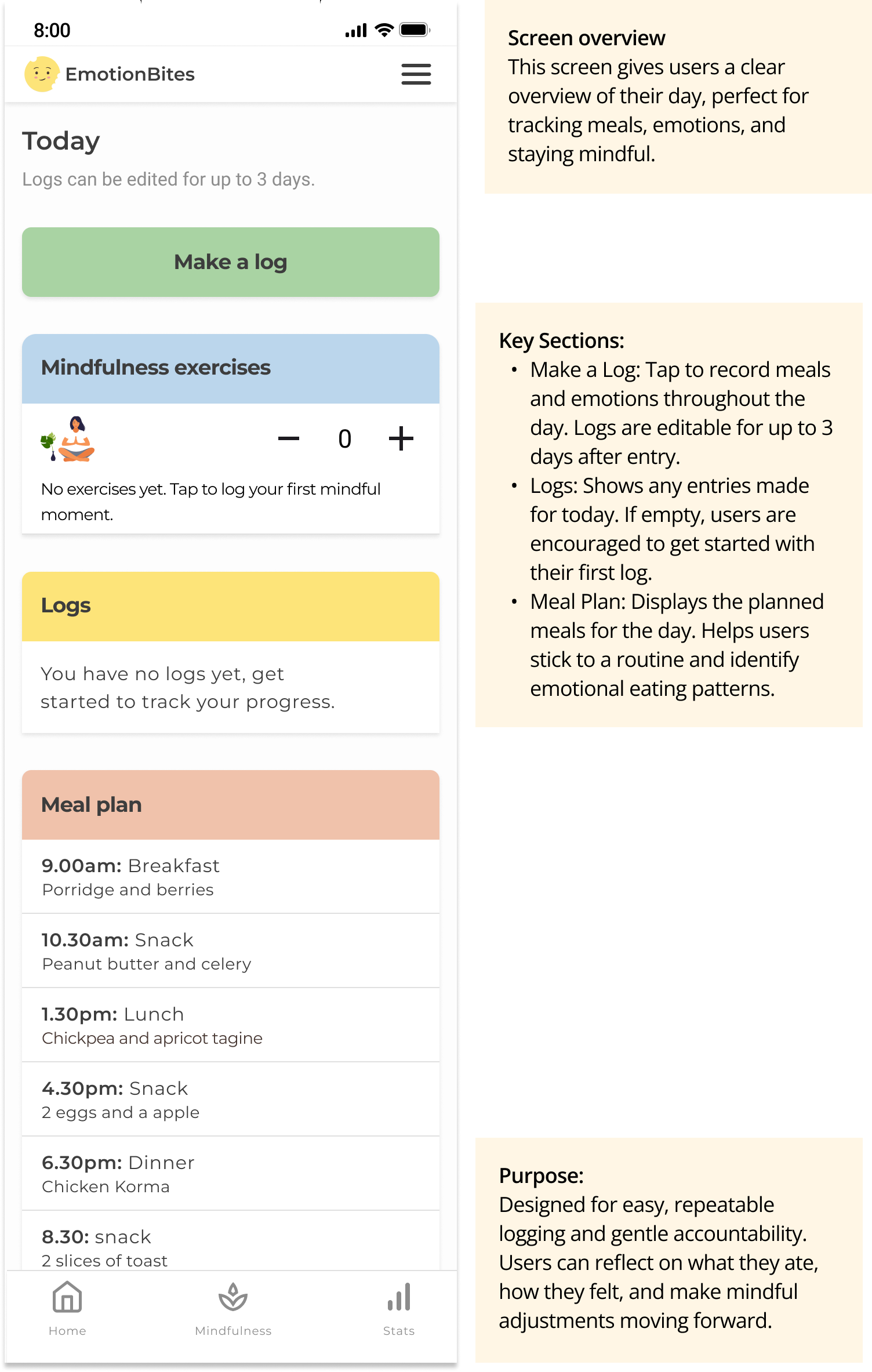
Iteration 3: Time-Based Orientation
Testing objective
Assess whether simplifying layout and hierarchy improved clarity, confidence, and speed of action.
Method
Remote usability testing via a Figma prototype, with a small group of users recruited through UserTesting.com.
Key Observations
- Users identified the main action more quickly
- The screen felt calmer and more approachable
- Some users still lacked a clear sense of time or daily context
Insight:
Simplifying the interface reduced visual overwhelm and helped users identify the primary action more quickly.
However, without a clear sense of time, users still lacked confidence about whether they were logging for the correct day or reviewing past behaviour.
Design implication:
Simplifying the interface improved clarity, but time context remained unclear.
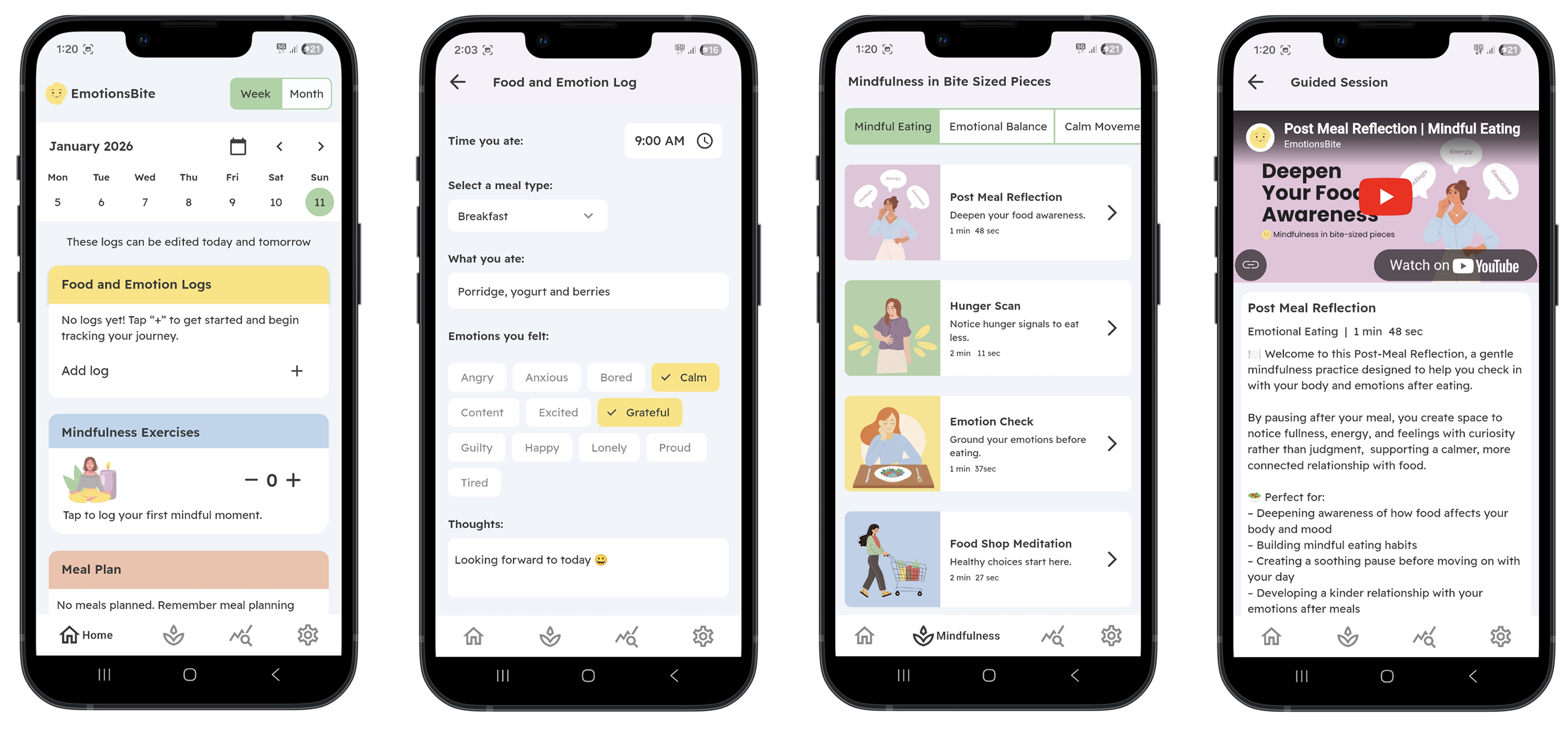
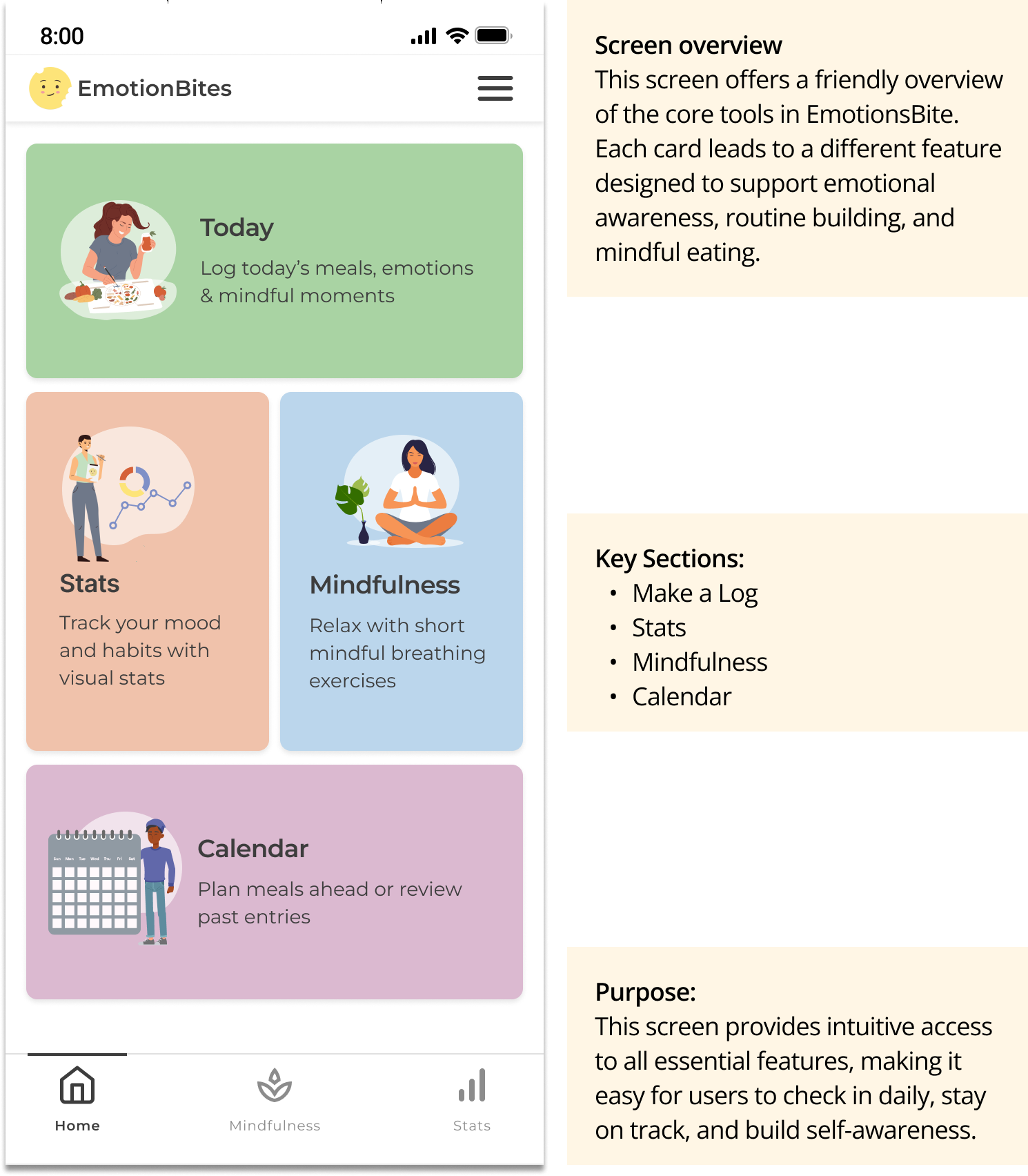
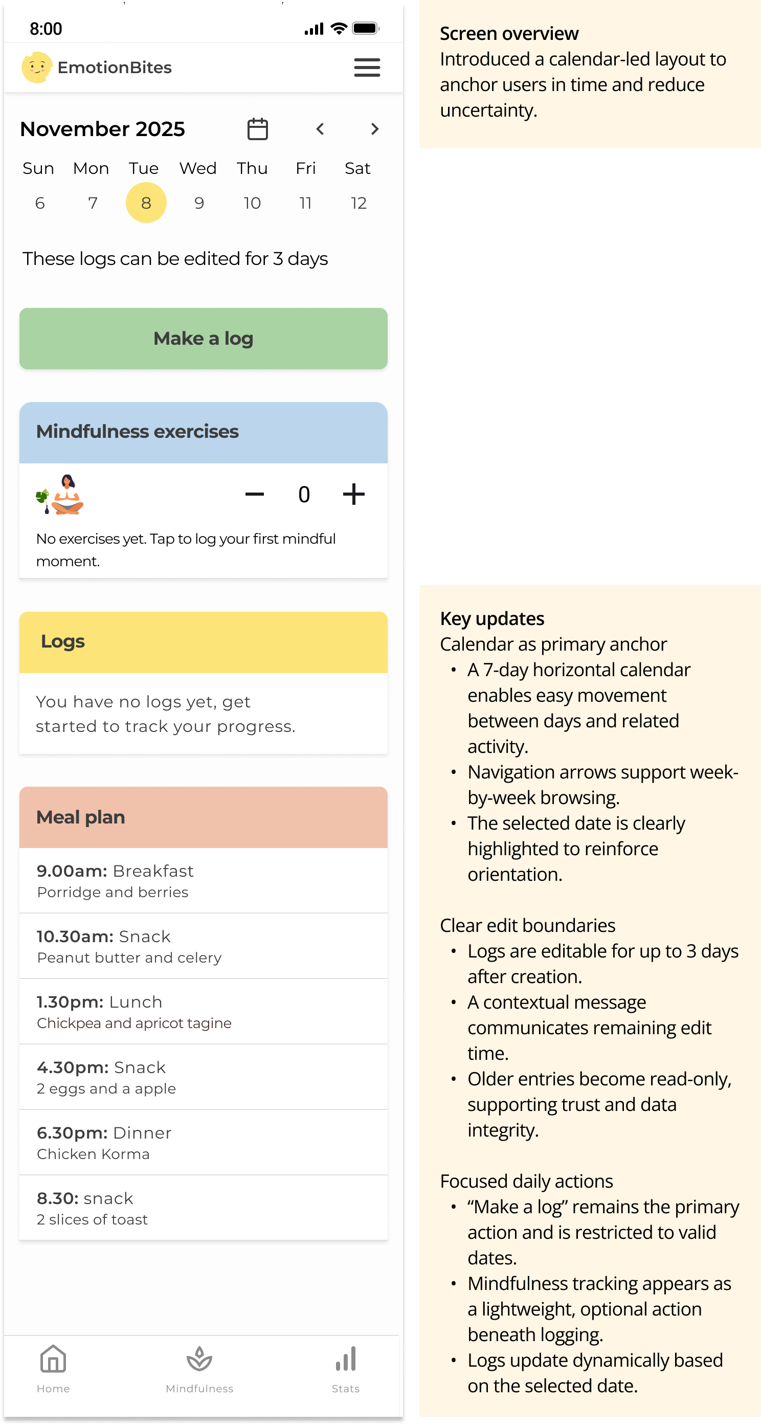
Current Version: MVP (FlutterFlow)
MVP Validation objective Validate that core Home screen interactions worked reliably in a live build and that users could understand daily status, logging rules, and navigation without guidance.
Method The Home screen was implemented in FlutterFlow and released for early-stage testing via the app stores. Access was shared with selected users from previous testing rounds.
Key observations
- Users understood where they were in time and what actions were available
- Logging and edit rules behaved as expected in a real environment
- Core interactions translated well from design to build
Insight Testing in a live environment confirmed that clarity and stability were more valuable than full customisation for the MVP.
Building the Home screen in FlutterFlow enabled early validation of layout and interaction behaviour in a real build environment. Some interactions were shaped by component constraints, prioritising stability, performance, and faster iteration over full customisation. This screen represents the current MVP Home experience, live for early-stage app store testing, with ongoing refinement informed by user feedback.*
* Navigation update: Based on separate usability testing, the top navigation menu was removed and primary navigation was consolidated into the bottom tab bar to improve discoverability and reduce cognitive load.
